How to create a chart from Google Sheets
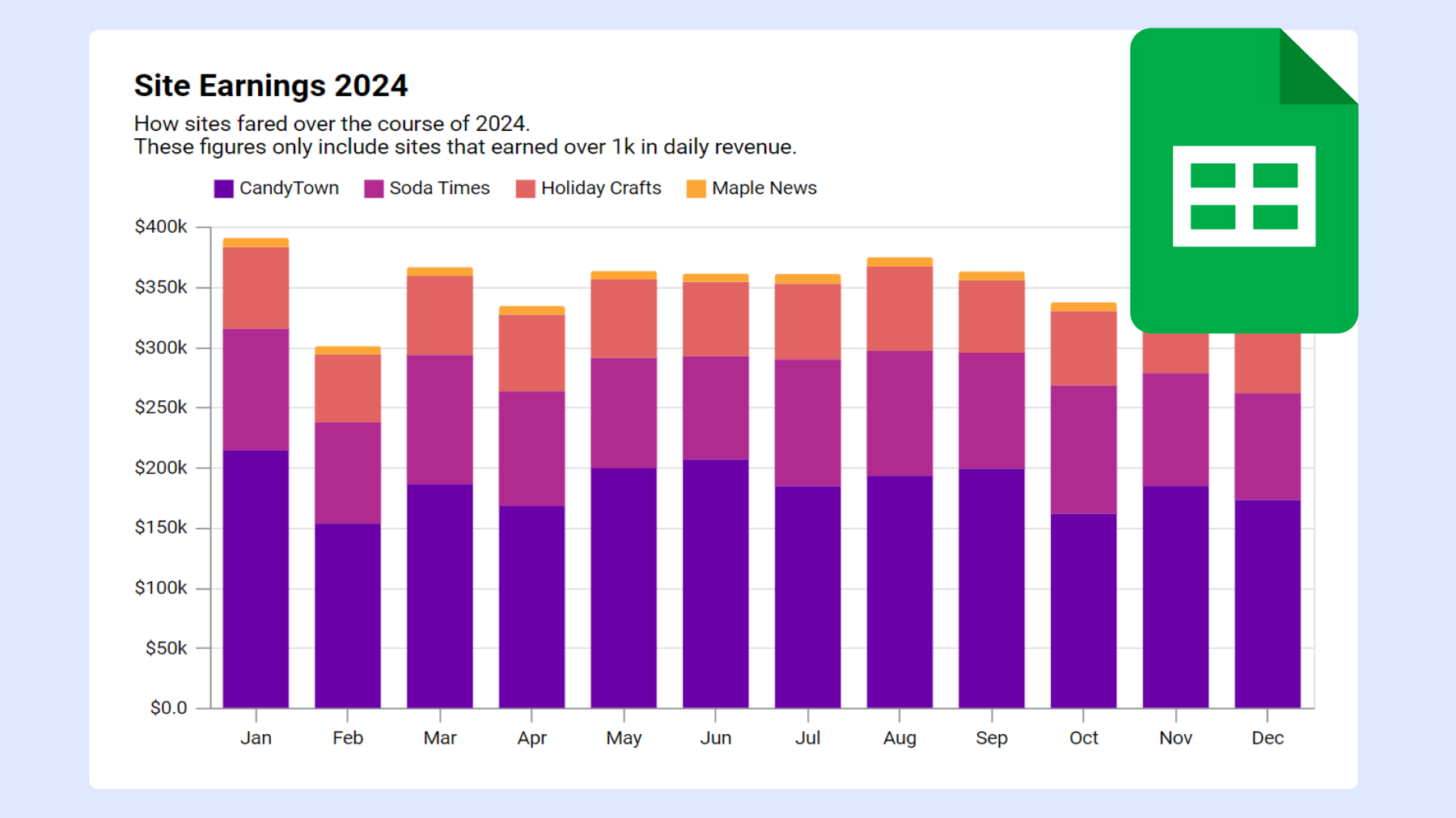
Connect your Google Sheet to InstaCharts to get a chart that automatically updates with your changes

Bart Howe
· 2 min readConnect your Google Sheet to InstaCharts to get a chart that automatically updates with your changes
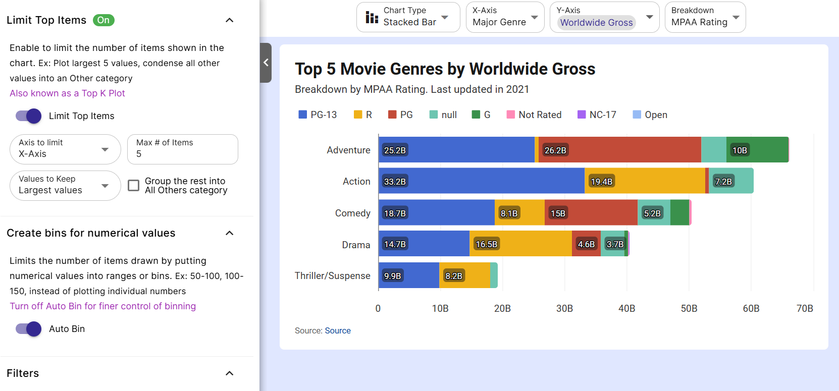
Upload the csv file to InstaCharts and use the Limit Items settings
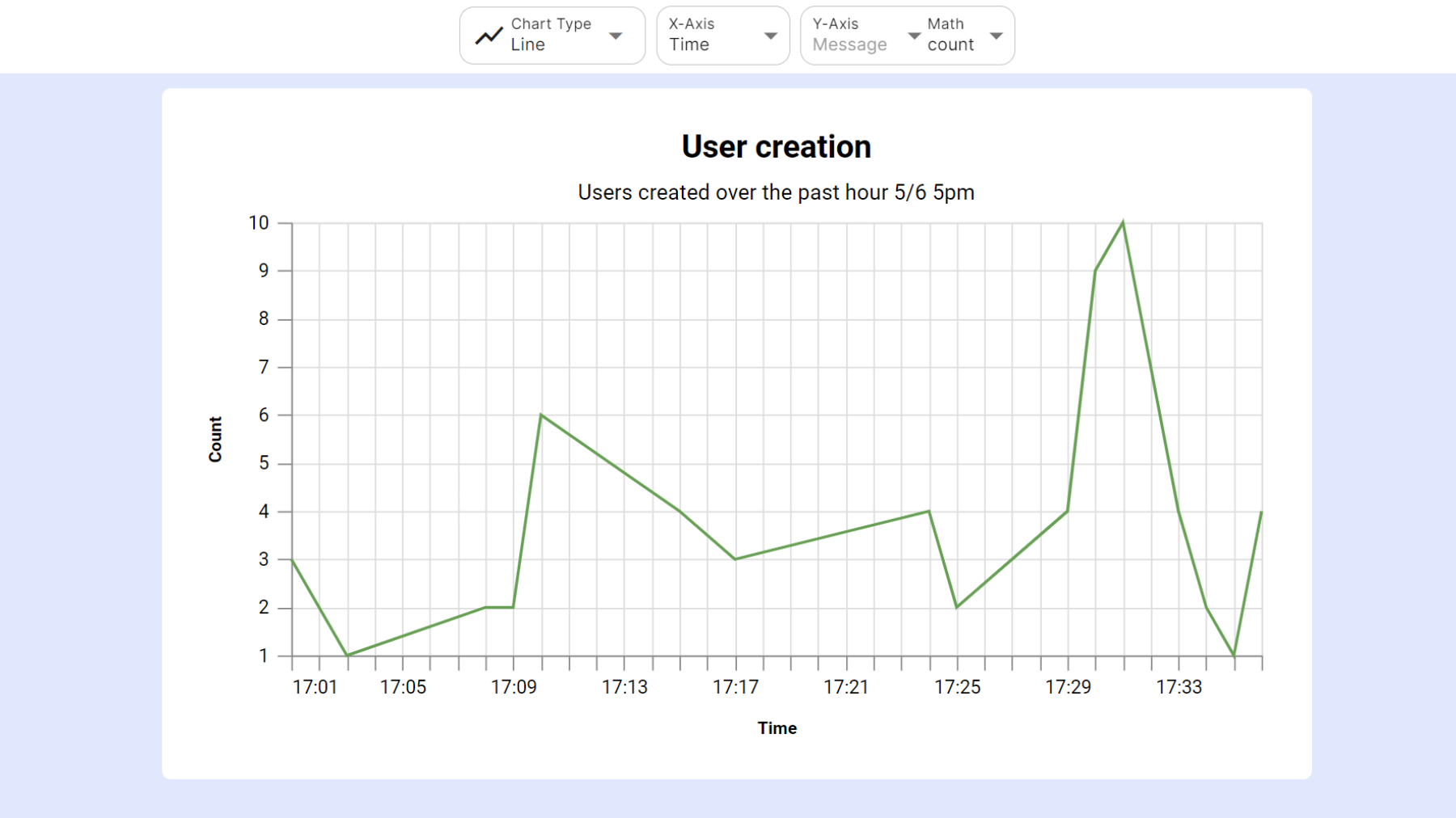
Upload the JSON file to InstaCharts for quick processing
Bar charts are the most flexible chart type you'll ever use. Here's exactly when they work and when to reach for something else.

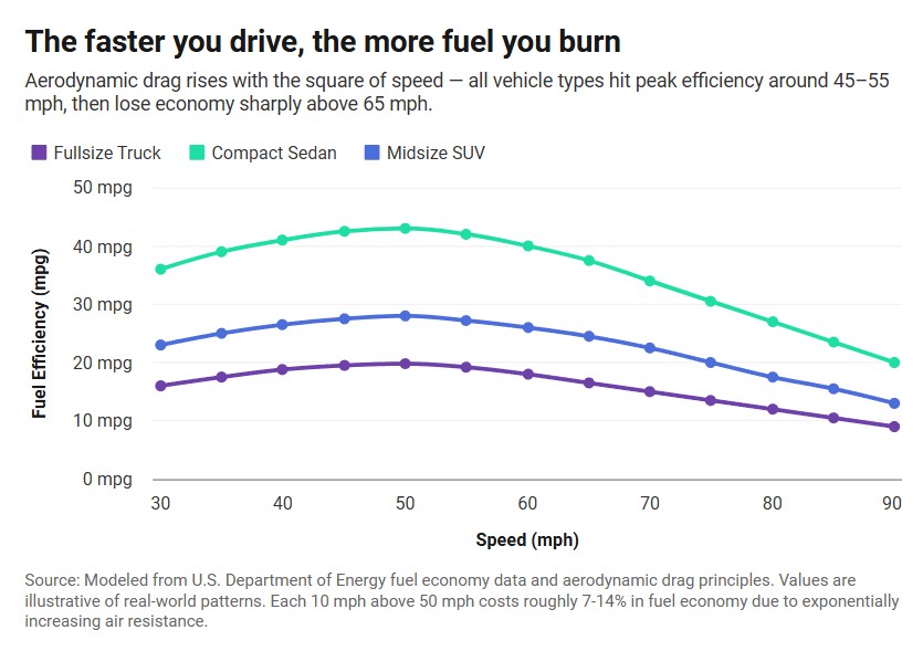
The line chart is the go-to chart for showing how something changes over time. Here's exactly when it works, when it doesn't, and the mistakes that make them hard to read.
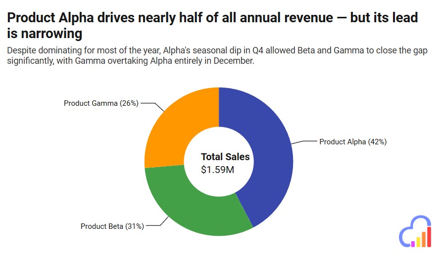
Pie charts have one job - showing how parts make up a whole. They do it well when used correctly, and badly when they're not. Here's exactly when to reach for one and when to use something else.
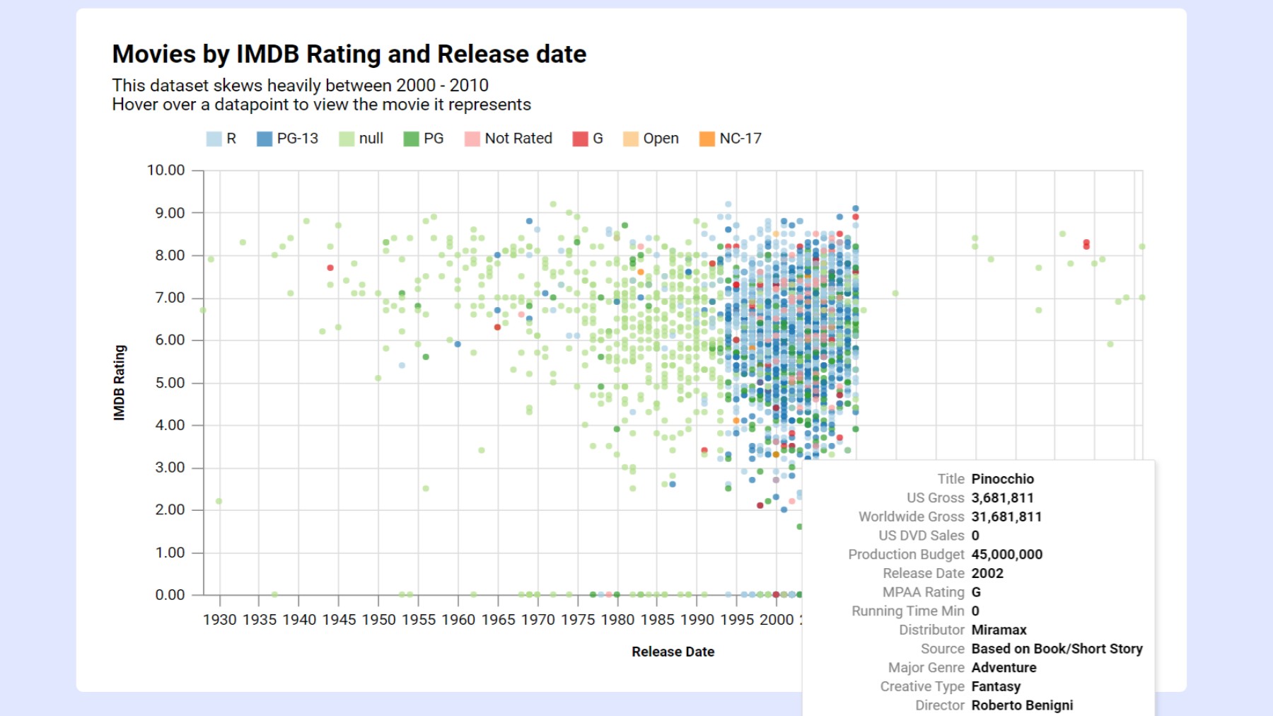
Scatter plots answer the question no other chart can - is there a relationship between these two things? Here's when to use one, what the patterns actually mean, and the mistakes that make them misleading.
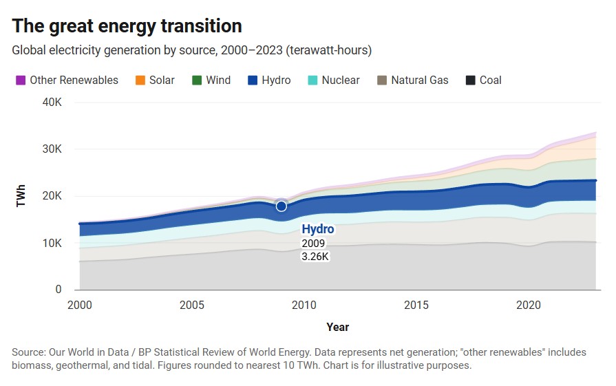
An area chart is a line chart with the space below filled in. That one difference changes everything about when it works and when it doesn't. Here's the full breakdown.
 InstaCharts
We use cookies to analyze website traffic and optimize your experience. By accepting our use of cookies, your data will be aggregated with all other user data.
Visit our Privacy Policy for more info.