
Chart maker
100% Stacked Bar Chart Maker
Compare the mix of each category as a share of 100%
A 100% stacked bar chart scales every bar to the same length, so each segment shows its percentage of that bar's total. InstaCharts calls this option Normalize, and it turns any stacked bar chart into a share-of-total comparison with one toggle.
A live 100% stacked bar chart example
An interactive 100% stacked bar chart built and embedded with InstaCharts.
Templates
100% Stacked Bar Chart templates
Choose the Templates tab when you create a new sheet in InstaCharts. Each template loads a sample dataset with a finished chart, so you can replace the sample rows with your own numbers.
Employee Engagement Survey
100% stacked horizontal bar chartAgreement levels for five engagement statements, stacked into horizontal bars so each question reads as one row.
| Statement | Response | Responses |
|---|---|---|
| I know what is expected of me | Strongly agree | 168 |
| I know what is expected of me | Agree | 205 |
| I know what is expected of me | Neutral | 68 |
| I know what is expected of me | Disagree | 27 |
| I know what is expected of me | Strongly disagree | 12 |
Department Budget by Expense Type
Stacked horizontal bar chartHow each department's annual budget splits across salaries, software, travel and equipment, stacked into horizontal bars.
| Department | Expense Type | Amount |
|---|---|---|
| Engineering | Salaries | 2450000 |
| Engineering | Software | 420000 |
| Engineering | Travel | 85000 |
| Engineering | Equipment | 190000 |
| Sales and Marketing | Salaries | 1780000 |
Your data
What data you need for a 100% stacked bar chart
Paste your spreadsheet, upload a CSV or Excel file, or connect a Google Sheet, and InstaCharts detects your column types and builds the 100% stacked bar chart automatically.
X-Axis
Categorical data or dates, with one bar for each
Y-Axis
Numerical values that add up within each bar
Breakdown
Categorical data, where each unique value becomes a segment
Use cases
When to use a 100% stacked bar chart
Best uses
- Compare the composition of several categories when their totals differ widely
- Show survey responses, such as agreement levels, as a percentage of each question's answers
- Track how the mix of segments changes across time periods
- Rank segments by share when the proportions matter more than the absolute totals
When another chart fits better
- Absolute totals matter, so a standard stacked bar chart keeps the real values visible
- A single part-to-whole split reads well as a pie chart or donut chart
- Many small segments make the colors hard to tell apart, so group the smallest values into an Other category
How it works
How to make a 100% stacked bar chart
Step 1
Add your data
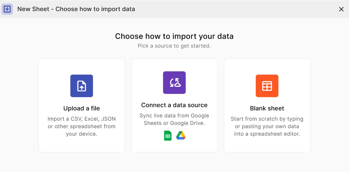
Use three columns: a category for each bar, a breakdown column for the segments, and a numeric value.
Step 2
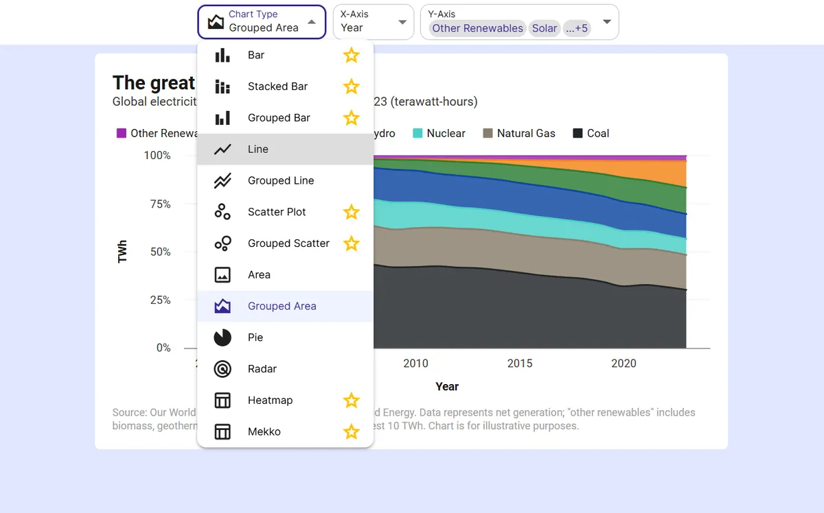
Pick the stacked bar chart
Choose the stacked bar chart type and map your columns to the X-axis, the breakdown, and the Y-axis.
Step 3
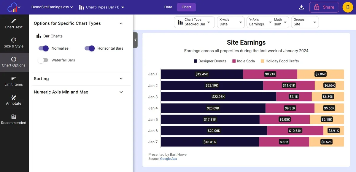
Turn on Normalize
Switch on the Normalize toggle in Options for Specific Chart Types and every bar rescales to 100 percent.
Step 4
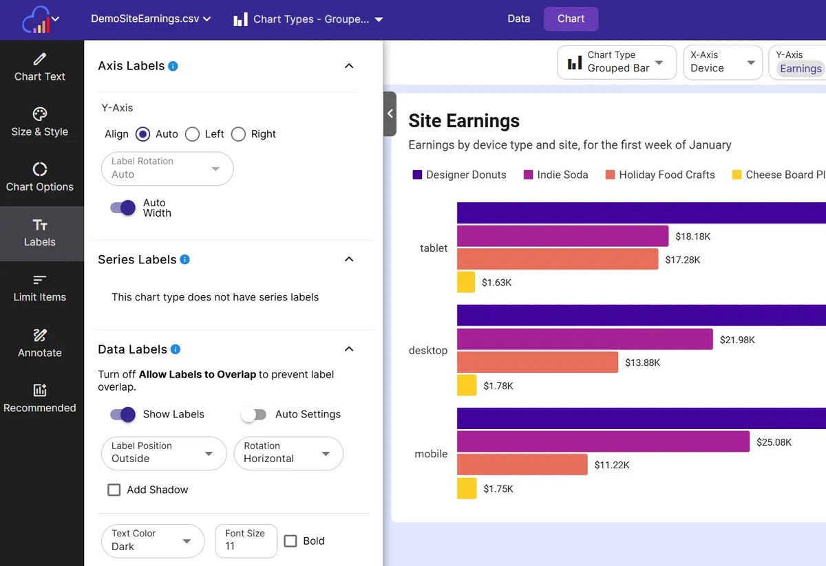
Label the segments
Add data labels to read each segment, and use the Label Removal % slider to hide labels on very small segments.
Step 5
Export or embed
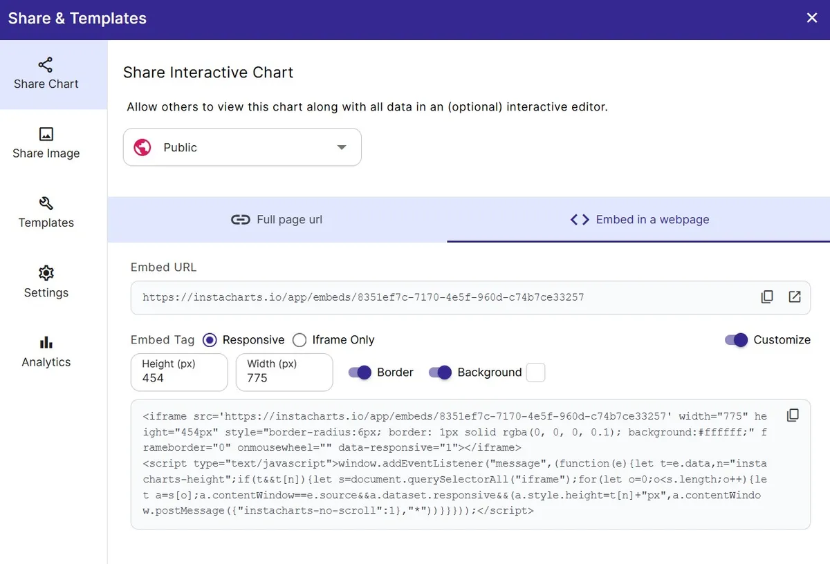
Download as PNG or SVG, share a link, or embed a live chart in your site or report.
FAQ
100% Stacked Bar Chart maker FAQ
Answers to common questions about making a 100% stacked bar chart with InstaCharts.
What is a 100% stacked bar chart?
A 100% stacked bar chart is a stacked bar chart where every bar is scaled to the same total length. Each segment then shows its percentage of the bar instead of its absolute value, which makes the mix between categories easy to compare.
What is the difference between a stacked bar chart and a 100% stacked bar chart?
A stacked bar chart keeps each bar at its real total, so bars can differ in length. A 100% stacked bar chart, called Normalize in InstaCharts, gives every bar the same length so the segments show relative shares.
How do I make a 100% stacked bar chart from a spreadsheet?
Upload a sheet with a category column, a breakdown column, and a numeric column, choose the stacked bar chart type, and switch on Normalize. InstaCharts sums the values for each category and scales the bars.
When should I use a 100% stacked bar chart?
Use it when the proportions matter more than the totals, such as comparing the audience mix of several channels, the split of budgets across departments, or how survey answers divide across questions.
Can I make the bars horizontal?
Yes. Switch on Horizontal Bars alongside Normalize to draw the 100% bars sideways, which suits long category names and Likert scale survey results.
Is the 100% stacked bar chart maker free?
Yes. The free plan lets you create and export 100% stacked bar charts with up to 500 rows per sheet, and charts include a small watermark. Paid plans starting at $10 per user per month remove the watermark.
Want the full reference?
Read the 100% stacked bar chart documentation.
Related guides
Explore
Related chart makers
Compare related chart types, or browse every InstaCharts chart maker below.
Stacked Bar Chart Maker
Show totals and composition in one chart
Horizontal Bar Chart Maker
Rank categories with long labels as sideways bars
Likert Scale Chart Maker
Visualize agreement scales from strongly disagree to strongly agree
All InstaCharts chart makers
- Bar Chart Maker
- Stacked Bar Chart Maker
- Grouped Bar Chart Maker
- Line Graph Maker
- Grouped Line Chart Maker
- Area Chart Maker
- Grouped Area Chart Maker
- Pie Chart Maker
- Scatter Plot Maker
- Grouped Scatter Plot Maker
- Radar Chart Maker
- Heatmap Maker
- Mekko Chart Maker
- Gauge Chart Maker
- Grouped Gauge Chart Maker
- Donut Chart Maker
- Waterfall Chart Maker
- Horizontal Bar Chart Maker
- 100% Stacked Area Chart Maker
- Trend Line Graph Maker
- Pie Chart Maker with Percentages
- Semi Circle Pie Chart Maker
- Likert Scale Chart Maker
- Survey Chart Maker
- Cash Flow Waterfall Chart Maker
- Budget vs Actual Chart Maker
See every option on the chart maker page.
Make your 100% stacked bar chart in seconds
InstaCharts makes data visualization easy, so you can build clear reports without design experience.