
Chart maker
Gauge Chart Maker
Show progress toward a goal on a dial
A gauge chart, also called a dial or speedometer chart, shows one number on a curved scale so readers can see how close it is to a maximum or a goal. InstaCharts is a free gauge chart maker that adds up or averages a column from your data and draws it as a filled arc or a needle dial, with an optional target line.
A live gauge chart example
An interactive gauge chart built and embedded with InstaCharts.
Templates
Gauge Chart templates
Choose the Templates tab when you create a new sheet in InstaCharts. Each template loads a sample dataset with a finished chart, so you can replace the sample rows with your own numbers.
Quarterly Sales Goal
Gauge chartClosed won deals for one sales team over a quarter, added up and shown on a gauge against the team quota.
| Close Date | Account | Sales Rep | Deal Amount |
|---|---|---|---|
| 2026-07-02 | Northwind Freight | Priya Shah | 72000 |
| 2026-07-09 | Blue Harbor Foods | Marcus Lee | 38500 |
| 2026-07-15 | Summit Dental Group | Priya Shah | 54000 |
| 2026-07-22 | Cedar Ridge Schools | Elena Novak | 91000 |
| 2026-07-30 | Lakeview Clinics | Marcus Lee | 46500 |
Monthly Operating Budget Spent
Needle gauge chartOne month of operating expenses added up and shown on a needle gauge, with the monthly budget marked as the target.
| Invoice Date | Expense Category | Amount |
|---|---|---|
| 2026-09-01 | Rent | 18000 |
| 2026-09-02 | Software subscriptions | 6400 |
| 2026-09-04 | Contractors | 14500 |
| 2026-09-05 | Cloud hosting | 8200 |
| 2026-09-09 | Travel | 3900 |
Your data
What data you need for a gauge chart
Paste your spreadsheet, upload a CSV or Excel file, or connect a Google Sheet, and InstaCharts detects your column types and builds the gauge chart automatically.
Value
A numeric column, added up or averaged into one number for the dial
Scale
An optional Min and Max, such as 1 to 5 for a rating or 0 to 100 for a percent
Target
An optional goal, drawn as a line across the dial
Use cases
When to use a gauge chart
Best uses
- Track sales against a monthly or quarterly quota
- Show progress on a project or task list as a percent complete
- Display an average customer rating on a 1 to 5 scale
- Compare spending to date against a monthly budget
- Add context to a headline KPI on a dashboard
When another chart fits better
- Trends over time suit a line graph, since a gauge shows one number
- Comparing many categories reads better as a bar chart
- A plain total with no scale or goal reads better as a KPI number
How it works
How to make a gauge chart
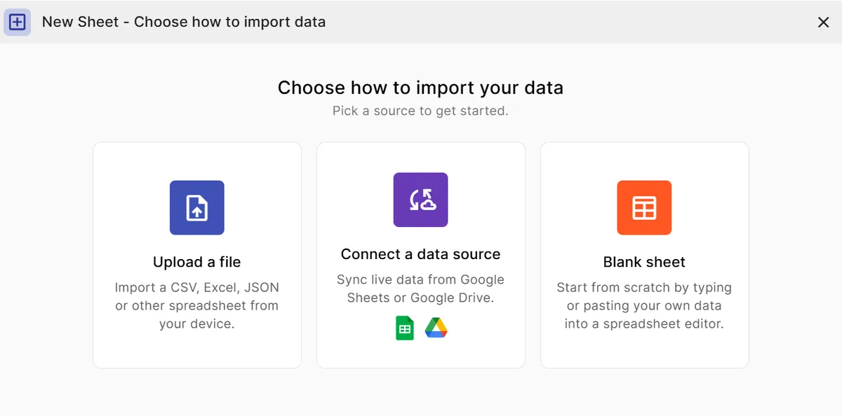
Step 1
Add your data
Paste a spreadsheet, or upload a CSV, Excel, TSV, or JSON file with a numeric column to measure, or start from a gauge template.
Step 2
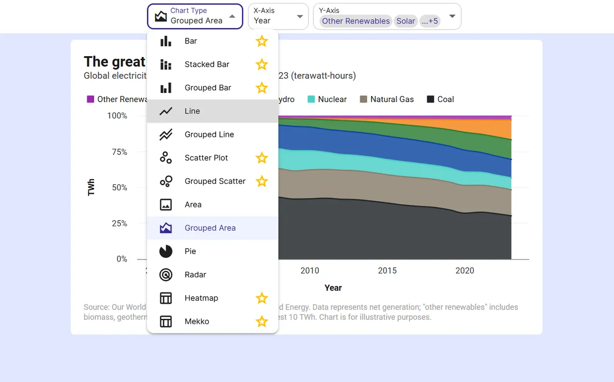
Pick the gauge chart
Choose Gauge from the chart type menu. Every row goes into one number, so only the Y-axis column is needed.
Step 3
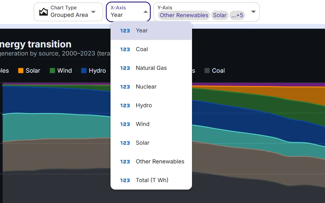
Choose sum or average
Add up amounts such as sales or expenses, or average ratings, scores, and percents.
Step 4
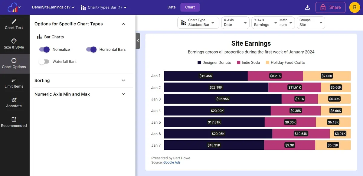
Set the scale and target
Open Options for Specific Chart Types to set the Min, Max, and Target, switch to a Needle Dial, or change the Degrees and Band Thickness.
Step 5
Export or embed
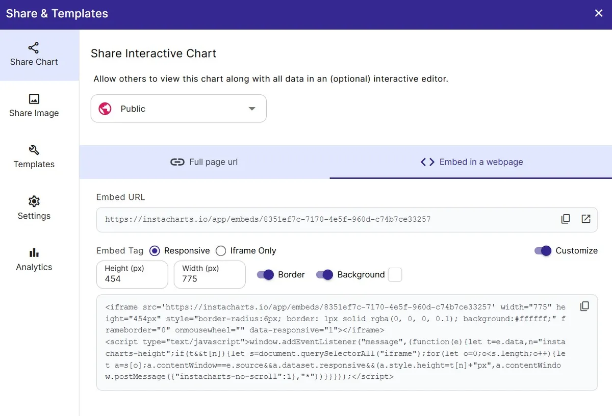
Download as PNG or SVG, share a link, embed a live chart, or add the gauge to a dashboard next to your KPIs.
FAQ
Gauge Chart maker FAQ
Answers to common questions about making a gauge chart with InstaCharts.
What is a gauge chart?
A gauge chart shows a single value on a curved scale, like a speedometer. The colored arc fills from the low end of the scale up to the value, so readers can see at a glance how close the number is to its maximum or to a goal.
How do I make a gauge chart?
Upload your data, choose Gauge from the chart type menu, and pick the numeric column to measure. InstaCharts adds up or averages the column into one number. Set a Min, Max, and Target in the Chart Options panel to match your goal.
Can I make a speedometer chart with a needle?
Yes. Turn on Needle Dial in the Chart Options panel to draw a speedometer style dial with a needle and tick marks instead of a filled arc.
Can I add a target to a gauge chart?
Yes. Enter a Target value and InstaCharts draws a line across the dial at that value and writes the target under the number. You can keep the default target color or choose your own.
Can I show several gauges on one chart?
Yes. A grouped gauge chart draws up to 10 progress rings on one chart, with one ring per category or one ring per column, so you can compare teams, regions, or campaigns side by side.
Can AI make a gauge chart for me?
Yes. AI Chart Recommendations and the dashboard AI prompt bar suggest a gauge chart when one total or average is the main story, and build one when you ask them to track progress toward a goal.
Is the gauge chart maker free?
Yes. The free plan lets you create and export gauge charts with up to 500 rows per sheet, and charts include a small watermark. Paid plans starting at $10 per user per month remove the watermark.
Want the full reference?
Read the gauge chart documentation.
Explore
Related chart makers
Compare related chart types, or browse every InstaCharts chart maker below.
Grouped Gauge Chart Maker
Compare progress across categories with rings
Semi Circle Pie Chart Maker
Fit a part-to-whole chart into half the height
Budget vs Actual Chart Maker
Compare planned spending with what was actually spent
All InstaCharts chart makers
- Bar Chart Maker
- Stacked Bar Chart Maker
- Grouped Bar Chart Maker
- Line Graph Maker
- Grouped Line Chart Maker
- Area Chart Maker
- Grouped Area Chart Maker
- Pie Chart Maker
- Scatter Plot Maker
- Grouped Scatter Plot Maker
- Radar Chart Maker
- Heatmap Maker
- Mekko Chart Maker
- Grouped Gauge Chart Maker
- Donut Chart Maker
- Waterfall Chart Maker
- Horizontal Bar Chart Maker
- 100% Stacked Bar Chart Maker
- 100% Stacked Area Chart Maker
- Trend Line Graph Maker
- Pie Chart Maker with Percentages
- Semi Circle Pie Chart Maker
- Likert Scale Chart Maker
- Survey Chart Maker
- Cash Flow Waterfall Chart Maker
- Budget vs Actual Chart Maker
See every option on the chart maker page.
Make your gauge chart in seconds
InstaCharts makes data visualization easy, so you can build clear reports without design experience.