
Grouped Scatter Plot Maker
Compare correlations across groups
A grouped scatter plot adds a third dimension to a scatter chart by coloring each point by category, so you can compare how the relationship between two numeric variables changes across groups. InstaCharts builds it from your spreadsheet with an automatic color legend.
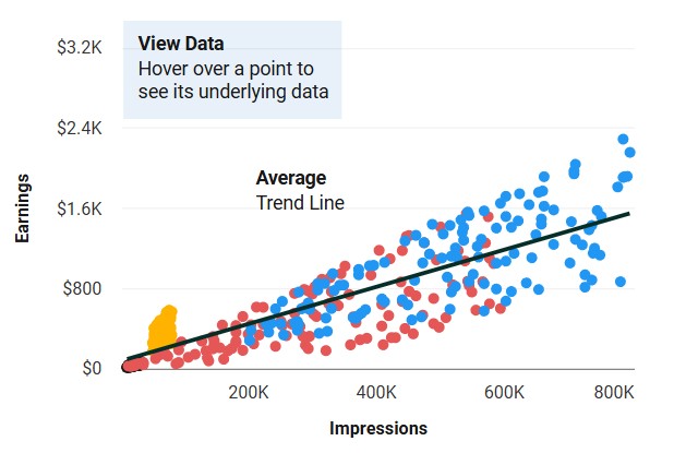
A live grouped scatter plot example
An interactive grouped scatter plot built and embedded with InstaCharts.
What data you need for a grouped scatter plot
Paste your spreadsheet, upload a CSV or Excel file, or connect a Google Sheet, and InstaCharts detects your column types and builds the grouped scatter plot automatically.
When to use a grouped scatter plot
- Compare whether a correlation is stronger in one group than another
- See whether groups occupy distinct regions of the chart
- Detect outliers within a specific category
- Test whether a third variable shapes a two-variable relationship
When another chart fits better
- More than five or six colors get hard to tell apart
- With only one group, a standard scatter plot is simpler
- Categorical axes belong in a grouped bar chart
How to make a grouped scatter plot
- 1Add your data: Paste a spreadsheet, or upload a CSV, Excel, TSV, or JSON file.
- 2Pick the grouped scatter plot: InstaCharts auto-suggests a chart; switch to this type in one click.
- 3Map your columns: Choose which columns drive each axis, or accept the smart defaults.
- 4Customize styling: Adjust colors, labels, and titles to match your brand or report.
- 5Export or embed: Download as PNG, SVG, or PDF, share a link, or embed a live, auto-updating chart.
Grouped Scatter Plot maker FAQ
Is the grouped scatter plot maker free?
Yes. You can build and export a grouped scatter plot for free, no sign-up needed. The free tier covers up to 500 rows and adds a watermark, removed on paid plans from $10/month.
How do I color scatter points by category?
Add a breakdown column with the category for each row. InstaCharts assigns each unique value its own color and builds a legend so groups are easy to tell apart.
What data do I need for a grouped scatter plot?
Two numeric columns for the axes plus one category column for the grouping. Both axes must be numeric; for categorical comparisons use a grouped bar chart instead.
How many groups can I show?
You can plot several, but five or six colors is the practical limit for readability. Filter or combine smaller categories to keep the groups distinct.
Want the full reference? Read the grouped scatter plot documentation.
Related chart makers
Scatter Plot Maker
Find correlations between two variables
Grouped Bar Chart Maker
Compare several series side by side
Heatmap Maker
Reveal patterns across a data grid
See every option on the chart maker page.
Craft professional charts in seconds
Boost your productivity. Elevate your reports. InstaCharts makes data visualization effortless.