
Heatmap Maker
Reveal patterns across a data grid
A heatmap arranges values in a grid and colors each cell by its number, so patterns, clusters, and outliers across a large matrix become instantly scannable. InstaCharts is a free heatmap maker with sequential and diverging color palettes.
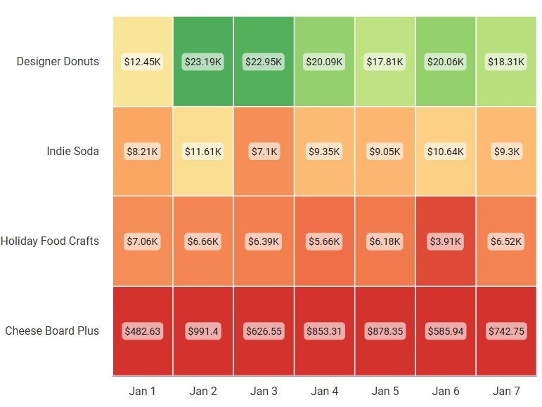
A live heatmap example
An interactive heatmap built and embedded with InstaCharts.
What data you need for a heatmap
Paste your spreadsheet, upload a CSV or Excel file, or connect a Google Sheet, and InstaCharts detects your column types and builds the heatmap automatically.
When to use a heatmap
- Spot high and low values at a glance across a whole matrix
- Show how two categorical variables interact
- Detect clusters of similar values and isolated outliers
- Make a large numerical table scannable with color
- Find time-based patterns, such as days against hours
When another chart fits better
- Very small grids are clearer as a plain table
- When exact numbers drive decisions, a bar chart is more precise
- Mixed positive and negative values need a diverging palette with a clear zero
How to make a heatmap
- 1Add your data: Paste a spreadsheet, or upload a CSV, Excel, TSV, or JSON file.
- 2Pick the heatmap: InstaCharts auto-suggests a chart; switch to this type in one click.
- 3Map your columns: Choose which columns drive each axis, or accept the smart defaults.
- 4Customize styling: Adjust colors, labels, and titles to match your brand or report.
- 5Export or embed: Download as PNG, SVG, or PDF, share a link, or embed a live, auto-updating chart.
Heatmap maker FAQ
Is the heatmap maker free?
Yes. You can build and export a heatmap for free with no account. The free tier supports up to 500 rows and adds a watermark; paid plans from $10/month remove it.
What data do I need to make a heatmap?
Two category columns for the rows and columns of the grid, plus a numeric column that determines each cell's color. InstaCharts can pivot raw data into this matrix shape for you.
Which color palette should I use?
Use a sequential palette for low-to-high data and a diverging palette when you want to highlight values above and below a midpoint, such as positive and negative growth. Avoid rainbow palettes, which distort perception.
Can I show the numbers inside the cells?
Yes. You can add value labels inside each cell for precise reading on smaller grids, while still using color to show the overall pattern.
Want the full reference? Read the heatmap documentation.
Related chart makers
Scatter Plot Maker
Find correlations between two variables
Bar Chart Maker
Compare values across categories online, free
Mekko Chart Maker
Show size and composition at once
See every option on the chart maker page.
Craft professional charts in seconds
Boost your productivity. Elevate your reports. InstaCharts makes data visualization effortless.