
Chart maker
Horizontal Bar Chart Maker
Rank categories with long labels as sideways bars
A horizontal bar chart draws each category as a bar that extends from left to right, which gives long category names room to stay on one line. InstaCharts turns any spreadsheet into a horizontal bar chart with a single toggle, and the same option works for grouped and stacked bar charts.
A live horizontal bar chart example
An interactive horizontal bar chart built and embedded with InstaCharts.
Templates
Horizontal Bar Chart templates
Choose the Templates tab when you create a new sheet in InstaCharts. Each template loads a sample dataset with a finished chart, so you can replace the sample rows with your own numbers.
Top Reasons Customers Churn
Horizontal bar chartExit survey answers from customers who cancelled, counted by the reason they gave and ranked as horizontal bars.
| Reason | Customers |
|---|---|
| Too expensive | 184 |
| Missing features they needed | 152 |
| Switched to a competitor | 131 |
| Hard to use | 97 |
| Slow customer support | 76 |
Won and Lost Deals by Industry
Grouped horizontal bar chartDeals won and deals lost in each industry segment, drawn as horizontal bars so the industry names stay readable.
| Industry | Outcome | Deals |
|---|---|---|
| Healthcare and Life Sciences | Won | 48 |
| Healthcare and Life Sciences | Lost | 31 |
| Financial Services | Won | 42 |
| Financial Services | Lost | 27 |
| Manufacturing | Won | 35 |
Department Budget by Expense Type
Stacked horizontal bar chartHow each department's annual budget splits across salaries, software, travel and equipment, stacked into horizontal bars.
| Department | Expense Type | Amount |
|---|---|---|
| Engineering | Salaries | 2450000 |
| Engineering | Software | 420000 |
| Engineering | Travel | 85000 |
| Engineering | Equipment | 190000 |
| Sales and Marketing | Salaries | 1780000 |
Your data
What data you need for a horizontal bar chart
Paste your spreadsheet, upload a CSV or Excel file, or connect a Google Sheet, and InstaCharts detects your column types and builds the horizontal bar chart automatically.
X-Axis
Categorical data, the names of the items you are ranking. The Horizontal Bars toggle turns the categories into rows
Y-Axis
Numerical values, shown as the length of each bar starting at zero
Use cases
When to use a horizontal bar chart
Best uses
- Rank items with long names, such as survey answers, product names, or job titles
- Show top and bottom performers in a sorted list that reads from top to bottom
- Compare categories on a phone screen or a narrow web page where vertical bars would crowd the labels
- Present many categories at once, since each extra bar adds height instead of width
When another chart fits better
- Continuous time trends are clearer as a line graph
- Part-to-whole splits suit a pie chart or a 100% stacked bar chart
- Ordered time periods usually read best as vertical bars in a standard bar chart
How it works
How to make a horizontal bar chart
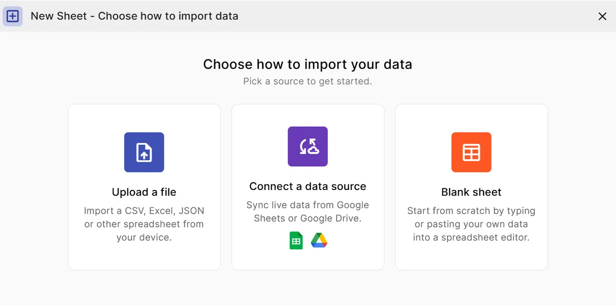
Step 1
Add your data
Paste a spreadsheet, or upload a CSV, Excel, TSV, or JSON file with one column of categories and one column of numbers.
Step 2
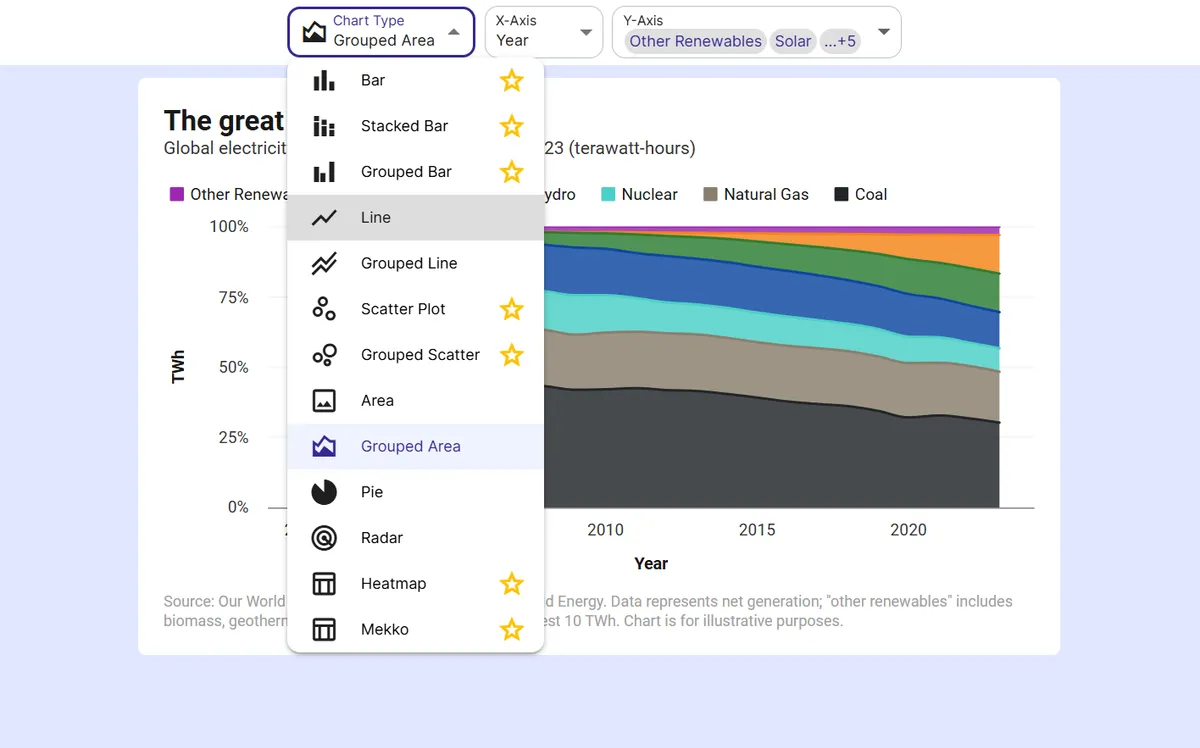
Pick a bar chart
Choose the bar chart type, or a grouped or stacked bar chart when your data has a breakdown column.
Step 3
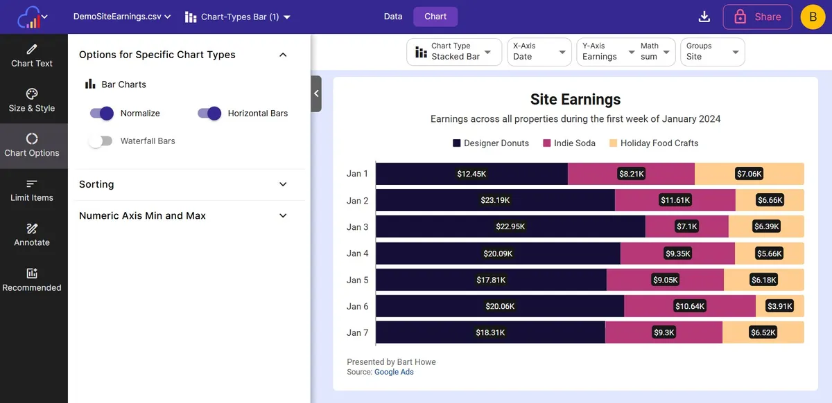
Turn on Horizontal Bars
Open Options for Specific Chart Types and switch on the Horizontal Bars toggle to rotate the bars.
Step 4
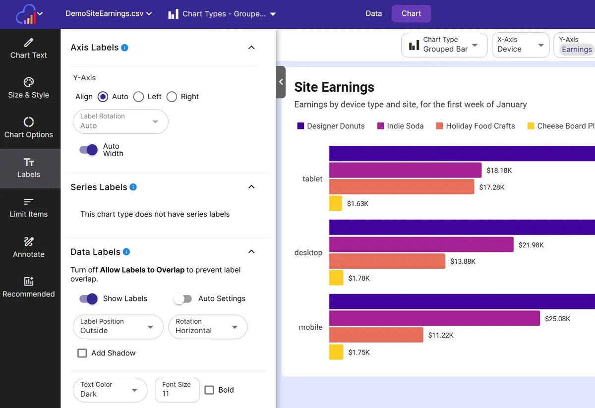
Sort and label the bars
Sort the bars by value and add data labels so every category name and number is easy to read.
Step 5
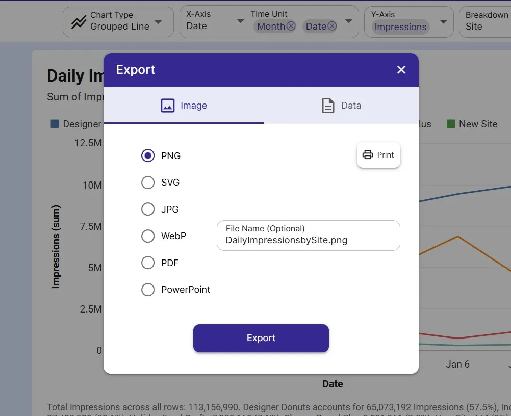
Export or embed
Download as PNG or SVG, share a link, or embed a live chart that can update from a connected Google Sheet.
FAQ
Horizontal Bar Chart maker FAQ
Answers to common questions about making a horizontal bar chart with InstaCharts.
What is a horizontal bar chart?
A horizontal bar chart shows each category as a bar that extends from the left, and the length of the bar encodes the value. It is a bar chart rotated a quarter turn, which gives long category names plenty of room.
When should I use a horizontal bar chart instead of a vertical one?
Choose horizontal bars when category names are long, when there are many categories, or when the chart will appear on a narrow screen. Vertical bars suit a small number of short labels and ordered time periods.
How do I make a horizontal bar chart in InstaCharts?
Upload your data, choose the bar chart type, and switch on the Horizontal Bars toggle in the options for specific chart types. The toggle is available for bar, grouped bar, and stacked bar charts.
Can I make a grouped or stacked horizontal bar chart?
Yes. Horizontal Bars works with grouped bar charts, which place bars side by side, and with stacked bar charts, which split each bar into segments. The Won and Lost Deals by Industry and Department Budget by Expense Type templates show both.
How do I sort the bars from largest to smallest?
Sort the chart by value to rank the categories from largest to smallest. You can also limit the chart to the top N categories to keep a long list readable.
Is the horizontal bar chart maker free?
Yes. The free plan lets you create and export horizontal bar charts with up to 500 rows per sheet, and charts include a small watermark. Paid plans starting at $10 per user per month remove the watermark.
Want the full reference?
Read the horizontal bar chart documentation.
Explore
Related chart makers
Compare related chart types, or browse every InstaCharts chart maker below.
Bar Chart Maker
Compare values across categories online
Grouped Bar Chart Maker
Compare several series side by side
Stacked Bar Chart Maker
Show totals and composition in one chart
All InstaCharts chart makers
- Bar Chart Maker
- Stacked Bar Chart Maker
- Grouped Bar Chart Maker
- Line Graph Maker
- Grouped Line Chart Maker
- Area Chart Maker
- Grouped Area Chart Maker
- Pie Chart Maker
- Scatter Plot Maker
- Grouped Scatter Plot Maker
- Radar Chart Maker
- Heatmap Maker
- Mekko Chart Maker
- Gauge Chart Maker
- Grouped Gauge Chart Maker
- Donut Chart Maker
- Waterfall Chart Maker
- 100% Stacked Bar Chart Maker
- 100% Stacked Area Chart Maker
- Trend Line Graph Maker
- Pie Chart Maker with Percentages
- Semi Circle Pie Chart Maker
- Likert Scale Chart Maker
- Survey Chart Maker
- Cash Flow Waterfall Chart Maker
- Budget vs Actual Chart Maker
See every option on the chart maker page.
Make your horizontal bar chart in seconds
InstaCharts makes data visualization easy, so you can build clear reports without design experience.