
Chart maker
Likert Scale Chart Maker
Visualize agreement scales from strongly disagree to strongly agree
A Likert scale chart shows how respondents answered a series of statements on an agreement scale, from strongly disagree to strongly agree. InstaCharts draws it as a 100% stacked horizontal bar chart, with one bar for each statement and one colored segment for each answer.
A live likert scale chart example
An interactive likert scale chart built and embedded with InstaCharts.
Templates
Likert Scale Chart templates
Choose the Templates tab when you create a new sheet in InstaCharts. Each template loads a sample dataset with a finished chart, so you can replace the sample rows with your own numbers.
Employee Engagement Survey
100% stacked horizontal bar chartAgreement levels for five engagement statements, stacked into horizontal bars so each question reads as one row.
| Statement | Response | Responses |
|---|---|---|
| I know what is expected of me | Strongly agree | 168 |
| I know what is expected of me | Agree | 205 |
| I know what is expected of me | Neutral | 68 |
| I know what is expected of me | Disagree | 27 |
| I know what is expected of me | Strongly disagree | 12 |
Your data
What data you need for a likert scale chart
Paste your spreadsheet, upload a CSV or Excel file, or connect a Google Sheet, and InstaCharts detects your column types and builds the likert scale chart automatically.
X-Axis
The survey statement or question, with one bar for each
Y-Axis
The number of responses for each answer
Breakdown
The answer level, such as Strongly agree or Neutral
Use cases
When to use a likert scale chart
Best uses
- Report agreement levels for employee engagement, customer satisfaction, and course feedback surveys
- Compare how respondents answered several statements on the same scale
- Spot the statements with the highest share of disagreement at a glance
- Share survey results as an embedded chart in a report or on a web page
When another chart fits better
- A single question with unordered choices reads better as a pie chart or bar chart
- Results over time suit a line graph, for example a monthly satisfaction score
- Reporting how many people gave each answer, instead of the share, suits a standard stacked bar chart
How it works
How to make a likert scale chart
Step 1
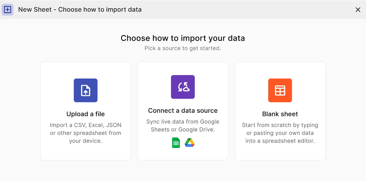
Add your survey data
Arrange the results with one row for each statement and answer level, plus a column for the number of responses.
Step 2
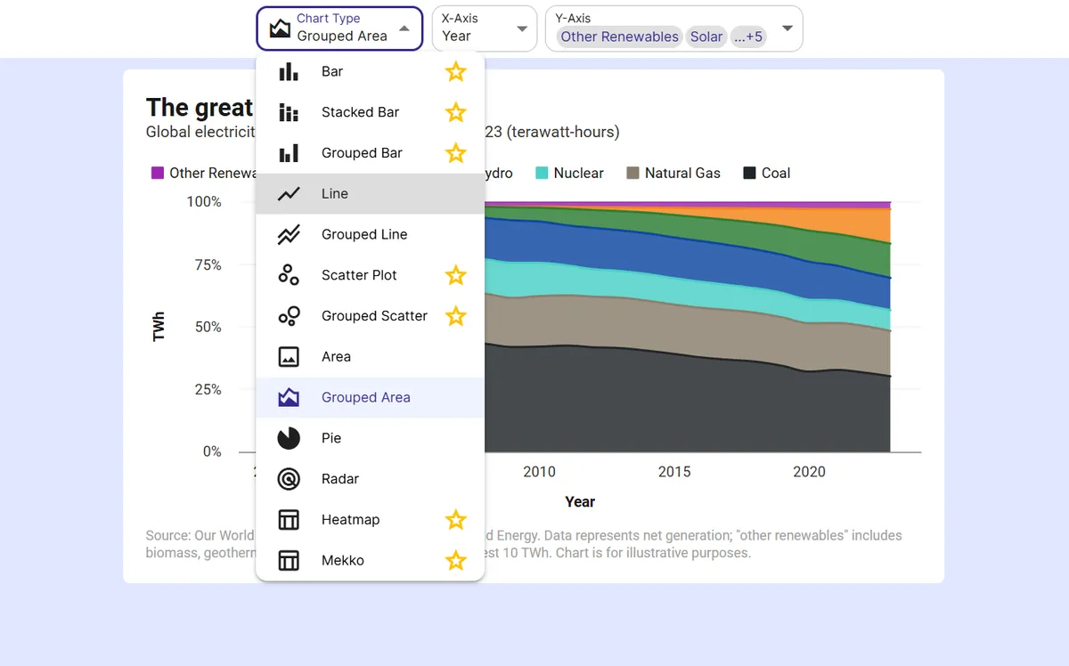
Pick the stacked bar chart
Choose the stacked bar chart. Map the statement to the X-axis, the answer level to the breakdown, and the response count to the Y-axis.
Step 3
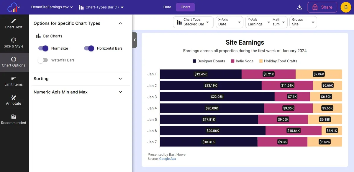
Turn on Normalize and Horizontal Bars
Both toggles are in Options for Specific Chart Types. Normalize scales each row to 100 percent and Horizontal Bars gives long statements room.
Step 4
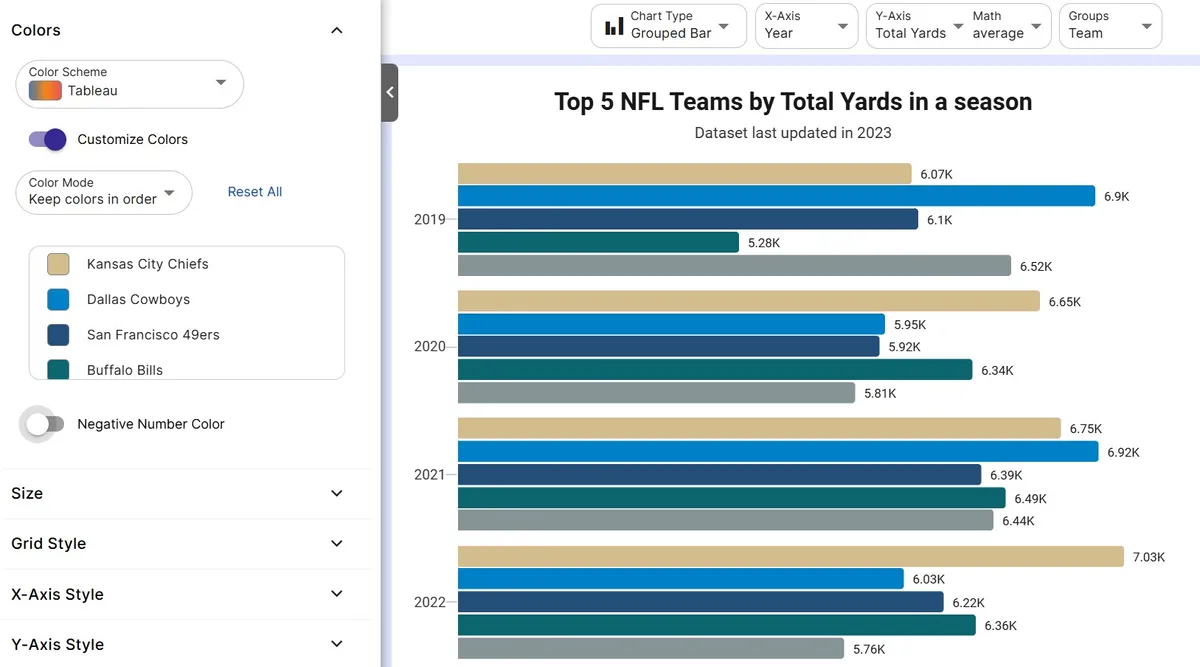
Choose a color scheme
Pick a color scheme that runs from one end of the scale to the other so agreement and disagreement are easy to tell apart.
Step 5
Export or embed
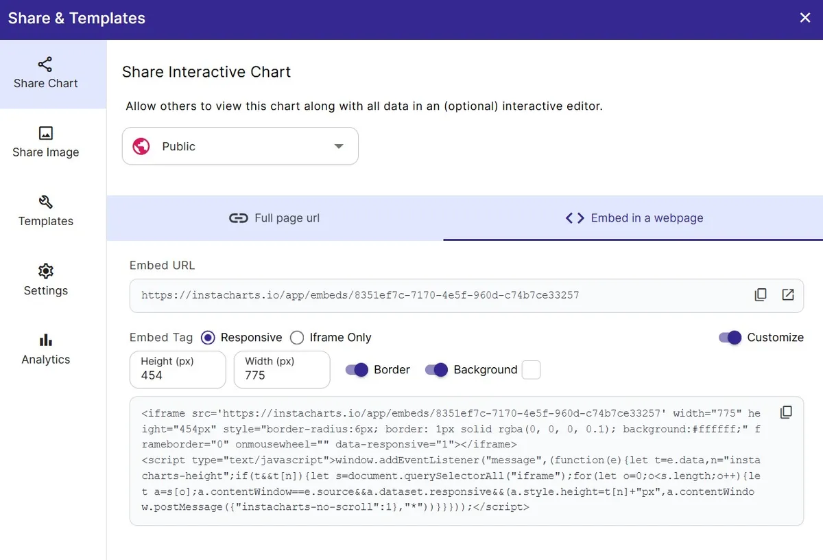
Download as PNG or SVG, share a link, or embed a live chart in your survey report.
FAQ
Likert Scale Chart maker FAQ
Answers to common questions about making a likert scale chart with InstaCharts.
What is a Likert scale chart?
A Likert scale chart displays survey answers given on an ordered scale, such as strongly disagree, disagree, neutral, agree, and strongly agree. Each statement gets one bar that shows the share of respondents at each level.
What is the best chart for Likert scale data?
A 100% stacked horizontal bar chart is a widely used choice. Every statement is one row, the segments run along the scale in order, and the equal bar lengths make the statements easy to compare.
How do I make a Likert scale chart from survey results?
Arrange the results with one row per statement and answer level plus a response count, choose the stacked bar chart, and switch on Normalize and Horizontal Bars. The Employee Engagement Survey template shows the layout.
How should I order and color the answer levels?
Keep the levels in scale order and use a color scheme that moves from one end to the other, so the agree side and the disagree side are visible at a glance.
How do I show the share of responses for each answer?
Turn on Normalize and each bar scales to 100 percent, so the length of every segment shows its share of that statement's responses. Data labels add the values on top of the segments.
Is the Likert scale chart maker free?
Yes. The free plan lets you create and export Likert scale charts with up to 500 rows per sheet, and charts include a small watermark. Paid plans starting at $10 per user per month remove the watermark.
Want the full reference?
Read the likert scale chart documentation.
Related guides
Explore
Related chart makers
Compare related chart types, or browse every InstaCharts chart maker below.
100% Stacked Bar Chart Maker
Compare the mix of each category as a share of 100%
Survey Chart Maker
Turn survey responses into charts for every question type
Horizontal Bar Chart Maker
Rank categories with long labels as sideways bars
All InstaCharts chart makers
- Bar Chart Maker
- Stacked Bar Chart Maker
- Grouped Bar Chart Maker
- Line Graph Maker
- Grouped Line Chart Maker
- Area Chart Maker
- Grouped Area Chart Maker
- Pie Chart Maker
- Scatter Plot Maker
- Grouped Scatter Plot Maker
- Radar Chart Maker
- Heatmap Maker
- Mekko Chart Maker
- Gauge Chart Maker
- Grouped Gauge Chart Maker
- Donut Chart Maker
- Waterfall Chart Maker
- Horizontal Bar Chart Maker
- 100% Stacked Bar Chart Maker
- 100% Stacked Area Chart Maker
- Trend Line Graph Maker
- Pie Chart Maker with Percentages
- Semi Circle Pie Chart Maker
- Survey Chart Maker
- Cash Flow Waterfall Chart Maker
- Budget vs Actual Chart Maker
See every option on the chart maker page.
Make your likert scale chart in seconds
InstaCharts makes data visualization easy, so you can build clear reports without design experience.