
Line Graph Maker
Plot trends over time online, free
A line graph connects data points with a continuous line to show how a value changes over time or an ordered sequence. InstaCharts is a free line graph maker: paste your time-series data and it plots the trend, ready to customize, export, or embed.
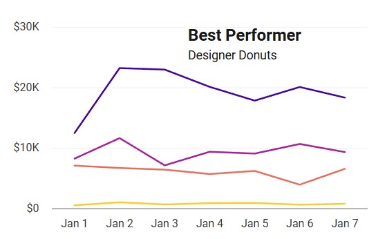
A live line graph example
An interactive line graph built and embedded with InstaCharts.
What data you need for a line graph
Paste your spreadsheet, upload a CSV or Excel file, or connect a Google Sheet, and InstaCharts detects your column types and builds the line graph automatically.
When to use a line graph
- Show how a metric rises or falls across days, months, or years
- Highlight the rate of change through the slope of the line
- Track a single continuous series measured at regular intervals
- Reveal seasonal or cyclical patterns over a long range
When another chart fits better
- Unordered categories belong in a bar chart instead
- Part-to-whole stories suit a pie or stacked bar chart
- Several groups read better as a grouped line chart
How to make a line graph
- 1Add your data: Paste a spreadsheet, or upload a CSV, Excel, TSV, or JSON file.
- 2Pick the line graph: InstaCharts auto-suggests a chart; switch to this type in one click.
- 3Map your columns: Choose which columns drive each axis, or accept the smart defaults.
- 4Customize styling: Adjust colors, labels, and titles to match your brand or report.
- 5Export or embed: Download as PNG, SVG, or PDF, share a link, or embed a live, auto-updating chart.
Line Graph maker FAQ
Is the line graph maker free?
Yes. You can create and export a line graph for free with no account. The free tier supports up to 500 rows and adds a small watermark; paid plans from $10/month remove it.
What data do I need to make a line graph?
A column of dates or an ordered sequence for the X-axis and a numeric column for the values. Paste it in, upload a CSV or Excel file, or connect a Google Sheet.
Can I plot more than one line?
Yes. Add a breakdown column to turn the chart into a grouped (multi-line) chart, with one colored line per category, so you can compare trends side by side.
Does my line graph update when my data changes?
If you connect it to Google Sheets, yes. The chart, including any embed on your website, stays in live sync and refreshes automatically when the sheet changes.
Want the full reference? Read the line graph documentation.
Related chart makers
Grouped Line Chart Maker
Compare multiple trends on one chart
Area Chart Maker
Show trends with volume emphasis
Bar Chart Maker
Compare values across categories online, free
See every option on the chart maker page.
Craft professional charts in seconds
Boost your productivity. Elevate your reports. InstaCharts makes data visualization effortless.