
Pie Chart Maker
Show part-to-whole proportions, free
A pie chart splits a circle into slices sized by each category's share of the whole, making proportions easy to read at a glance. InstaCharts is a free pie chart maker that also produces donut and semi-circle variants from the same data.
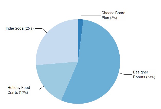
A live pie chart example
An interactive pie chart built and embedded with InstaCharts.
What data you need for a pie chart
Paste your spreadsheet, upload a CSV or Excel file, or connect a Google Sheet, and InstaCharts detects your column types and builds the pie chart automatically.
When to use a pie chart
- Show how a total splits across a few categories
- Highlight one clearly dominant category
- Communicate a simple proportion in a report or slide
- Switch to a donut to free up the center for a summary value
When another chart fits better
- More than five or six slices clutter the circle; use a bar chart
- Similar slice sizes are hard to compare by angle
- Changes over time suit a line or stacked bar chart
- Pie charts cannot show negative values
How to make a pie chart
- 1Add your data: Paste a spreadsheet, or upload a CSV, Excel, TSV, or JSON file.
- 2Pick the pie chart: InstaCharts auto-suggests a chart; switch to this type in one click.
- 3Map your columns: Choose which columns drive each axis, or accept the smart defaults.
- 4Customize styling: Adjust colors, labels, and titles to match your brand or report.
- 5Export or embed: Download as PNG, SVG, or PDF, share a link, or embed a live, auto-updating chart.
Pie Chart maker FAQ
Is the pie chart maker free?
Yes. You can create and export a pie chart for free with no account. The free tier supports up to 500 rows and adds a small watermark; paid plans from $10/month remove it.
Can I make a donut chart?
Yes. A donut chart is a pie with a hollow center, and InstaCharts can switch your pie to a donut or a semi-circle in one click, with no need to re-enter data.
What data do I need for a pie chart?
One column of category labels and one column of numbers. InstaCharts converts each value into a proportional slice and can label slices with percentages or absolute values.
How many slices should a pie chart have?
Keep it to five or six slices for readability. If you have more categories, group the smallest into an Other slice or use a bar chart instead.
Want the full reference? Read the pie chart documentation.
Related chart makers
Donut Chart Maker
Show proportions with a clean center
Bar Chart Maker
Compare values across categories online, free
Stacked Bar Chart Maker
Show totals and composition in one chart
See every option on the chart maker page.
Craft professional charts in seconds
Boost your productivity. Elevate your reports. InstaCharts makes data visualization effortless.