
Chart maker
Pie Chart Maker with Percentages
Label every slice with its share of the total
A pie chart with percentages labels each slice with its category name and its share of the total, so readers can see the split at a glance. InstaCharts calculates the percentages from your numbers, so one column of categories and one column of values is all the data you need.
A live pie chart with percentages example
An interactive pie chart with percentages built and embedded with InstaCharts.
Templates
Pie Chart with Percentages templates
Choose the Templates tab when you create a new sheet in InstaCharts. Each template loads a sample dataset with a finished chart, so you can replace the sample rows with your own numbers.
Donations by Source
Pie chartTotal donations broken down by source, including individual donors, corporate sponsors and grants.
| Donation Source | Amount |
|---|---|
| Individual Donors | 184500 |
| Corporate Sponsors | 126000 |
| Grants | 210000 |
| Fundraising Events | 78500 |
| Recurring Giving | 95000 |
How Did You Hear About Us
Donut chartSign up survey answers naming where each new customer first found the product, shown as a donut.
| Channel | Responses |
|---|---|
| Search engine | 1240 |
| Word of mouth | 860 |
| Social media | 540 |
| Review site | 410 |
| Conference or event | 220 |
Subscription Plan Mix
Donut chartActive subscriber counts across four pricing tiers, from free to enterprise, shown as a donut.
| Plan | Subscribers |
|---|---|
| Free | 8400 |
| Starter | 3200 |
| Pro | 1850 |
| Enterprise | 420 |
Your data
What data you need for a pie chart with percentages
Paste your spreadsheet, upload a CSV or Excel file, or connect a Google Sheet, and InstaCharts detects your column types and builds the pie chart with percentages automatically.
X-Axis
Categorical data, the label for each slice
Y-Axis
Numerical values, each converted into a percentage of the total
Use cases
When to use a pie chart with percentages
Best uses
- Show how a total divides across a small number of categories, such as budget lines or survey answers
- Highlight one dominant slice with its exact percentage
- Report shares in presentations where the percentage is the main message
- Turn raw counts into percentages automatically, so your data can stay as counts
When another chart fits better
- More than five or six slices become crowded, so a bar chart fits better
- Slices of similar size are easier to compare as bars
- Changes over time read better as a line graph or a 100% stacked bar chart
How it works
How to make a pie chart with percentages
Step 1
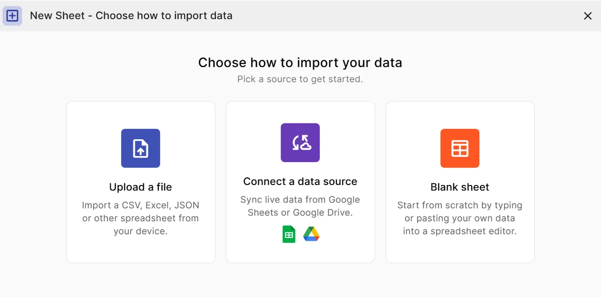
Add your data
Paste a spreadsheet or upload a file with a column of categories and a column of numbers. The numbers can be counts or amounts.
Step 2
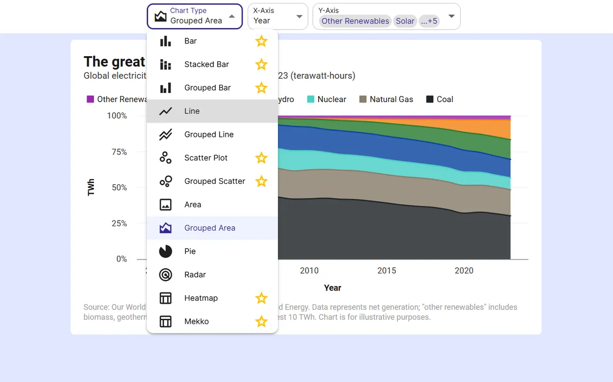
Pick the pie chart
Choose the pie chart type. Each slice is labeled with its category and its percentage of the total.
Step 3
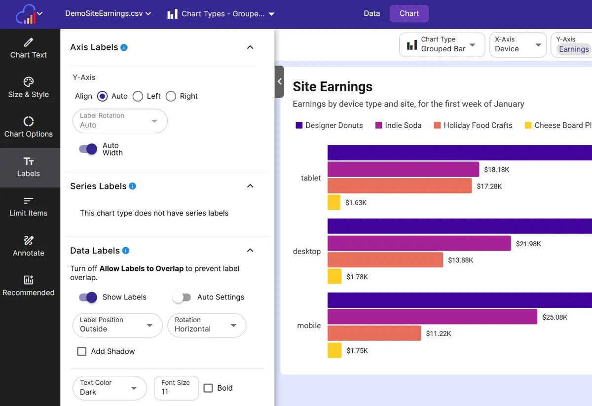
Tidy the labels
Use the Label Removal % slider to hide labels on very small slices, and adjust the data label size and color.
Step 4
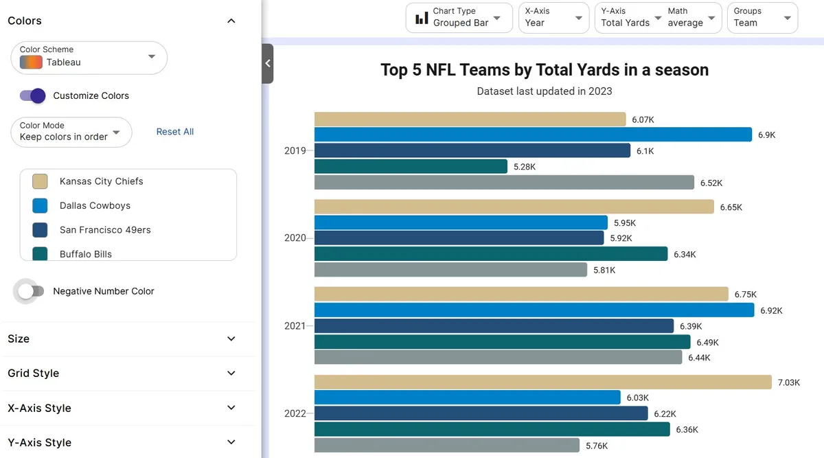
Style the chart
Choose colors, and switch to a donut or semi circle layout if it suits your page better.
Step 5
Export or embed
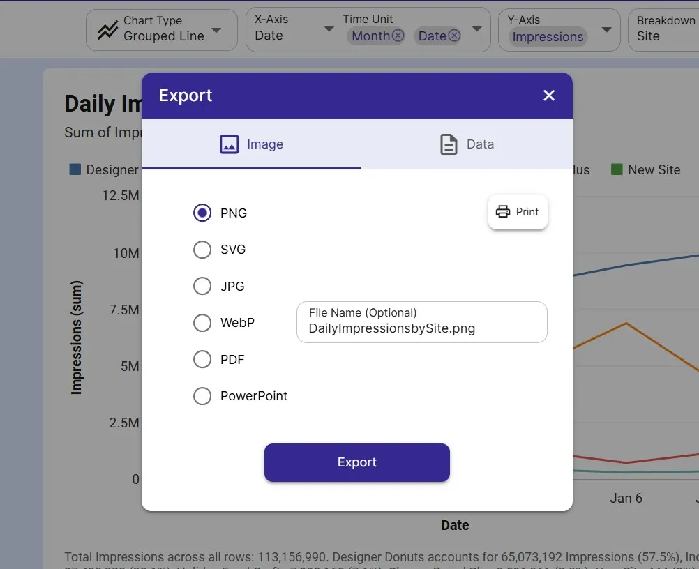
Download as PNG or SVG, share a link, or embed a live chart in your site or report.
FAQ
Pie Chart with Percentages maker FAQ
Answers to common questions about making a pie chart with percentages with InstaCharts.
How do I make a pie chart with percentages?
Upload a sheet with one column of categories and one column of numbers, then choose the pie chart type. InstaCharts labels each slice with its category and its percentage of the total.
How do you calculate percentages in a pie chart?
Divide each category's value by the sum of all values and multiply by 100. InstaCharts performs this calculation for you, so the percentages always match your data.
Do my values need to add up to 100?
Any set of positive numbers works. InstaCharts adds the values, divides each one by the total, and labels the slices, so counts, dollar amounts, and percentages all produce a correct pie chart.
Can I hide the percentage labels on small slices?
Yes. The Label Removal % setting hides labels on slices below a percentage you choose, which keeps a chart with several small slices readable.
How many slices should a pie chart have?
A pie chart reads best with five or six slices or fewer. When you have more categories, group the smaller ones into an Other slice or switch to a bar chart.
Is the pie chart maker with percentages free?
Yes. The free plan lets you create and export pie charts with up to 500 rows per sheet, and charts include a small watermark. Paid plans starting at $10 per user per month remove the watermark.
Want the full reference?
Read the pie chart with percentages documentation.
Related guides
Explore
Related chart makers
Compare related chart types, or browse every InstaCharts chart maker below.
Pie Chart Maker
Show part-to-whole proportions
Donut Chart Maker
Show proportions with a clean center
Semi Circle Pie Chart Maker
Fit a part-to-whole chart into half the height
All InstaCharts chart makers
- Bar Chart Maker
- Stacked Bar Chart Maker
- Grouped Bar Chart Maker
- Line Graph Maker
- Grouped Line Chart Maker
- Area Chart Maker
- Grouped Area Chart Maker
- Pie Chart Maker
- Scatter Plot Maker
- Grouped Scatter Plot Maker
- Radar Chart Maker
- Heatmap Maker
- Mekko Chart Maker
- Gauge Chart Maker
- Grouped Gauge Chart Maker
- Donut Chart Maker
- Waterfall Chart Maker
- Horizontal Bar Chart Maker
- 100% Stacked Bar Chart Maker
- 100% Stacked Area Chart Maker
- Trend Line Graph Maker
- Semi Circle Pie Chart Maker
- Likert Scale Chart Maker
- Survey Chart Maker
- Cash Flow Waterfall Chart Maker
- Budget vs Actual Chart Maker
See every option on the chart maker page.
Make your pie chart with percentages in seconds
InstaCharts makes data visualization easy, so you can build clear reports without design experience.