
Radar Chart Maker
Compare profiles across many dimensions
A radar chart, also called a spider or web chart, plots each variable on its own spoke and connects the values into a polygon, so you can read the overall shape of a profile at a glance. InstaCharts is a free radar chart maker that overlays multiple profiles for easy comparison.
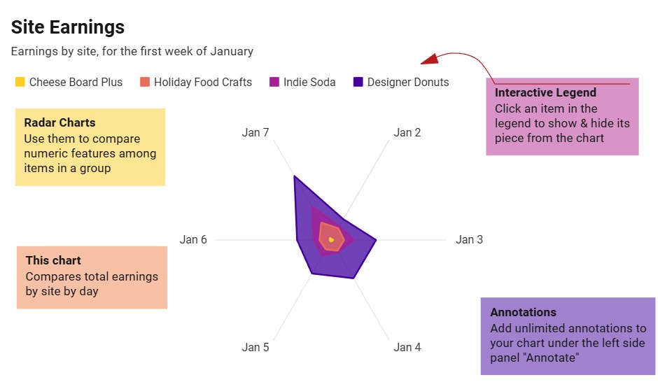
A live radar chart example
An interactive radar chart built and embedded with InstaCharts.
What data you need for a radar chart
Paste your spreadsheet, upload a CSV or Excel file, or connect a Google Sheet, and InstaCharts detects your column types and builds the radar chart automatically.
When to use a radar chart
- Compare strengths and weaknesses across several attributes
- Visualize skill or competency scores for a person or team
- Contrast feature ratings across multiple products
- Overlay before and after profiles to show change
When another chart fits better
- Precise value reading is hard; use a bar chart when exact numbers matter
- More than two or three overlapping polygons get muddy
- Variables on very different scales need normalizing first
How to make a radar chart
- 1Add your data: Paste a spreadsheet, or upload a CSV, Excel, TSV, or JSON file.
- 2Pick the radar chart: InstaCharts auto-suggests a chart; switch to this type in one click.
- 3Map your columns: Choose which columns drive each axis, or accept the smart defaults.
- 4Customize styling: Adjust colors, labels, and titles to match your brand or report.
- 5Export or embed: Download as PNG, SVG, or PDF, share a link, or embed a live, auto-updating chart.
Radar Chart maker FAQ
Is the radar chart maker free?
Yes. Creating and exporting a radar chart is free with no account. The free tier supports up to 500 rows and adds a watermark; paid plans from $10/month remove it.
How many variables should a radar chart have?
Radar charts work best with three to ten variables. Fewer than three does not benefit from the radial layout, and more than ten spokes becomes crowded and hard to read.
What data do I need for a radar chart?
A category column for the spokes and a numeric column for the values. Add a breakdown column to overlay multiple profiles, such as different people, teams, or products.
Why do my values look distorted?
If variables sit on very different scales, one spoke can dominate the shape. Normalize the values to a common range first so each dimension contributes fairly.
Want the full reference? Read the radar chart documentation.
Related chart makers
Bar Chart Maker
Compare values across categories online, free
Line Graph Maker
Plot trends over time online, free
Heatmap Maker
Reveal patterns across a data grid
See every option on the chart maker page.
Craft professional charts in seconds
Boost your productivity. Elevate your reports. InstaCharts makes data visualization effortless.