
Chart maker
Survey Chart Maker
Turn survey responses into charts for every question type
A survey chart turns raw responses into a picture of what respondents said. InstaCharts reads a CSV or Excel export from your survey tool and charts rating counts, single choice answers, Likert scales, and score trends, and it counts each selection separately when a column uses the Multiple Choice column type.
A live survey chart example
An interactive survey chart built and embedded with InstaCharts.
Templates
Survey Chart templates
Choose the Templates tab when you create a new sheet in InstaCharts. Each template loads a sample dataset with a finished chart, so you can replace the sample rows with your own numbers.
Customer Satisfaction Ratings
Bar chartHow many customers picked each star rating in the survey sent after a support conversation.
| Rating | Responses |
|---|---|
| 1 star | 96 |
| 2 stars | 134 |
| 3 stars | 298 |
| 4 stars | 742 |
| 5 stars | 870 |
How Did You Hear About Us
Donut chartSign up survey answers naming where each new customer first found the product, shown as a donut.
| Channel | Responses |
|---|---|
| Search engine | 1240 |
| Word of mouth | 860 |
| Social media | 540 |
| Review site | 410 |
| Conference or event | 220 |
Feature Priorities by Segment
Grouped bar chartThe feature each customer segment picked as most important in the annual product survey.
| Feature | Segment | Responses |
|---|---|---|
| Faster reporting | Small Business | 184 |
| Faster reporting | Mid Market | 152 |
| Faster reporting | Enterprise | 96 |
| Team collaboration | Small Business | 121 |
| Team collaboration | Mid Market | 178 |
Net Promoter Score Trend
Line graphNet Promoter Score from the in-app survey for each month over the last year.
| Month | NPS |
|---|---|
| 2025-09-01 | 28 |
| 2025-10-01 | 31 |
| 2025-11-01 | 27 |
| 2025-12-01 | 34 |
| 2026-01-01 | 36 |
Your data
What data you need for a survey chart
Paste your spreadsheet, upload a CSV or Excel file, or connect a Google Sheet, and InstaCharts detects your column types and builds the survey chart automatically.
X-Axis
Answer options, rating levels, or survey dates
Y-Axis
The number of responses, or a score such as NPS
Breakdown
Optional. A segment such as customer type, to compare how groups answered
Use cases
When to use a survey chart
Best uses
- Show how many respondents chose each rating in a satisfaction survey
- Split single choice answers, such as how customers heard about you, into a donut or bar chart
- Compare how different customer segments answered the same question in a grouped bar chart
- Track a score such as NPS over time in a line graph
When another chart fits better
- Agreement scales with several statements read best as a Likert scale chart
- Open text answers need summarizing into categories before they can be charted
- Very small response counts can mislead, so add the number of responses to the chart caption
How it works
How to make a survey chart
Step 1
Export your survey data
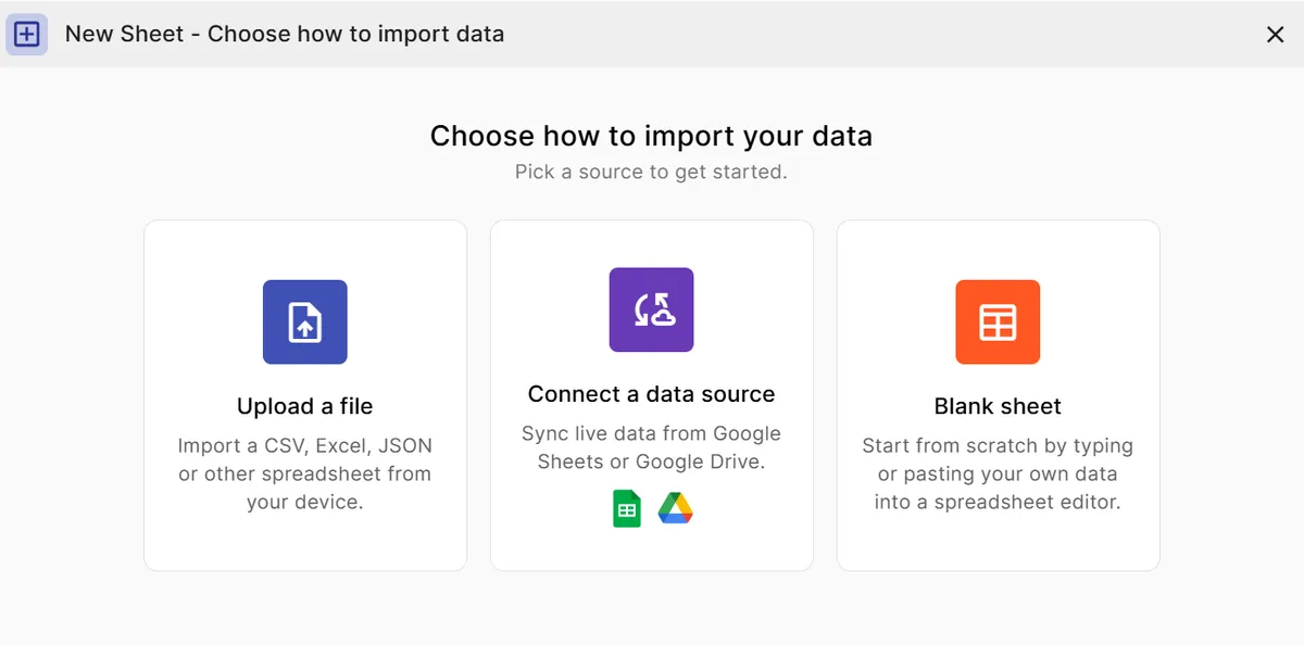
Download the results from your survey tool as a CSV or Excel file, or connect a Google Sheet that collects responses.
Step 2
Upload the file
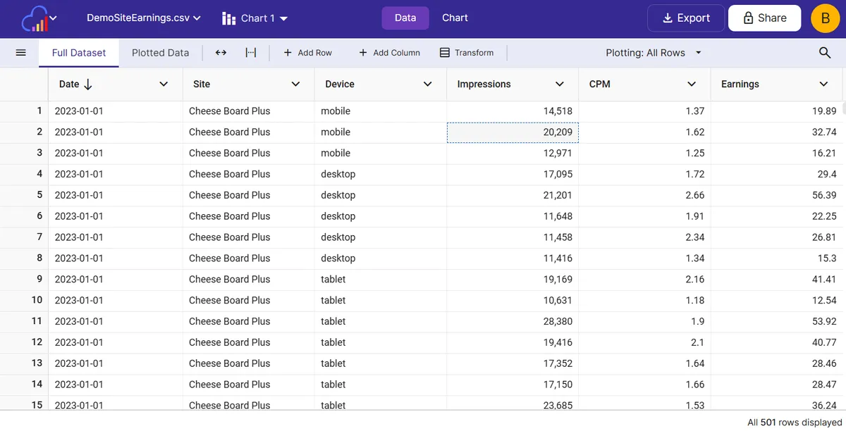
InstaCharts detects the column types. Set a column to Multiple Choice when a cell holds several comma separated selections.
Step 3
Match the chart to the question
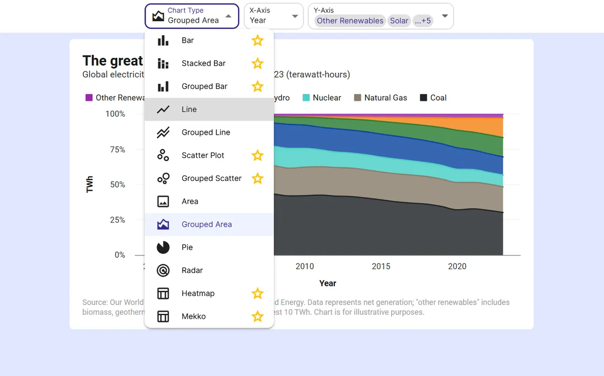
Use a bar chart for ratings, a donut chart for single choice answers, a grouped bar chart to compare segments, and a line graph for trends.
Step 4
Add context
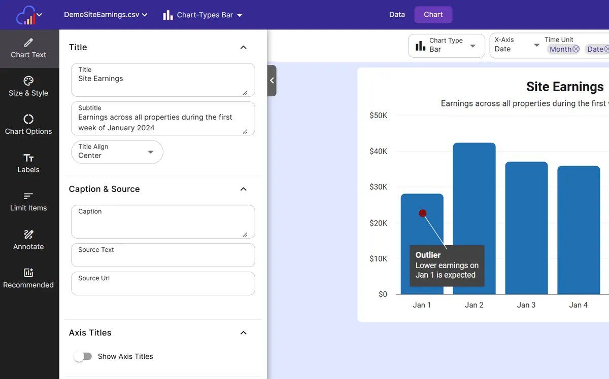
Write the number of responses and the survey dates in the chart caption so readers know how much weight the results carry.
Step 5
Share the results
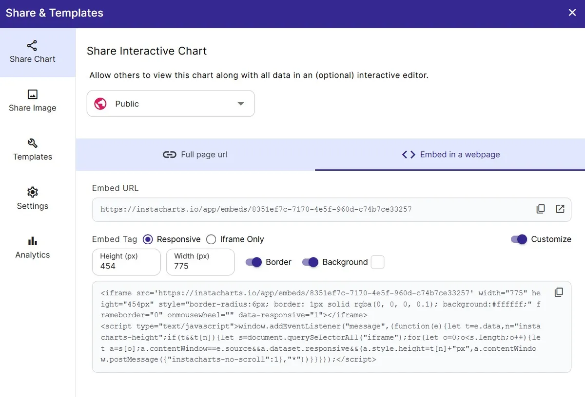
Export as PNG or SVG, share a link, or embed a live chart that updates when new responses arrive in your connected Google Sheet.
FAQ
Survey Chart maker FAQ
Answers to common questions about making a survey chart with InstaCharts.
How do I make a chart from survey results?
Export your responses as a CSV or Excel file, upload it to InstaCharts, and choose a chart that matches the question type. A bar chart works for ratings and a donut chart works for single choice questions.
What is the best chart for survey data?
The best chart depends on the question. Bar charts suit ratings and ranked options, donut charts suit single choice answers, 100% stacked bar charts suit Likert scales, and line graphs suit scores tracked over time.
How do I chart a select all that apply question?
Set the column to the Multiple Choice column type when a cell holds several comma separated answers. InstaCharts counts each selection separately, so every option becomes its own category in the chart.
How do I compare survey results between groups?
Add a segment column, such as customer type or region, and use it as the breakdown in a grouped bar chart. The Feature Priorities by Segment template shows this layout.
Can I chart NPS and CSAT scores?
Yes. The templates include Customer Satisfaction Ratings, which counts each star rating, and Net Promoter Score Trend, which plots monthly NPS as a line graph.
Is the survey chart maker free?
Yes. The free plan lets you create and export survey charts with up to 500 rows per sheet, and charts include a small watermark. Paid plans starting at $10 per user per month remove the watermark.
Want the full reference?
Read the chart types documentation.
Explore
Related chart makers
Compare related chart types, or browse every InstaCharts chart maker below.
Likert Scale Chart Maker
Visualize agreement scales from strongly disagree to strongly agree
Pie Chart Maker with Percentages
Label every slice with its share of the total
Grouped Bar Chart Maker
Compare several series side by side
All InstaCharts chart makers
- Bar Chart Maker
- Stacked Bar Chart Maker
- Grouped Bar Chart Maker
- Line Graph Maker
- Grouped Line Chart Maker
- Area Chart Maker
- Grouped Area Chart Maker
- Pie Chart Maker
- Scatter Plot Maker
- Grouped Scatter Plot Maker
- Radar Chart Maker
- Heatmap Maker
- Mekko Chart Maker
- Gauge Chart Maker
- Grouped Gauge Chart Maker
- Donut Chart Maker
- Waterfall Chart Maker
- Horizontal Bar Chart Maker
- 100% Stacked Bar Chart Maker
- 100% Stacked Area Chart Maker
- Trend Line Graph Maker
- Pie Chart Maker with Percentages
- Semi Circle Pie Chart Maker
- Likert Scale Chart Maker
- Cash Flow Waterfall Chart Maker
- Budget vs Actual Chart Maker
See every option on the chart maker page.
Make your survey chart in seconds
InstaCharts makes data visualization easy, so you can build clear reports without design experience.