
Chart maker
Trend Line Graph Maker
Add average, median, and regression lines to any chart
A trend line graph adds a reference line on top of your data, such as an average, a median, a target value, or a line of best fit. InstaCharts adds these lines from the Annotate panel, and they work on line, bar, area, and scatter charts.
A live trend line graph example
An interactive trend line graph built and embedded with InstaCharts.
Templates
Trend Line Graph templates
Choose the Templates tab when you create a new sheet in InstaCharts. Each template loads a sample dataset with a finished chart, so you can replace the sample rows with your own numbers.
Page Load Time vs Bounce Rate
Scatter plot with trend linePage load time and bounce rate samples across different page types on a website. The template includes a dashed linear regression line with its equation in the caption.
| Page Type | Load Time (s) | Bounce Rate (%) |
|---|---|---|
| Homepage | 1.2 | 22.1 |
| Homepage | 1.8 | 26.4 |
| Product Page | 1.5 | 24.0 |
| Checkout | 0.9 | 15.2 |
| Blog Post | 2.0 | 28.5 |
Stock Price Trend
Line graphDaily closing price for a sample stock ticker over several weeks of trading. Add an average, median or custom value trend line from the Annotate panel.
| Trading Date | Closing Price |
|---|---|
| 2026-07-27 | 138.40 |
| 2026-07-28 | 139.15 |
| 2026-07-29 | 137.80 |
| 2026-07-30 | 140.55 |
| 2026-07-31 | 141.02 |
Your data
What data you need for a trend line graph
Paste your spreadsheet, upload a CSV or Excel file, or connect a Google Sheet, and InstaCharts detects your column types and builds the trend line graph automatically.
X-Axis
Numbers or dates. Linear regression lines need a numeric X-axis
Y-Axis
Numerical values that the trend line summarizes
Use cases
When to use a trend line graph
Best uses
- Show whether two numeric measures move together with a linear regression line on a scatter plot
- Mark the average or median so readers can see which points sit above or below it
- Highlight a target, budget, or threshold with a custom value line
- Write the regression equation, R², r, and sample size into the chart caption
When another chart fits better
- Curved patterns are described better by an average or median line than by a straight regression line
- Categorical comparisons where a reference line adds little read cleanly as a plain bar chart
- Very few data points make a regression line unreliable, so collect more observations first
How it works
How to make a trend line graph
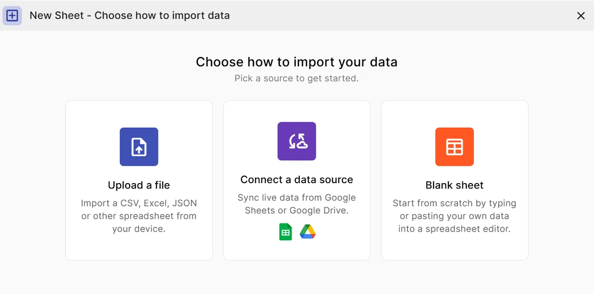
Step 1
Add your data
Paste a spreadsheet, or upload a CSV, Excel, TSV, or JSON file with the numbers you want to analyze.
Step 2
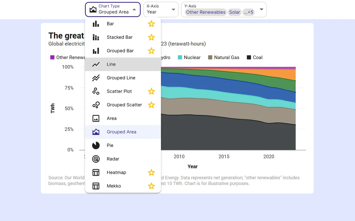
Pick the base chart
Choose a line, bar, area, or scatter chart. Use a scatter plot with numeric columns on both axes for a regression line.
Step 3
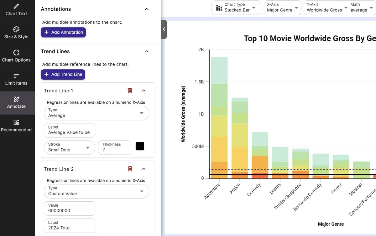
Add a trend line
Open the Annotate panel and click Add Trend Line under Trend Lines.
Step 4
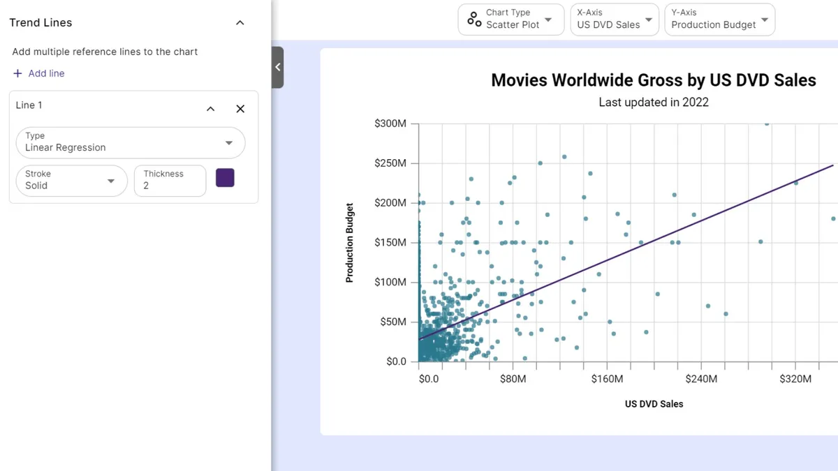
Choose the line type
Pick Average, Median, Custom Value, or Linear Regression, then set the label, stroke, thickness, and color.
Step 5
Share the result
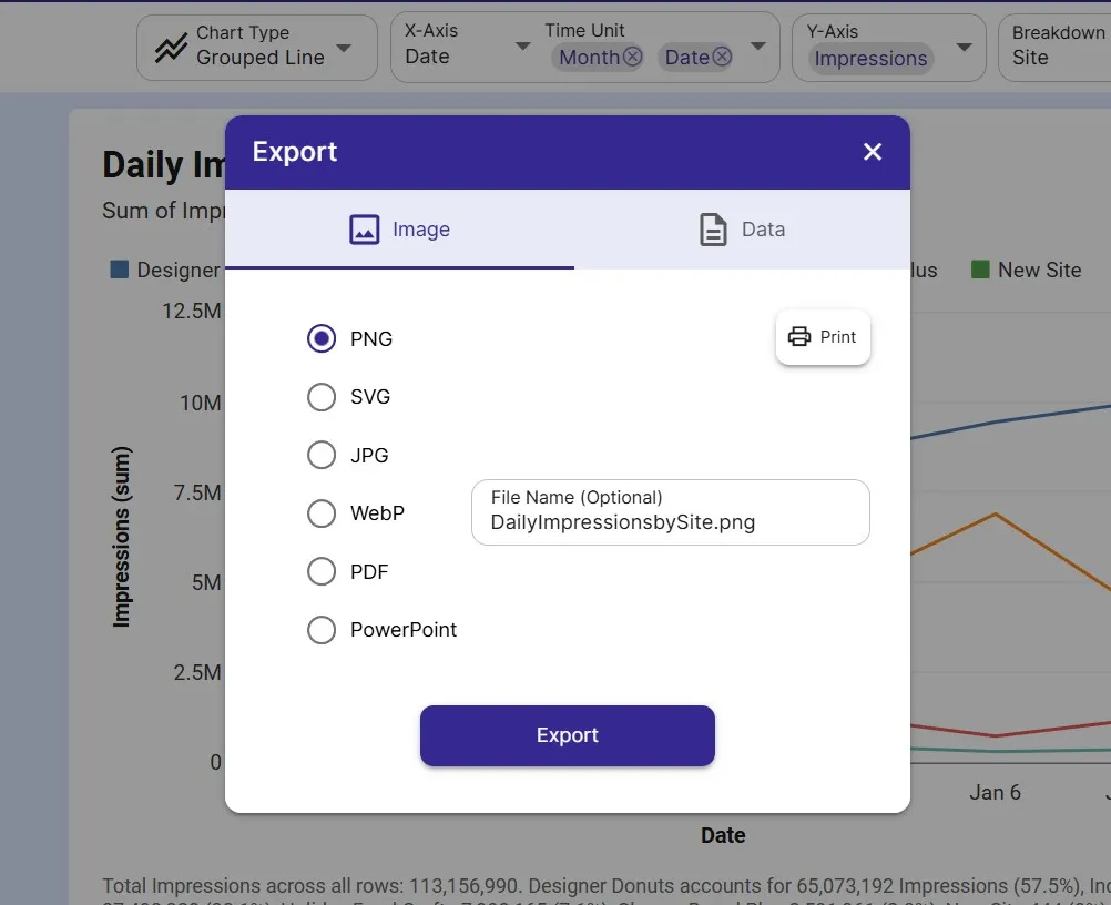
Turn on Add info to caption to print the line's statistics under the chart, then export as PNG or SVG or embed the chart.
FAQ
Trend Line Graph maker FAQ
Answers to common questions about making a trend line graph with InstaCharts.
How do I add a trend line to a graph?
Open the Annotate panel, click Add Trend Line, and choose a line type. The line draws on top of your chart right away, and you can change its label, stroke, thickness, and color.
What types of trend lines can I add?
InstaCharts offers Average, Median, Custom Value, and Linear Regression lines. Average and median lines mark the center of your data, a custom value line marks a target or threshold, and a linear regression line shows the best straight line fit.
How do I add a line of best fit to a scatter plot?
Create a scatter plot with numeric columns on both axes, then add a Linear Regression trend line from the Annotate panel. Turn on Add info to caption to print the equation, R², r, and sample size.
Which charts support trend lines?
Trend lines are available on line, bar, area, and scatter charts and on their grouped versions, plus stacked bar charts.
Can I add more than one trend line?
Yes. The Annotate panel lets you add several trend lines to one chart, for example an average line and a target line together, each with its own color and stroke.
Is the trend line graph maker free?
Yes. The free plan lets you create and export charts with trend lines with up to 500 rows per sheet, and charts include a small watermark. Paid plans starting at $10 per user per month remove the watermark.
Want the full reference?
Read the trend line documentation.
Related guides
Explore
Related chart makers
Compare related chart types, or browse every InstaCharts chart maker below.
Scatter Plot Maker
Find correlations between two variables
Line Graph Maker
Plot trends over time online
Grouped Scatter Plot Maker
Compare correlations across groups
All InstaCharts chart makers
- Bar Chart Maker
- Stacked Bar Chart Maker
- Grouped Bar Chart Maker
- Line Graph Maker
- Grouped Line Chart Maker
- Area Chart Maker
- Grouped Area Chart Maker
- Pie Chart Maker
- Scatter Plot Maker
- Grouped Scatter Plot Maker
- Radar Chart Maker
- Heatmap Maker
- Mekko Chart Maker
- Gauge Chart Maker
- Grouped Gauge Chart Maker
- Donut Chart Maker
- Waterfall Chart Maker
- Horizontal Bar Chart Maker
- 100% Stacked Bar Chart Maker
- 100% Stacked Area Chart Maker
- Pie Chart Maker with Percentages
- Semi Circle Pie Chart Maker
- Likert Scale Chart Maker
- Survey Chart Maker
- Cash Flow Waterfall Chart Maker
- Budget vs Actual Chart Maker
See every option on the chart maker page.
Make your trend line graph in seconds
InstaCharts makes data visualization easy, so you can build clear reports without design experience.