
Waterfall Chart Maker
Show how a value builds up step by step
A waterfall chart is a bar chart variant where each bar starts where the previous one ended, so you can see how a starting value grows and shrinks through a series of positive and negative steps to a final total. InstaCharts builds one from your spreadsheet, ideal for profit-and-loss and budget reconciliations.
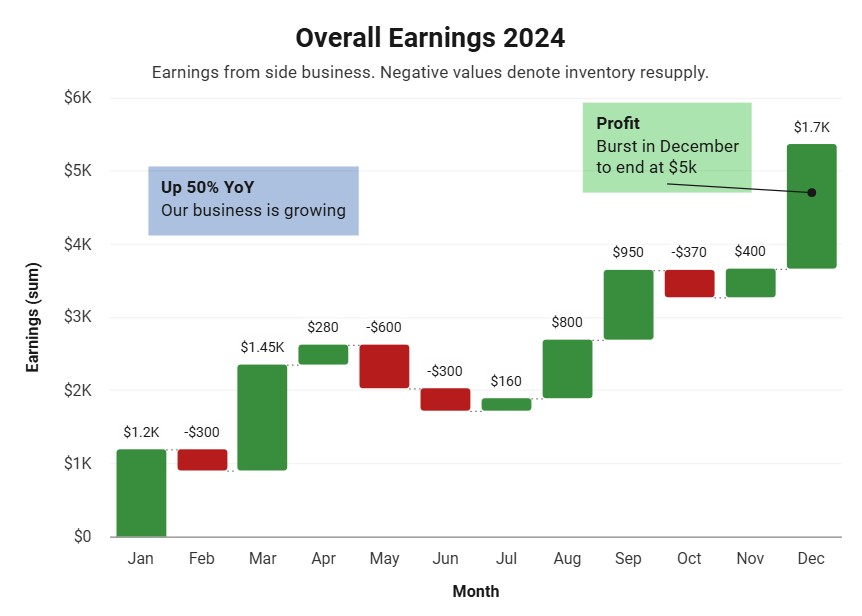
A live waterfall chart example
An interactive waterfall chart built and embedded with InstaCharts.
What data you need for a waterfall chart
Paste your spreadsheet, upload a CSV or Excel file, or connect a Google Sheet, and InstaCharts detects your column types and builds the waterfall chart automatically.
When to use a waterfall chart
- Show a running cumulative total across a sequence of steps
- Break down a profit-and-loss statement from revenue to net
- Reconcile a budget from its starting to its ending value
- Explain what drove the change between two totals
When another chart fits better
- Unordered categories belong in a standard bar chart
- Part-to-whole at a single point in time suits a pie or stacked bar chart
- Continuous trends read better as a line graph
How to make a waterfall chart
- 1Add your data: Paste a spreadsheet, or upload a CSV, Excel, TSV, or JSON file.
- 2Pick the waterfall chart: InstaCharts auto-suggests a chart; switch to this type in one click.
- 3Map your columns: Choose which columns drive each axis, or accept the smart defaults.
- 4Customize styling: Adjust colors, labels, and titles to match your brand or report.
- 5Export or embed: Download as PNG, SVG, or PDF, share a link, or embed a live, auto-updating chart.
Waterfall Chart maker FAQ
Is the waterfall chart maker free?
Yes. Creating and exporting a waterfall chart is free with no account. The free tier supports up to 500 rows and adds a watermark; paid plans from $10/month remove it.
What is a waterfall chart used for?
Waterfall charts explain how an initial value reaches a final value through a series of positive and negative steps. They are most common for profit-and-loss breakdowns, budget reconciliations, and showing what drove the change between two numbers.
What data do I need for a waterfall chart?
A column of ordered step labels for the X-axis and a numeric column of contributions, where increases are positive and decreases are negative. InstaCharts plots each step from where the last one ended.
Can a waterfall chart show negative values?
Yes. Unlike pie, stacked bar, and area charts, a waterfall chart is designed for mixed positive and negative steps, which is exactly what makes it suited to gains-and-losses analysis.
Want the full reference? Read the waterfall chart documentation.
Related chart makers
Bar Chart Maker
Compare values across categories online, free
Stacked Bar Chart Maker
Show totals and composition in one chart
Line Graph Maker
Plot trends over time online, free
See every option on the chart maker page.
Craft professional charts in seconds
Boost your productivity. Elevate your reports. InstaCharts makes data visualization effortless.