
· features · 5 min read
Features of the InstaCharts Demo
View the options and features of the UI that make charting quick and easy.
What’s included in the demo?
The demo is a local sandbox that allows you to explore one spreadsheet at a time. It will not upload any of your data to our servers, so feel free to explore your data, knowing your privacy is respected.
Try it here!
Onward with the features, the demo has two main tabs: Sheet and Chart.
Sheet Tab

This tab is useful for looking at and filtering the data that was imported into the sheet. Note: At this time, editing the sheet data is not supported. The major features of this tab are listed below.
Data Types
When a spreadsheet is imported, each column in the spreadsheet is assigned one of 3 major data types:
- Text For categorical or qualitative data, the names of things, text in general
- Numerical For numbers, currency, any quantitative data
- Dates For data that can be parsed into dates
A column is assigned one of the above data types only if every row in the column fits. Ex: If a spreadsheet has 100 rows, and 99 values in a column are numbers, but the last row contains text, the text data type will be assigned.
Sheet table
View the data in the sheet here. Each column can be sorted and filtered. Multiple filters can be set on each column. Only the filtered data is sent along to be included within the chart; if there is data in the sheet you don’t wish to be included in the chart, filter it out!
Quick Filter
Quickly filters data in the sheet. Each row in the sheet must contain the filter in any of its columns.
Edit Column
This is a popup window that allows you to edit the column names. Column names are auto populated into chart axis titles, so editing names here could save time later.
Export Sheet Data
Allows you to export your filtered sheet data back into a file. Can choose from .csv, .tsv, .json or .json lines (useful for log files) file types.
Sheet Info
Information about the sheet displayed in a popup window.
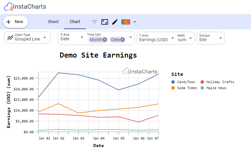
Chart Tab

You can edit and export the drawn chart from this tab. It contains the following features:
Change Chart Type
There are 9 main chart types split into two groups:
Single Charts
Single charts are basic charts. They do not have a legend. These charts require you to choose an x and y-axis.
- Line Basic Line chart
- Bar Basic bar chart
- Area Basic area chart
- Scatterplot Basic scatterplot chart
Grouped Charts
Grouped Charts have a legend and a third dimension in addition to x & y-axis: a group column. These grouped chart types allow you to pick a third dimension in addition to the x & y column. Auto aggregation will occur in these charts, depending on the data in the sheet.
- Grouped Line Multi Line Chart. Choose an x-axis, y-axis, and a group (which column should have multiple lines drawn)
- Stacked Bar Bar chart with stacked groups. Choose x & y-axis along with a stacked group
- Grouped Area Area chart with stacked groups
- Pie Pie chart
- Grouped Scatterplot Scatterplot with categorical data highlighted via colors.
Change X-Axis
Allows you to choose the x-axis on the selected chart. This select box will be autopopulated with all columns from your spreadsheet. Columns with dates and names with lower cardinality are recommended to be chosen here.
Change Y-Axis
Allows you to choose the y-axis on your chart. Also autopopulated with all columns from your sheet. Columns with numeric values with high cardinality are recommended selections for the y-axis. If you select one of the grouped chart types, an extra Math setting is displayed, allowing you to choose which aggregate formula is used to create your chart.
Aggregate formulas:
- sum Add all values in group together
- count Count number of rows per group
- average Average of all values in the group
- median Middle value of group
- min Smallest value in group
- max Largest value in group
- distinct Number of distinct values in group
- valid Number of valid values in group (non-null)
- missing Number of rows in group missing a value
Change Group (Optional)
If a grouped chart type is selected, this optional setting allows you to choose which column is displayed as a group. Name columns with low cardinality are recommended for this column
Open Chart Data Panel
Opens and closes the chart data panel. This panel allows you to view and export the data produced by your chart.
View Filters
If any filters are set on the sheet tab, they will be displayed here in a tooltip for easy viewing.
Change Chart Size
Adjust the width and height of the chart in a popup window
Edit Chart Text
Edit the chart title, x-axis title, y-axis title and optional legend title from this popup window. All titles are auto populated based on the columns you choose per axis, but can be overridden here.
Select Color
Select a different color scheme via predefined color palettes.
More actions
This menu contains options to export your chart.
- Save as PNG Save your chart in .png format.
- Save as SVG Save your chart in .svg format.
- Get Shareable Link Coming soon to logged in accounts! Allows you to share your interactive chart with others through a public link.
- View Compiled Vega The charting software uses vega under the hood. Select this option to view the vega specification used to create the resultant chart. This is useful for advanced users who wish to use InstaCharts to initially explore the data in their sheet, and export for further refinement.
- Open in Vega Editor Opens your chart in a vega sandbox. Note this will send your data to a third party website.
Give it a try
InstaCharts is a powerful tool that can help you create professional-looking charts in seconds. Give our beta a try demo!