How to create a chart from survey results
In this guide, we walk you through how to prepare your survey data & choose the perfect visuals to model your survey results

Quickly visualize survey data
You’ve closed your survey, the responses are in, and you’re looking at a massive spreadsheet. Raw data is great, but it’s hard to present a column of “Strongly Agree” at a board meeting. To find the real insights, you need to visualize them.
Here is your step-by-step guide to transforming survey results into professional visuals using InstaCharts: the online chart maker.
TLDR: Try the demo or sign up for a free account!
Prepare Your Data for Importing
Before you jump into the tool, ensure your data is “clean.” Most survey platforms (like Google Forms, SurveyMonkey, or Typeform) allow you to export your results as a CSV or Excel file.
Clean your headers: Ensure the top row contains clear questions or category names.
Remove “Incomplete” responses: If a respondent dropped out halfway, their empty cells might skew your averages.
Format Likert Scales: If you used a 1-5 scale, ensure the data is consistent (all numbers or all text).
Login to InstaCharts
Login to your InstaCharts account (if you plan on sharing your data and interactive chart with others or loading your data from Google Drive /Google Sheets).
Or use the demo to try InstaCharts without signing up.
Load your survey data
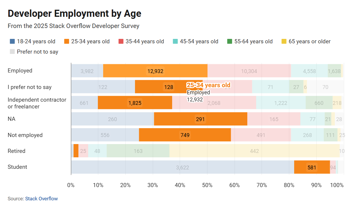
 View data in a data table for easy filtering, editing and sorting. Our example chart summarizes all 49k rows of the Stack Overflow 2025 Dev Survey
From the dashboard, click New+ then New Sheet. There are several ways to import your data:
- Load from your device Load a CSV, excel file, and many more file types using this option. Guide to importing files
- Connect to a datasource Load a file from Google Drive using this option. Guide to import files from Google Drive
- Blank Sheet Manually type in your data or paste it from another spreadsheet.
Import Options
Big surveys can contain hundreds of columns. To cut down on noise, only import the columns you are interested in charting.
Import
Once you are happy with how the imported data looks, click Import to import your data into InstaCharts.
Refine and Customize Your Charts
That’s it! Once your data is imported into InstaCharts, a new sheet is opened and populated with your data; your first chart is automatically created and displayed.
There’s 2 main tabs on the Sheet page, Data and Chart.
- Use the Data tab to filter and edit data shown in the chart.
- Use the Chart tab to customize the current chart or add more charts to the sheet.
From the Chart tab, you can pick a different chart type and which columns are plotted using the main dropdowns in the chart toolbar. You can further customize the current chart using the left sidebar.
 Quickly edit your survey results chart on the Chart tab.
Choose Chart Type
Matching your question type to the right chart is the secret to clarity.
The Bar Chart (Best for Single Choice)
If you asked a question like “Which of these features do you use most?”, a standard bar chart is your best friend. It clearly ranks responses from most to least popular.
The Pie Chart (Best for Parts-of-a-Whole)
Use this for simple demographics or “Yes/No” questions.
Tip: Avoid pie charts if you have more than 5 categories; they become cluttered and hard to read quickly. (Or use Limit Items to restrict the pie chart to the top 5 categories.)
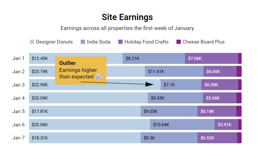
The Stacked Bar Chart (The Survey Super-Power)
This is the gold standard for Likert Scales (e.g., Strongly Disagree to Strongly Agree).
Why it works: It allows you to see the total volume of responses while simultaneously showing the internal breakdown.
Effective Chart Types for different survey questions
Below is a summary of which types of charts are best suited for each type of survey question.
| Question Type | Best Chart | Why? |
|---|---|---|
| Demographics | Pie or Bar | Shows simple distribution. |
| Preference (Ranked) | Horizontal Bar | Easy to read long text labels. |
| Likert Scales (1-5) | Stacked Bar | Shows intensity of feeling across groups. |
| Trends over Time | Line Chart | Shows if satisfaction is rising or falling. |
Edit/Transforming Data
Most of the time, survey results come from 3rd party software and may require some light editing.
Typically, survey data is formatted so each question has its own column. This can make plotting overall results (from multiple questions) tough. Luckily, you can use an Unpivot Transformation to condense multiple question columns into just 2 columns, which allows you to plot multiple questions in the same chart.
Note: Data Transforms affect all charts in a sheet; If you’ve already created charts, it may be best to copy your data into a separate sheet before using a transform so you don’t affect the other charts in the sheet.
Further Customize the Chart
Once you have the chart type and axis figured out, the chart can be refined further via the left sidebar of the Chart tab.
- Chart Text Edit axis titles, the chart title, subtitle, caption, source text and link and change the chart’s language locale.
- Chart Appearance Change the chart’s width, height & colors.
- Limit Items Too many items appearing in the chart? Limit the number of items that appear using the Limit Items sidebar.
- Filter Data Restrict the data that appears in the chart.
- Annotations Add text and images to your chart.
- Number Formatting Change how numbers are formatted in the chart.
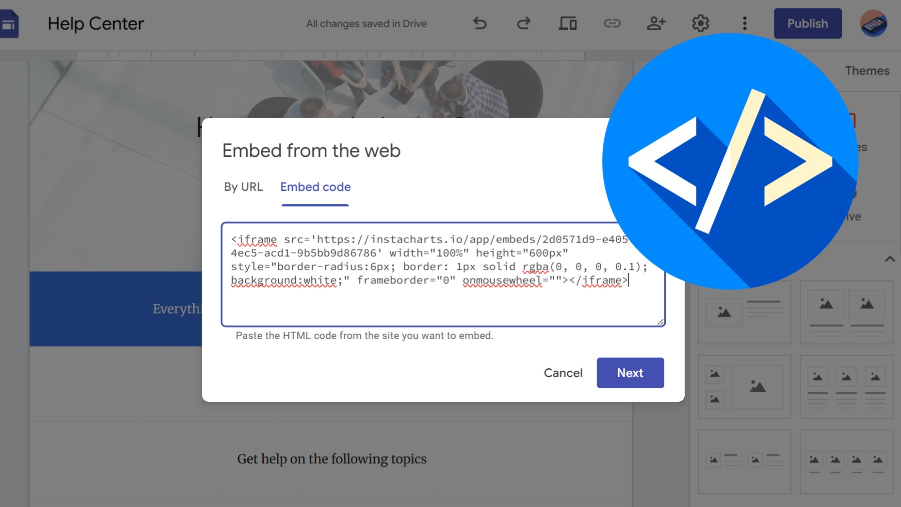
Export & Share
Share charts through the Share dialog, located on the main toolbar (sharing is an accounts only feature). You can share a static image of your chart, or a copy of the interactive chart via a public link.
Need to use the chart image in a report? Use the Export dialog export images.
You can also use the Export window to export your data as a csv, excel, tsv or json file.
Ready to see your survey data in action?
Visualizing your results shouldn’t take hours of manual formatting.
InstaCharts is a powerful tool that can help you create and share professional-looking charts in seconds. Signup for a free account today!