How to create a graph from JSON
Upload a JSON file to InstaCharts to instantly generate a graph from your data

Create and share graphs
InstaCharts lets you create a graph from a JSON file and share it with your team in just a few steps.
TLDR: Try the demo or sign up for a free account!
1. Open InstaCharts
Login to your InstaCharts account if you plan on sharing your data and interactive graph with others. Use the demo to try InstaCharts without signing up, or if you don’t need to save and share your chart.
2. Upload the JSON file
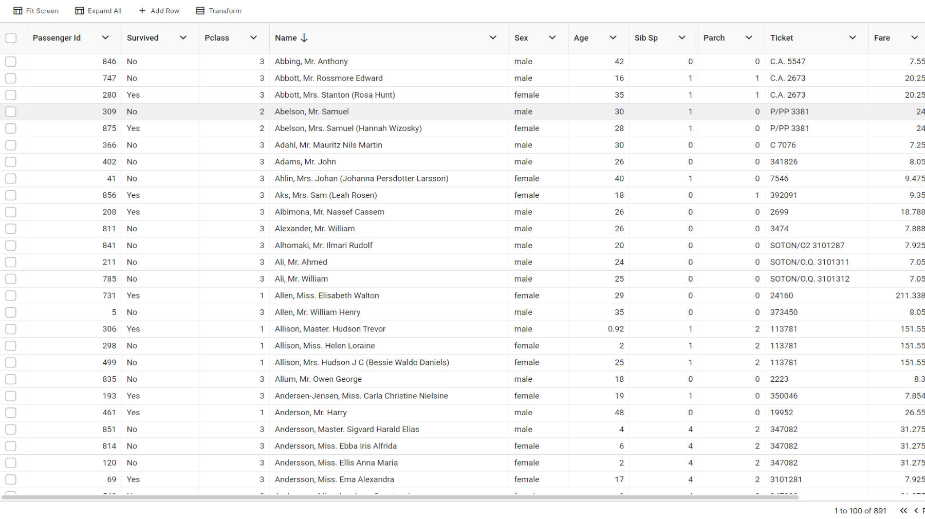
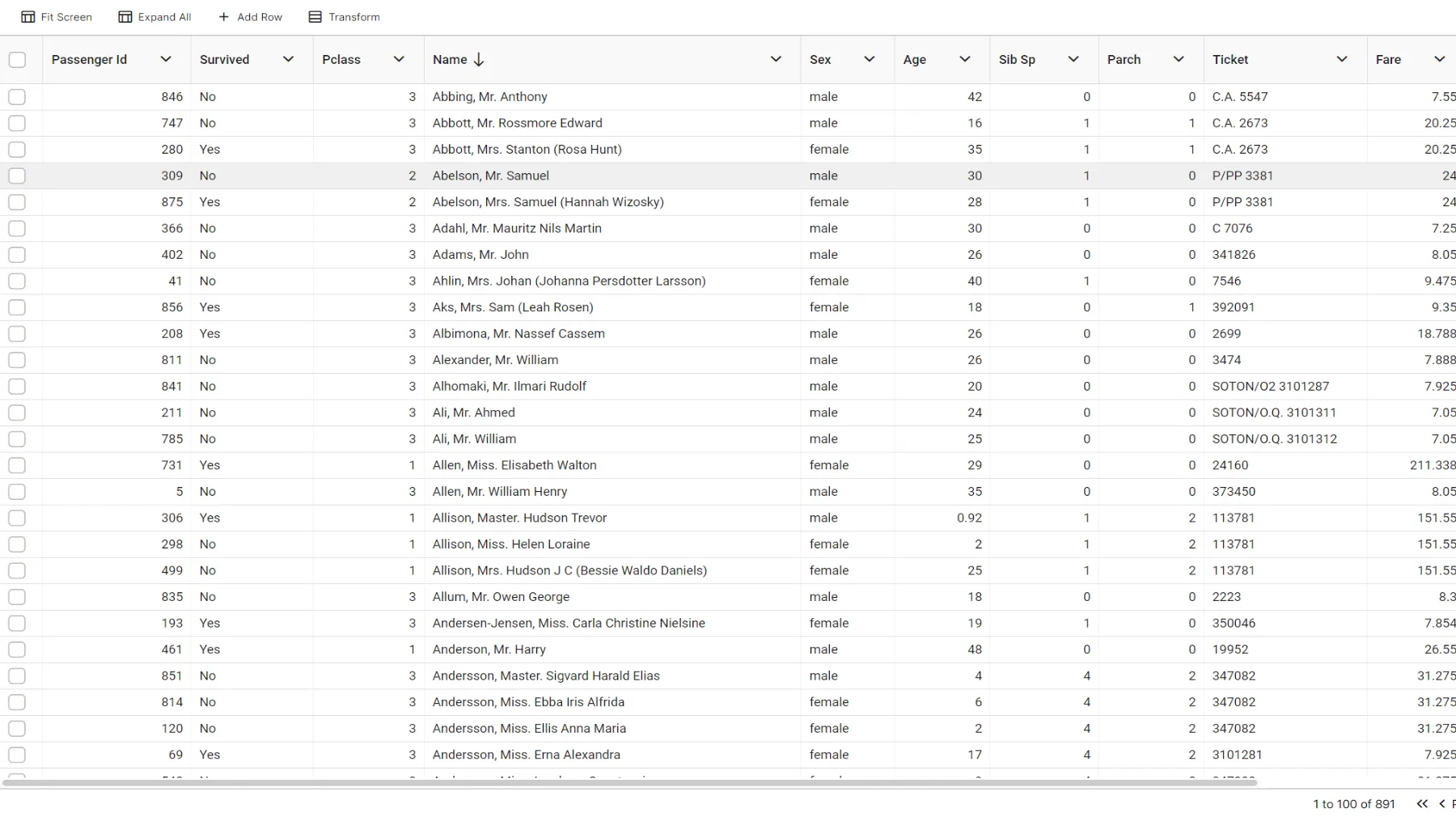 View your JSON data on the Data Tab
From your workspace, click New, then New Sheet, and choose Upload a file, or drag and drop the file onto the workspace. InstaCharts reads .json files and .jsonl (JSON Lines) files. Review the import preview, then click Import. The file is read and processed, and a graph is instantly produced from its data.
The json file is first turned into a spreadsheet with rows and columns; properties within the json objects become columns and each json object becomes a row. JSON records already carry their property names, so InstaCharts reads the column names directly from the data and skips the header row options used for other file types. InstaCharts automatically analyzes and chooses column types, formatting, and cardinality for each column in the spreadsheet. A chart is instantly shown on the Chart tab. Free accounts can import files up to 2MB and 500 rows per sheet, and paid plans raise the row limits.
On the Data tab, check that your file was uploaded correctly. Any text in a column otherwise full of numbers causes the column to be treated as text instead of numeric, which affects charting. Values such as N/A or TBD inside a numeric property are a common cause, so leave those values blank in the source file.
Nested objects and lists
JSON often nests objects inside other objects. A column that holds JSON objects is recognized as an Object column. Open the column’s header menu and choose Split Object Column to turn each property into its own column so the individual values can be charted. Lists such as [1,2,3] are imported as an Array column and shown correctly in the data table. The Transform Data tools can also pivot, unpivot, merge and split columns when the data needs reshaping.
InstaCharts uses the full dataset you upload to make a chart. To make minor data edits, double click a cell on the Data tab, or use the Add Row and Add Column buttons in the toolbar. To filter out data from appearing in the chart, open a column’s menu from its top right corner and choose Set Filters, or use the quick filter (the magnifying glass) in the toolbar.
3. Edit your chart
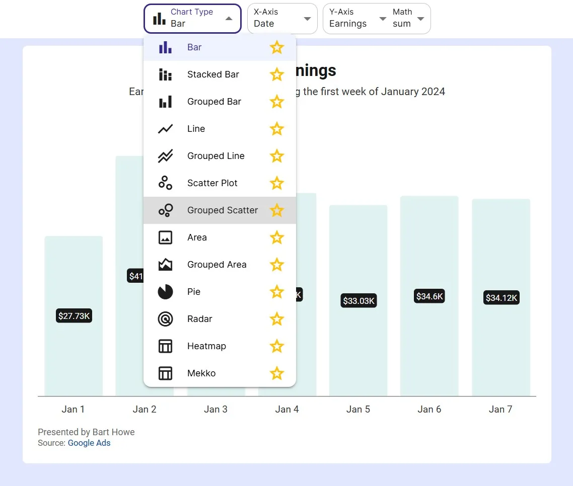 Choose between 13 chart types (all chart types are recommended for the sample data!)
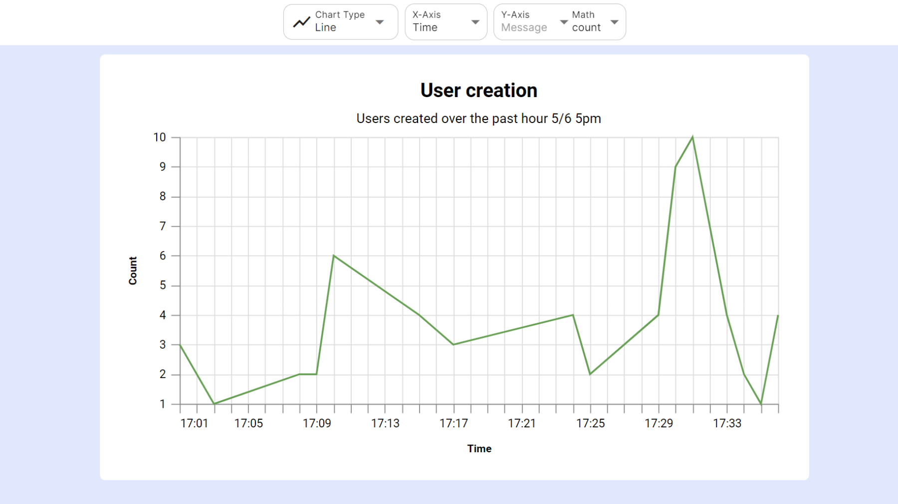
Click on the Chart tab to switch to the Chart view. A chart is automatically created based on your data.
There’s 2 main settings to quickly change this chart:
Chart Type
The chart type can be switched to bar, stacked bar, grouped bar, line, grouped line, scatter plot, grouped scatter, area, grouped area, pie, radar, heatmap or mekko.
Some chart types will be marked with a star. The stars denote recommended chart types based on the data in your spreadsheet. For example, a scatterplot will be recommended if your data contains at least 2 numerical columns.
Axis Dropdowns
The x and y-axis can be selected from any column in the spreadsheet. If a chart type is selected that can handle multiple series (grouped line, stacked bar, grouped area) , the y-axis dropdown will turn into a series dropdown. Using the series dropdown, you can either drill down into your data further by selecting a breakdown column, or add another series to the chart.
Some choices in the axis dropdowns will be marked with a star. The star means this column is recommended for the axis based on the selected chart type. For example, date columns are recommended for the x-axis in a line chart. This will create a time series graph, and is one of the best charts to visualize changes over time. Hover over the stars to learn more reasons why a column is recommended for a particular axis.
4. Further Customize the Chart
Once you have the chart type and axis figured out, the chart can be refined further via the sidebar.
Chart Text
The x-axis, y-axis, legend title and chart title all auto update based on your selections. If you wish to override this text, open the Chart Text panel to change it. Subtitles, captions and source links can also be set from this panel. Axis titles, the legend and number formatting are in the Axes & Legend panel.
Chart Appearance
The chart’s width and height can be changed from the Size & Style side bar. The chart’s color scheme, fonts and theme can also be changed here.
Limit Items
Too many items appearing in the chart? New charts start with Auto Limit turned on, which keeps the 50 largest items and groups the rest into an All Others category. Turn Auto Limit off in the Data panel to choose your own number with Limit Top Items.
Filter Data
Want to restrict the data that appears in the chart? Click on the data tab and apply multiple filters per column. There is also a quick filter in the main toolbar that will filter all columns by the search term.
5. Export & Share
Use the Export dialog (located on the main toolbar) to download your chart as an image file (.png, .jpg, .svg, .webp or .pdf) or a PowerPoint slide. You can also use the Export dialog to download chart data to a CSV, excel, TSV or JSON file.
Share charts through the Share & Templates dialog, also located on the main toolbar (sharing is an accounts only feature). You can share an interactive copy of the chart via a public link, embed it in a website, or share a static image that updates automatically when the chart changes.
Keep the graph up to date
When a new JSON export arrives, right click the sheet in your workspace and choose Update Data to overwrite the sheet or add rows to it. Your charts keep working. See Update Sheet Data for the steps. To send single records into a sheet automatically from other apps, see how to automate chart creation with Zapier.
Give it a try
InstaCharts helps you create and share professional-looking charts without writing any code. Sign up for a free account today!