How to create a Top N chart from a csv file
Upload the csv file to InstaCharts and use the Limit Items settings

Create a Top N chart from a csv file
This guide shows how to create a Top 5 chart from a CSV file in InstaCharts, including how to group items outside the Top 5 into an “All Others” category. The same steps create a Bottom N chart by keeping the smallest values instead of the largest.
TLDR: Try the demo or sign up for a free account!
What is a Top N chart?
A Top N chart shows the highest or lowest values in a dataset, where N is the number of items you choose to display. A Top 5 chart shows the five largest values, a Top 10 chart shows the ten largest, and a Bottom 5 chart shows the five smallest. The chart focuses in on one section of your dataset, the values that matter most, so the important items stand out instead of getting lost among hundreds of categories.
For example, a spreadsheet of 200 products can become a chart of the 10 best sellers by revenue, and a list of sales regions can become a chart of the 5 weakest performers. Top N charts are usually drawn as bar charts, because bars sorted from largest to smallest make a ranking easy to read.
The remaining items can be combined into a single “All Others” bar. This keeps the chart focused on the top items while the total still reflects the full dataset.
1. Load your spreadsheet
From your workspace, click New, then New Sheet, and choose Upload a file. Select a spreadsheet from your device. In the import preview, check over the data (column headers are color coded green for dates, blue for numbers, and pink for text) then click Import.
Your spreadsheet will be processed into a Sheet and automatically opened. You can view your data in the Data tab. InstaCharts automatically detects the column type and formatting for each spreadsheet column and applies it to your chart, saving you time. CSV, Excel, JSON and several other file types work the same way. See the Importing Data guide for the full list.
2. Edit your chart
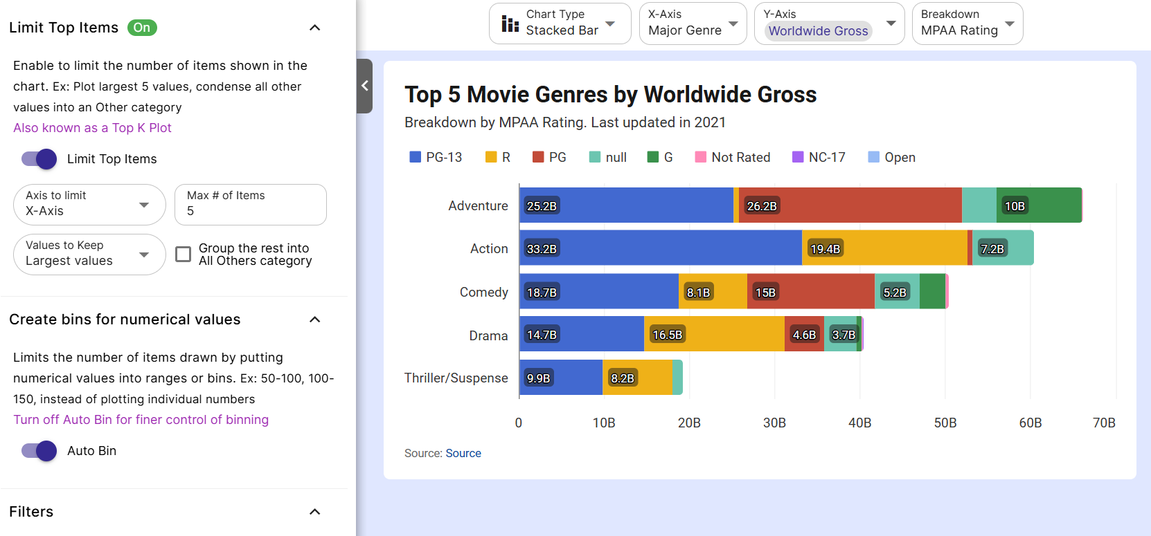
A Top N Chart with remaining items in an Others category
A chart has been automatically produced on the chart tab. Edit the chart settings to customize what’s shown in the chart.
Chart Type
A bar chart or stacked bar chart is recommended to visualize rankings.
Axis
The x and y-axis can be selected from any column in the spreadsheet. Certain columns will be recommended for either based on the data within the column.
For ranking, it’s recommended to choose numerical values on the y-axis and categorical data (like names) on the x-axis. If you choose a stacked bar chart, you’ll be able to choose a breakdown column to highlight subsections within each bar of the chart.
Y-Axis Aggregation
InstaCharts automatically performs aggregation on your data in order to produce a chart. You can select the mathematical function used to aggregate the chart data. Here are some of the available options:
- Sum Adds all values together
- Count Counts number of rows
- Average Calculates the average of all values
- Median Finds the middle value
- Min Finds the smallest value
- Max Finds the largest value
- Distinct Counts the number of different values
- Valid Counts rows with a value. Useful for validating data in the spreadsheet.
- Missing Count of rows missing a value. Useful for validating data in the spreadsheet.
Choose the function that best describes what you wish to illustrate in the chart. Sum and average are common choices for a Top N chart.
Auto Limit
New charts start with Auto Limit turned on. When the X-Axis holds text categories, Auto Limit keeps the 50 largest items and groups everything else into an “All Others” category, so a chart with hundreds of categories stays readable. Charts with dates on the X-Axis show all of their points.
Limit Top Items
Once a chart type and axis have been selected, it’s time to choose your own limits. Click Data on the left sidebar to open the Data panel, find the Limit Top Items section, and turn Auto Limit off. A Limit Top Items toggle appears. Switch it on to reveal the settings below:
- Axis to limit: Choose the X-Axis, or the Breakdown when the chart has one.
- Max # of Items: Enter how many items to keep. The default is 6, and any number from 1 to 999 works.
- Values to Keep: Select Largest values to show the top items in the plot, or Smallest values to showcase the bottom items.
- Group the rest into All Others category: Check this box to collect every item outside the limit into one “All Others” bar. This option is available for text columns and hidden for numeric and date columns.
A green badge appears on the Data button in the left sidebar while a limit is applied to the chart. Hover over it to see a summary of what is applied.
Filters and sorting
Combine Top N with filters to rank a specific slice of your data, such as the top 5 products for a single year. The Data panel includes options to remove blank values and zeros, and each column menu on the Data tab has Set Filters for more detailed conditions. See the Filtering docs for the full list.
Auto Sort is on by default in the Chart Options panel. With text categories on the X-Axis, it orders the bars from the largest value to the smallest, so a Top N chart reads as a ranking. Turn Auto Sort off in Chart Options to sort by the X-Axis or Y-Axis in either direction.
3. Done
The Top N chart is ready to export or share.
Export your chart as a PNG, JPG, SVG, WebP, PDF, or PowerPoint file to share your findings with others, or share and embed the interactive chart in a webpage.
You can also view and download the data shown in the chart.
Next Steps
Read our docs on Limit Items to learn more.
Read our Importing Data guide to view all the file types InstaCharts can handle.
Give it a try
InstaCharts creates professional-looking charts from your data in a few clicks. Sign up for a free account to make your own Top N chart.