How to generate a graph from a csv file
Upload a csv to instantly produce a graph or scatterplot

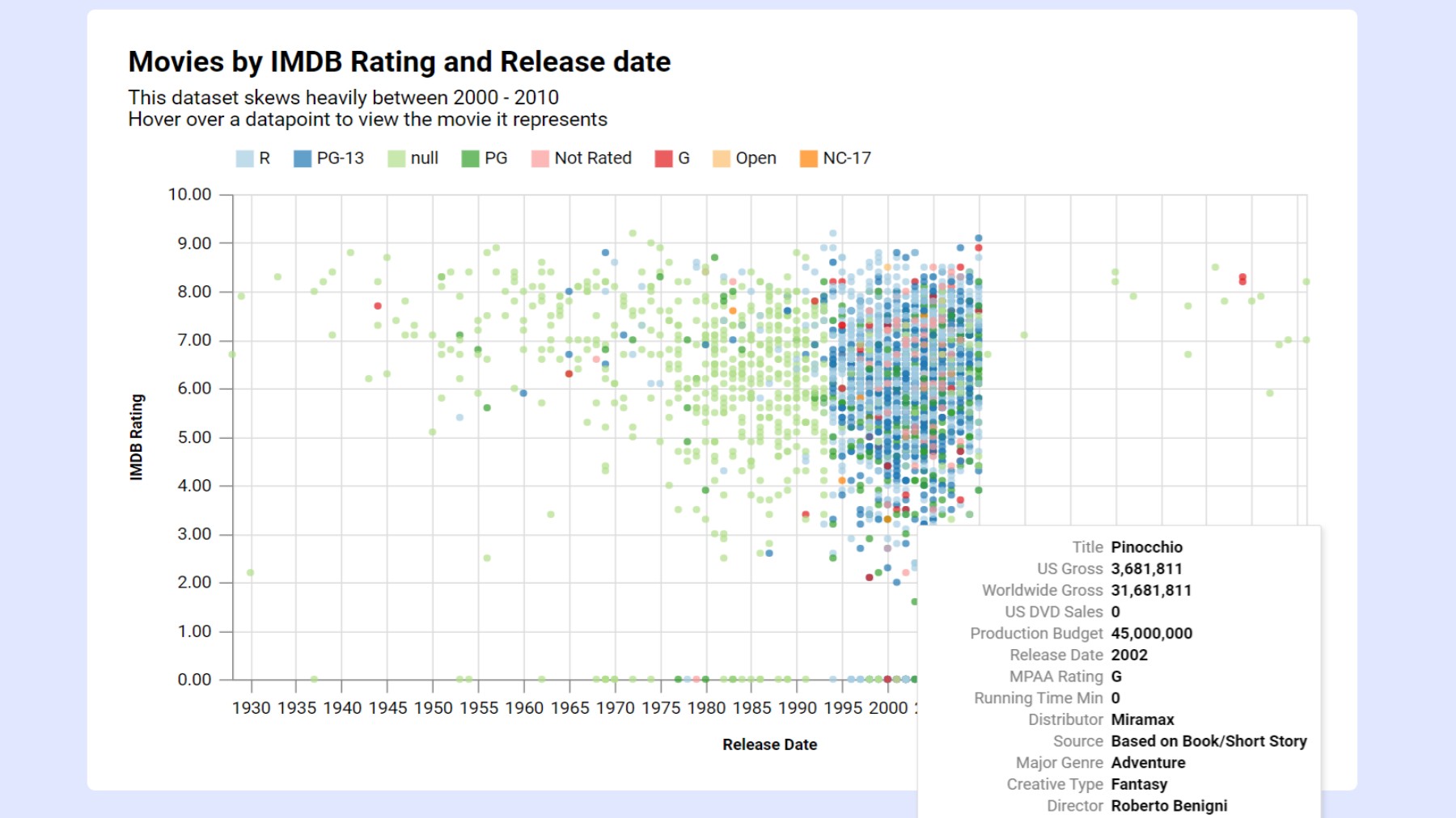
Generate a graph from a csv file
This guide shows how to create a graph from a CSV file in InstaCharts, including how to change the scatterplot’s axis or chart type and how to add a trend line.
TLDR: Try the demo or sign up for a free account!
1. Load your csv
 View your csv spreadsheet data on the Data Tab
From your workspace, click New, then New Sheet, and choose Upload a file. Select the csv file from your device, review the import preview, and click Import. The preview shows the first 100 rows, with each column header color coded by the type InstaCharts detected: green for dates, blue for numbers, and pink for text. Scatterplots need numeric columns, so check that the columns you plan to graph show up blue.
The data from the csv file is processed into a sheet and the sheet opens. Column types are auto detected for each column in the spreadsheet, saving you time from having to manually set each one. Free accounts can import files up to 2MB and 500 rows per sheet, and paid plans raise the row limits.
2. Edit your chart
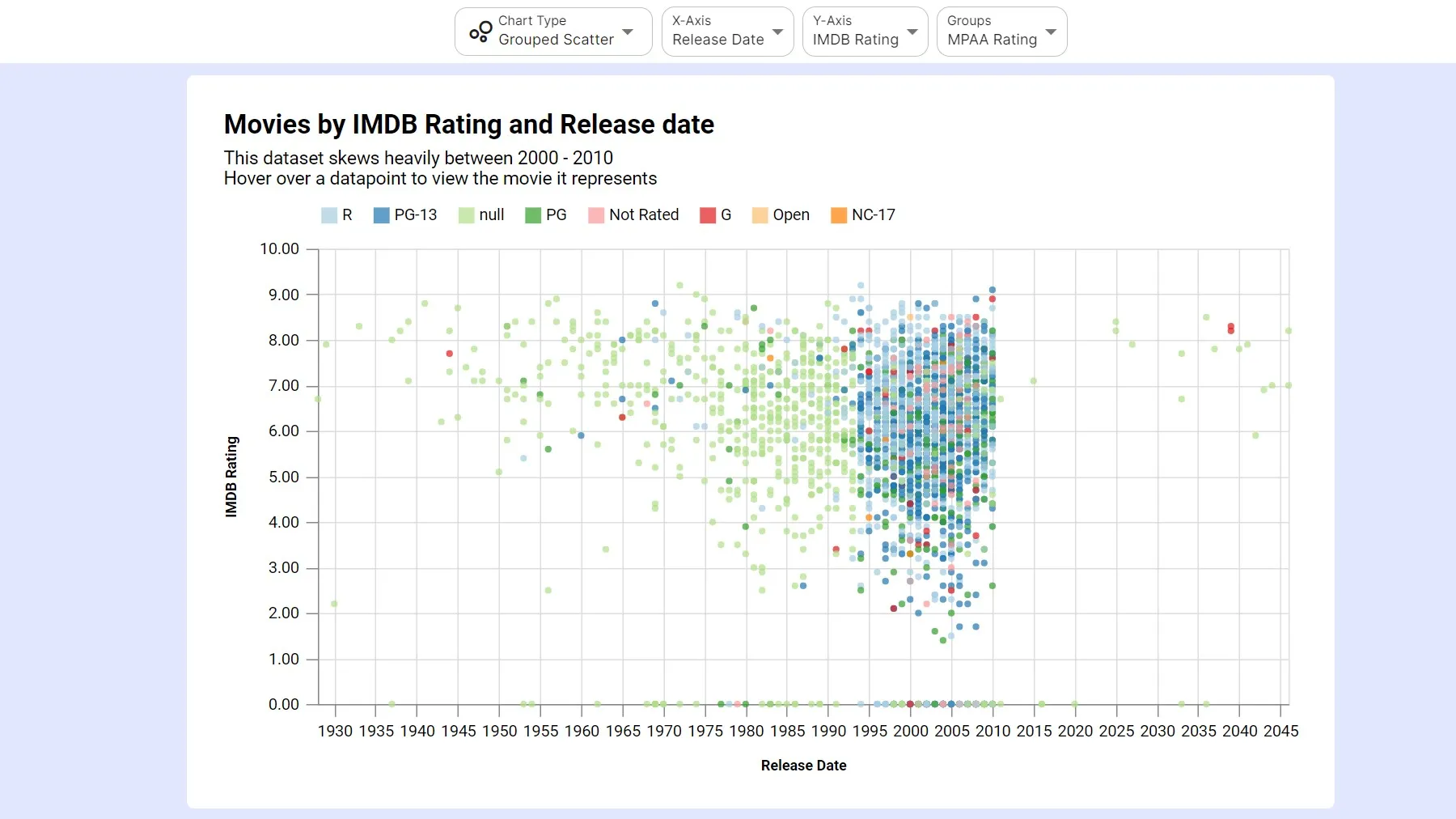 A grouped scatterplot allows you to color code the graphed points
A chart will be produced on the Chart tab. To produce a graph, set the chart type to either Scatter Plot or Grouped Scatter. Chart types marked with a star are recommended for your data, and a scatterplot is recommended when your data contains at least 2 numerical columns. The major features you can change are explained below.
Chart Type - Scatter Plot
Choose Scatter Plot when there are numerical values to graph in both the X and Y-axis. Each dot on the chart is one row of your sheet.
Chart Type - Grouped Scatter
Choose Grouped Scatter when there are numerical values to graph on both the X and Y-axis and you also want to highlight different groups of data within the scatterplot using colors.
Axis Dropdowns
The X and Y-axis can be selected from any column in the spreadsheet. For a scatterplot graph, it is recommended to choose numerical values for both the X and Y-axis. If the chart type is Grouped Scatter, an additional third axis will appear under Series called Breakdown. This axis determines the color coded groups within the graph, and each unique value in the breakdown column gets its own color.
Trend Line
A trend line shows whether the two columns move together. Open the Annotate panel in the left sidebar, click Add Trend Line, and choose Linear Regression to draw the best fit straight line through the points. Turn on Add info to caption to write the regression equation, R², r, and sample size into the chart’s caption. Regression lines need a numeric X-axis. The same panel adds average, median and custom value lines, and text annotations you can anchor to an outlier.
Chart Text
The X-axis, Y-axis, legend title and chart title are all auto updated based on your selections. If you wish to override this text, open the Chart Text panel in the left sidebar to edit the title, subtitle and caption. Axis titles and the legend are in the Axes & Legend panel.
Chart Appearance
The chart’s width and height can be edited from the Size & Style side menu. The chart’s color scheme, fonts and theme can also be changed from this menu.
Too many points?
Thousands of overlapping points can hide the pattern in a scatterplot. Filter the data on the Data tab to focus on a section of it, or aggregate the data and try a heatmap instead.
3. Export
Use the Export dialog on the main toolbar to export your chart as a png, jpg, svg, webp or pdf image, or as a PowerPoint slide. You can also export the original sheet data, or the data the chart produced, from the same dialog. Charts can also be shared with a link or embedded in a website from the Share button.
Not sure whether a scatterplot is the right graph? Read when to use a scatter plot chart.
Give it a try
InstaCharts creates professional-looking charts from your data in a few clicks. Try the demo to see it for yourself.