How to use AI Chart Assist
Upload a spreadsheet to InstaCharts for quick data analysis.


Create and share charts
This guide shows how to create charts from a spreadsheet using AI in InstaCharts and share the results with a coworker. InstaCharts calls the feature AI Recommendations, and it is the successor to AI Chart Assist.
TLDR: Try the demo or sign up for a free account!
Data visualization made easy
Building a good chart usually takes some trial and error: picking a chart type, choosing the right axes, and adjusting the layout until the data reads clearly. InstaCharts handles that first pass automatically, with two kinds of suggestions:
- Recommended Charts are free, rule-based suggestions that show the exact X-axis, Y-axis and breakdown columns used for each chart.
- AI Recommendations use an AI credit to analyze your data and suggest three charts, each with a chart type, title, subtitle and caption written for what your data shows.
Generate AI charts when you upload
 View your spreadsheet data and set filters on the Data Tab
From your workspace, click New, then New Sheet, and choose Upload a file. Select a spreadsheet from your device and the import preview opens. Next to the Import button is a Generate AI charts checkbox. Leave it checked and click Import.
As soon as the upload finishes, InstaCharts analyzes the sheet, creates three charts from its recommendations, and opens the first one. Generation can take a few minutes, and the progress window has an Open sheet button so you can start working on your data while the charts finish in the background.
Generating AI charts uses 1 AI credit. The chip under the checkbox shows how many credits your workspace has left for the month. Free accounts get 5 AI credits a month, Starter workspaces get 50 per seat, and Pro workspaces get 100 per seat. The checkbox is available when you are logged in, and it remembers your choice for the next import.
Ask for more recommendations
To view other suggestions, click Recommended in the left sidebar. The panel opens with Recommended Charts and AI Recommendations side by side.
To generate more AI charts, type optional instructions into the Additional instructions box, such as “Focus on trends over time” or “I want to compare revenue across product categories”, then click Generate 3 Recommendations. This uses 1 AI credit.
The AI also writes a Data Summary and Insights above the recommendations, which call out outliers or data quality issues it noticed. Each recommendation shows a suggested chart type, title, subtitle and caption. Click Add Chart on any recommendation to add it to your sheet, and add as many as you like. Your last set of recommendations is remembered for the sheet.
For more detail, see the AI Chart Recommendations guide.
What the AI receives
To make recommendations, InstaCharts sends a summary of your sheet to the AI. The summary includes column names, column types, summary statistics such as totals and ranges, and a small sample of rows. AI is optional. Uncheck Generate AI charts when you import, and AI recommendations run only when you click Generate 3 Recommendations. Recommended Charts are rule-based and use no AI credits.
Customize your Chart
You can refine your generated chart in a variety of ways.
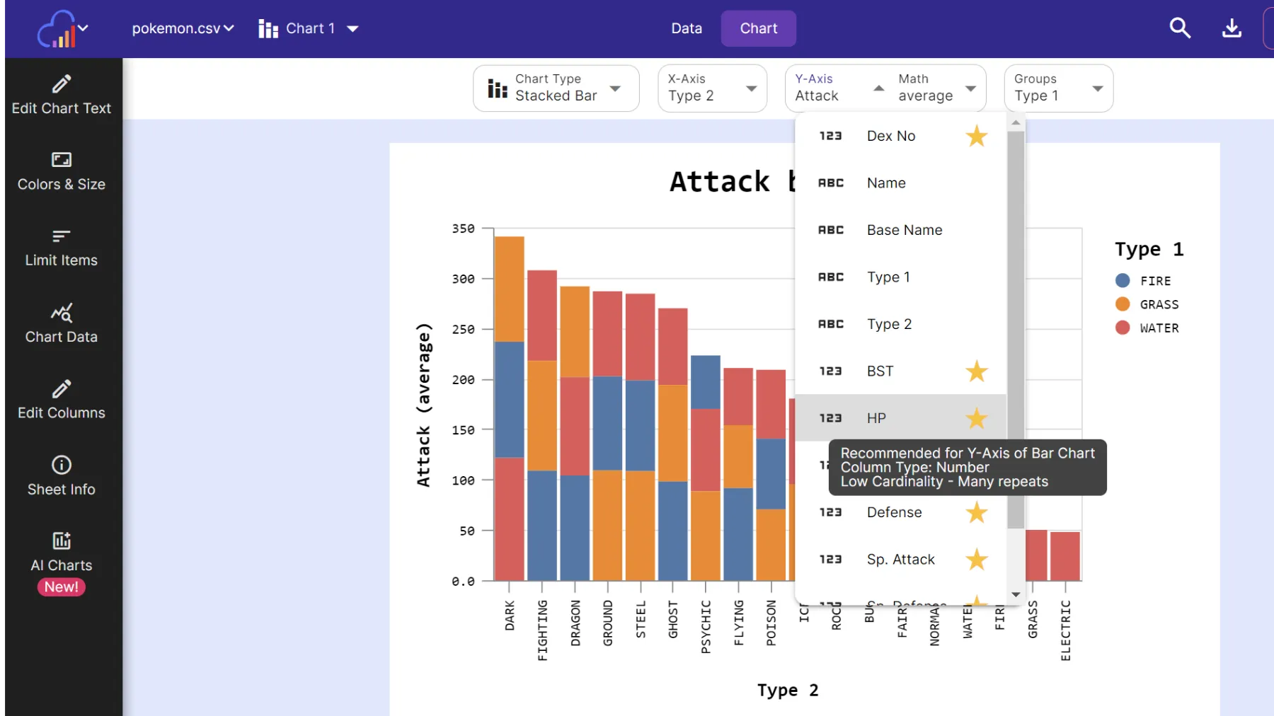 Selecting a different Y-Axis from other columns in the spreadsheet. Hover over the star icon to see why a column is recommended
Chart Type
The chart type can be switched to bar, stacked bar, grouped bar, line, grouped line, scatter plot, grouped scatter, area, grouped area, pie, radar, heatmap or mekko.
Some chart types will be marked with a star. The stars denote chart types that are recommended for the data in your spreadsheet.
Axis
The x and y-axis can be selected from any column in the spreadsheet. Starred columns are recommended for the selected chart type. If a chart type is selected that can handle multiple series, the y-axis dropdown will turn into a series dropdown. Using the series dropdown, you can either drill down into your data further by selecting a breakdown column, or add another series to the chart.
Chart Text
The x-axis, y-axis, legend title and chart title all auto update based on your selections. If you wish to override this text, open the Chart Text panel in the left sidebar. AI generated charts arrive with a title, subtitle and caption that you can edit there.
Chart Appearance
The chart’s width and height can be changed from the Size & Style sidebar. The chart’s theme, color scheme and fonts can also be changed here.
Limit Items
Too many items appearing in the chart? New charts start with Auto Limit turned on, which keeps the 50 largest items and groups the rest into an All Others category. Turn Auto Limit off in the Data panel to choose your own number with Limit Top Items.
Filter Data
Want to restrict the data that appears in the chart? Click on the data tab and apply multiple filters per column. There is also a quick filter in the main toolbar that will filter all columns by the search term.
Export & Share
Use the Export dialog (located on the main toolbar) to download your chart as an image file (.png, .jpg, .svg, .webp or .pdf) or a PowerPoint slide. You can also use the Export dialog to export chart data to a csv, excel, tsv or json file.
Share charts through the Share & Templates dialog, also located on the main toolbar (sharing is an accounts only feature). You can share an interactive copy of the chart via a public link, embed it in a website, or share a static image that updates automatically when the chart changes.
Give it a try
InstaCharts helps you create and share professional-looking charts from your data in a few clicks. Sign up for a free account today.