
Financial Reporting
Clear Financial Charts for Every Report
Chart cash flow, budgets, revenue and expenses for board decks, investor updates and monthly reports, with currency formats and live data built in.
Upload
From Spreadsheet to Financial Chart in Minutes
Upload an Excel or CSV export from your accounting software, or connect a Google Sheet. InstaCharts detects currencies, numbers and dates, and recommends charts that fit your data.
Reports
Chart Every Financial Report
Built for finance: Waterfalls, currency formats and monthly rollups for the reports you send every period.
Chart your:
- Cash flow statements
- Budget vs actual
- Profit & loss summaries
- Revenue by month
- Expense breakdowns
- Department budgets
- Investor updates
- Board decks
Cash flow
See how money moves
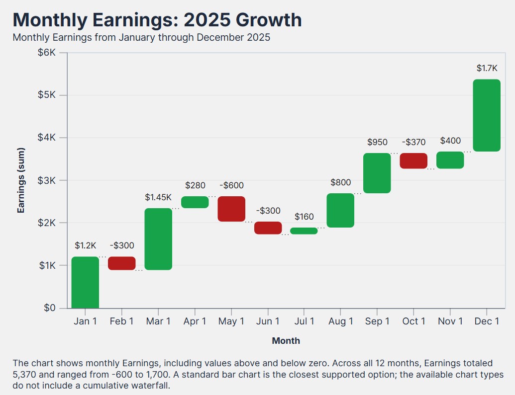
Show every inflow and outflow on the way to your ending balance, like the live cash flow waterfall chart shown here.
Cash Flow Waterfalls
Each bar rises or drops from the running total, so readers see which months grew your balance.
Profit & Loss Bridges
Walk from revenue through each cost line to net income with a waterfall chart.
Negative Number Color
Give losses, outflows and declines their own color so they stand out from gains.
Cash Flow Waterfall Chart
LiveBudgets
Keep spending on plan
Compare planned and actual spending by month or category, like the live budget vs actual chart shown here.
Budget vs Actual
Place budget and actual bars side by side for every month or category, or switch to lines or areas.
Department Budgets
Stack each department's budget by expense type in horizontal bars to see where money is planned.
Top Expenses
Limit a chart to the largest 5 or 10 expense categories and rank them by amount.
Budget vs Actual Chart
LiveFeatures
Built for Financial Data
Currency Formats
Show $3.50 or abbreviated amounts such as $650k, $650m and $650b, with the separators and symbol for your locale.
Monthly & Quarterly Rollups
Group daily transactions by month, quarter or year and sum them, without building a pivot table.
Financial Themes
Apply Financial Light for precise market data, or Financial Dark for a trading terminal look.
Trend Lines
Add an average, median or custom value line, or a line of best fit with its equation and R² in the caption.
Data Labels & Totals
Show every value on the chart and add total labels to stacked bars so readers see the exact amounts.
Board-Ready Exports
Export PowerPoint files for board decks, PDF and SVG for printed reports, and the data as Excel or CSV.
Dashboards
A live financial dashboard
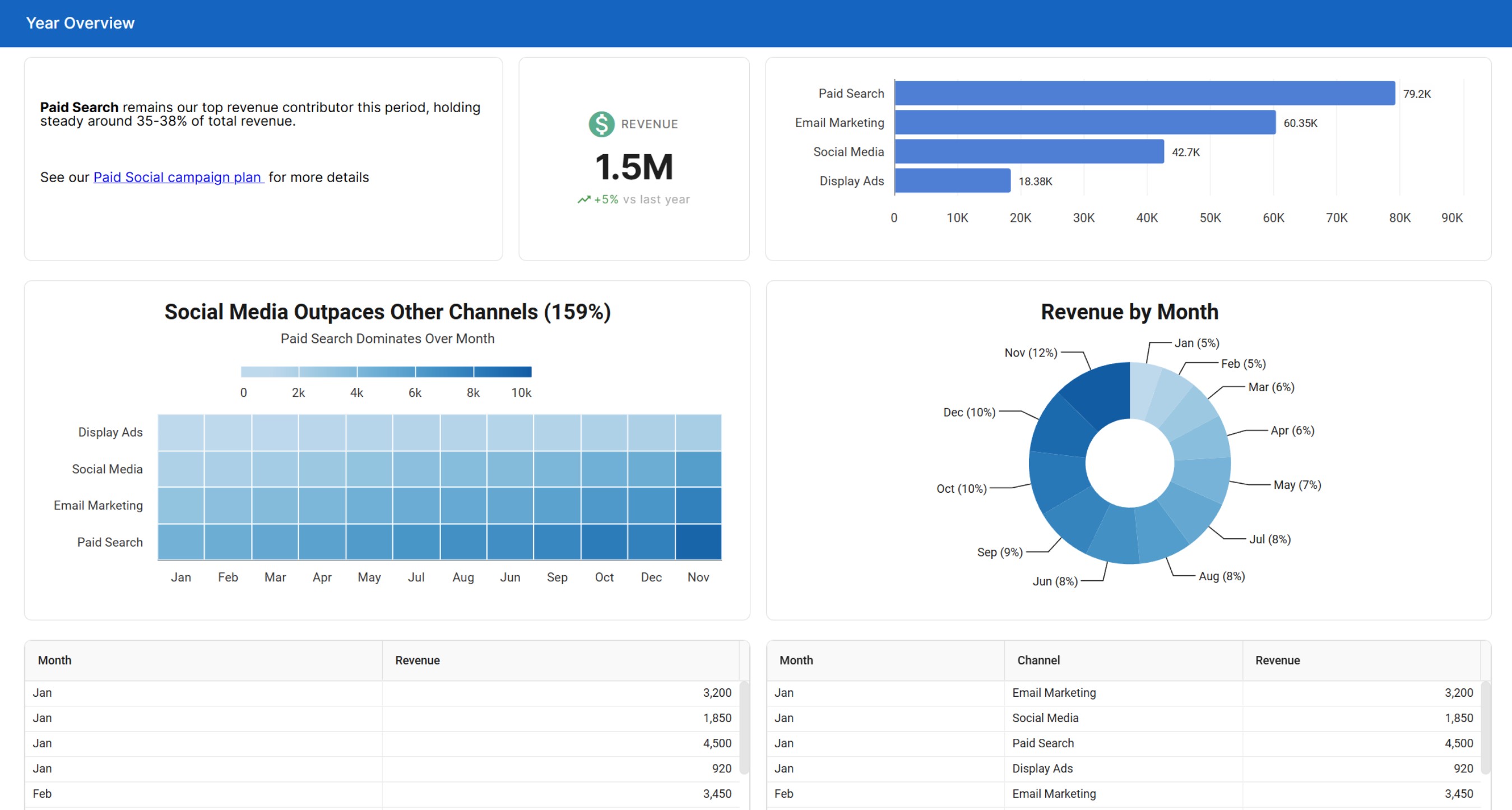
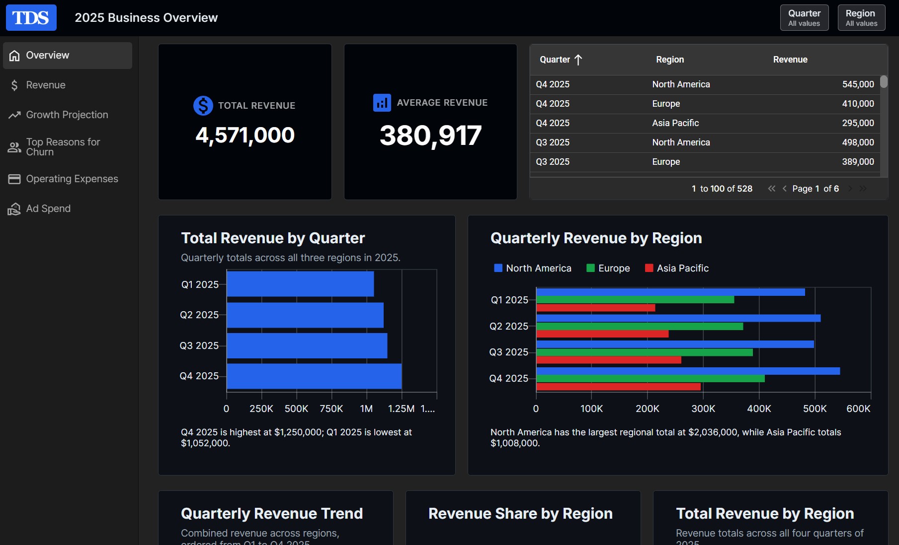
Bring revenue, expenses and cash flow together on one page that updates with your numbers.
KPI Widgets
Call out revenue, cash on hand or monthly spend in large numbers with a trend such as +12% vs last month.
Slicers by Department or Period
Filter every chart and table built from the same sheet by department, account or date range.
Financial Dashboard Theme
Restyle every widget at once with the Financial or Executive dashboard theme.
Live data
Close the month faster
Connect your financial data once, and each new period's charts are ready when the numbers are.
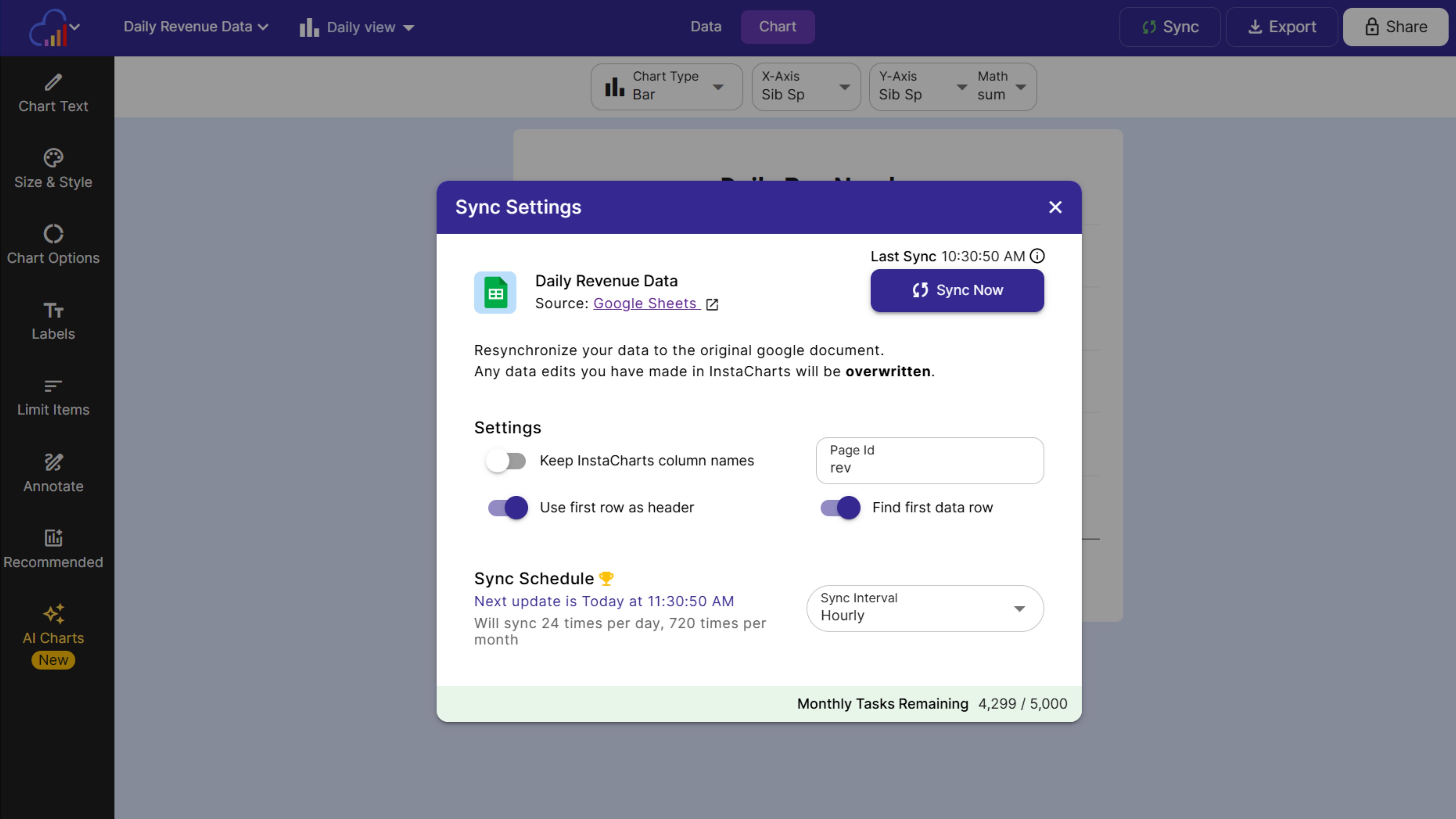
Google Sheets Sync
Sync your financial model or revenue sheet on a schedule or whenever it changes.
Monthly Exports
Add this month's export from your accounting software to your sheet, and every chart keeps its settings.
Stripe Payments
Send each new Stripe payment into a sheet with the Zapier "Add Data Row" action.
FAQs
Financial Reporting Charts FAQs
Use a waterfall chart to show how cash flow or profit builds from one total to another, a grouped bar chart to compare budget with actual spending, a line chart to show revenue or a stock price over time, and a stacked bar or donut chart to break expenses down by category. Data labels and currency formats make every number easy to read.
List each period's inflows and outflows in a sheet, create a bar chart and turn the bars into a waterfall in the Chart Options panel. Each bar rises or drops from the running total, so readers see which months added to your balance and which months drew it down. The Cash Flow Waterfall template includes sample data to start from.
Put your revenue, each cost line and your net income in a sheet in order, then create a bar chart and turn on the waterfall option. The chart walks from revenue down through each cost to the final result, which makes it a clear way to explain a P&L in a board deck.
Put the budget and actual amounts side by side for each month or category and create a grouped bar chart, with one bar for the budget and one for the actual amount. The Budget vs Actual Expenses template shows the layout, and you can switch to lines or areas with one click.
Open the Axes & Legend panel and choose a currency format, such as $3.50, or an abbreviated format such as $650k, $650m or $650b. Set the number and currency locale in the Chart Text panel so separators and the currency symbol match your audience.
Yes. Turn on Negative Number Color in the color settings and pick a color, so losses, outflows and declines stand out from positive values. Workspace admins can also make it part of the workspace Chart Defaults for every new chart.
Put the transaction date on the X axis and choose a time unit such as month, quarter or year, then sum the amounts on the Y axis. InstaCharts groups the rows for you, so a sheet of daily transactions becomes a monthly or quarterly chart without a pivot table.
InstaCharts includes Financial Light, a precise style for market data, and Financial Dark, a trading terminal style. Classic and Studio suit board decks and business reports, and every theme can be adjusted to match your company colors and fonts.
Yes. Chart closing prices by date with a line graph, and add an average, median or custom value trend line from the Annotate panel. The Stock Price Trend template includes sample trading data, and the Financial themes give the chart a market data look.
Yes. Combine revenue, expense and cash flow charts, data tables and KPI widgets into one dashboard. Show headline numbers such as revenue or cash on hand in KPI widgets, add slicers to filter by department or period, and apply the Financial or Executive dashboard theme.
Yes. Connect a Google Sheet or Google Drive file and sync it on a schedule or whenever it changes, send new Stripe payments into a sheet with the Zapier "Add Data Row" action, or update a sheet with this month's export from your accounting software. Every chart keeps its settings and shows the new numbers.
Export charts as PowerPoint files for slides, PDF or SVG for printed reports, and PNG for email updates. Set the chart width and height up to 2,400 pixels to fit your template, and add a caption with the data source and reporting period.
Yes. Paid plans can share charts, data tables and dashboards with specific people by email, and whitelist the domains allowed to load embeds. Invite your accountant, advisors or board members as Viewers for read-only access, with up to 5 free viewers per paid workspace.
Yes. Export the full dataset or only the plotted data as a CSV, Excel, TSV or JSON file, so the numbers behind every chart are ready for an appendix or for your own analysis.
Yes. The free plan lets you create and export financial charts with up to 500 rows of data per sheet, and charts include a small watermark. Paid plans starting at $10 per user per month remove the watermark, raise the limit to 25,000 rows per sheet or more, and add scheduled syncing, private sharing and dashboard sharing.
Start Building Clearer Financial Reports
InstaCharts makes data visualization easy, so you can build clear reports without design experience.