
Survey Results
Turn Survey Responses Into Clear Charts
Chart ratings, multiple choice answers, Likert scales and NPS trends in minutes, then share live results with your team, clients and stakeholders.
Upload
From Survey Export to Chart in Minutes
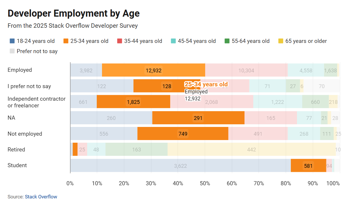
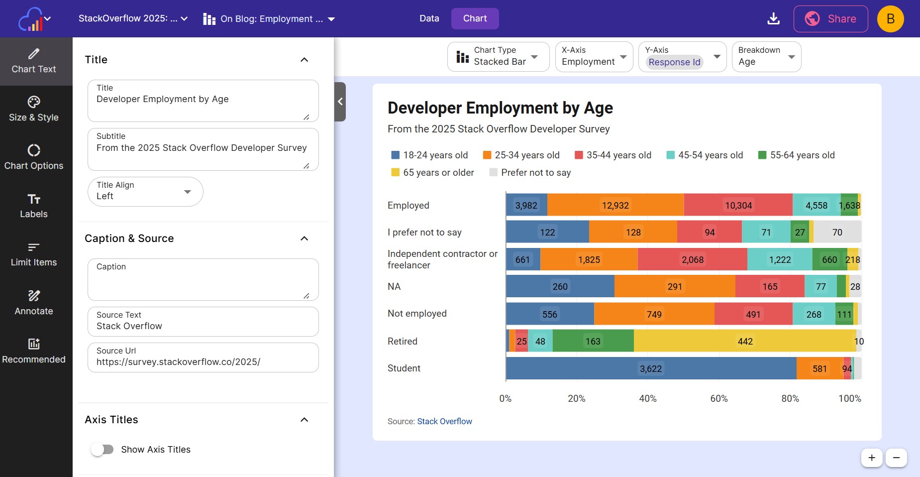
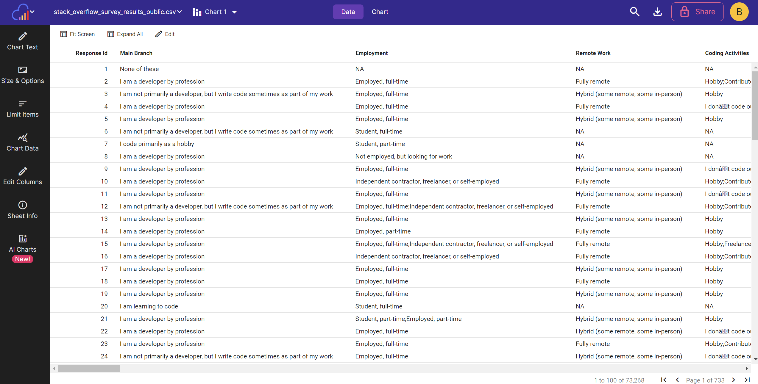
Upload the CSV or Excel export from your survey tool, or connect the Google Sheet that collects your responses. InstaCharts detects each column type and recommends charts, so you can chart your survey results right away.
Survey types
Chart Every Kind of Survey
Any survey tool: Upload a CSV or Excel export, connect a Google Sheet, or send responses in through Zapier.
Popular survey charts:
- Customer satisfaction
- Net Promoter Score
- Employee engagement
- Course & event feedback
- Market research
- Product feedback
- Exit & churn surveys
- Polls & questionnaires
Question types
The right chart for every question
Match each question to a chart that reads at a glance, like the live survey chart shown here.
Rating Questions
Count each star or score rating with a bar chart to show how satisfied respondents are.
Single Choice Questions
Split answers such as how customers heard about you into a donut or bar chart.
Select All That Apply
The Multiple Choice column type counts each selection, so every option becomes its own category.
Survey Chart
LiveLikert scales
Likert scale charts made simple
Show agreement from strongly disagree to strongly agree for every statement, like the live Likert scale chart shown here.
100% Stacked Bars
Turn on Normalize so each statement scales to 100% and every segment shows its share of responses.
Room for Long Statements
Horizontal bars give long survey statements space to stay readable.
Scale-Ordered Colors
Diverging palettes such as Red Yellow Green make the agree and disagree sides easy to tell apart.
Likert Scale Chart
LiveFeatures
Everything You Need to Report on a Survey
Compare Segments
Use a segment such as customer type, department or region as the breakdown in a grouped bar chart.
Track Scores Over Time
Plot NPS or satisfaction scores by week, month or quarter in a line graph to see the trend.
Filter Responses
Add column filters to chart only one group, one date range, or responses that match a condition.
Rank the Top Answers
Limit a chart to the top 5 or top 10 answers and sort by count to show what matters most.
Show the Response Count
Add the number of responses and survey dates to the caption, and show counts or percentages as data labels.
Survey Templates
Start from Employee Engagement, Customer Satisfaction, NPS Trend and other survey templates with sample data.
Live responses
Watch results update as responses arrive
Connect your survey to InstaCharts once, and every chart and dashboard built on it stays current.
Google Sheets Responses
Connect the Google Sheet that collects your form responses and sync whenever it changes.
Typeform & Google Forms
Send each new response into a sheet with the Zapier "Add Data Row" action.
New Exports
Add the rows from a newer survey export to your sheet, and every chart keeps its settings.
Share results
Share survey results everywhere
Put your findings in front of the people who need them, in the format they already use.
Survey Dashboards
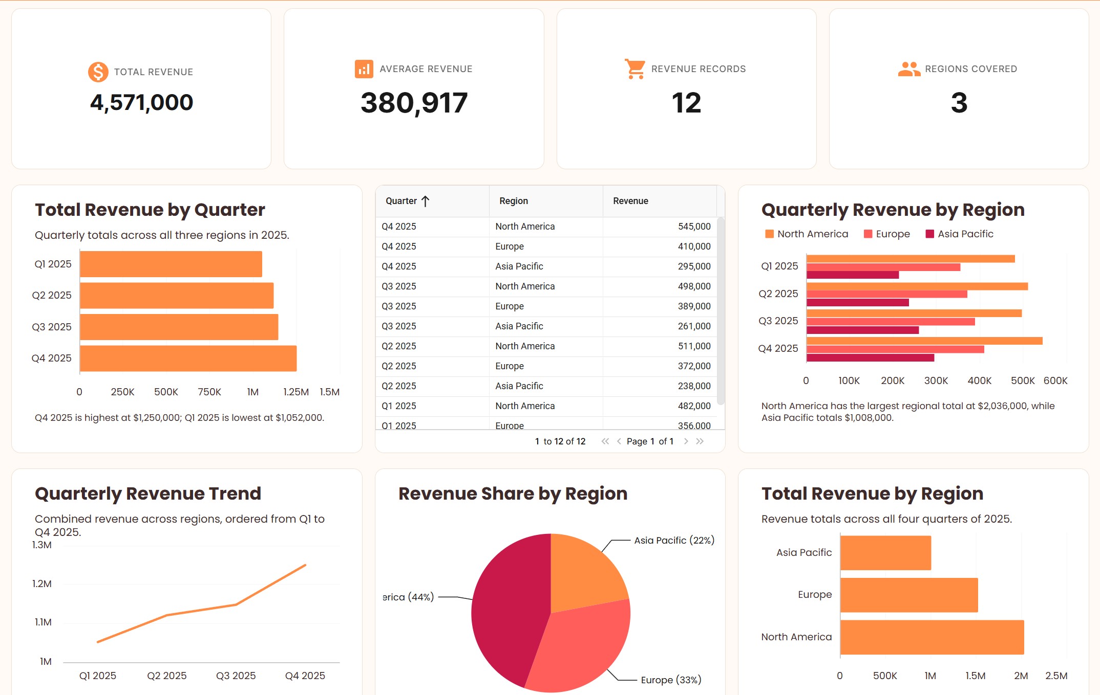
Combine a chart for each question with KPI and text widgets, and add slicers to filter by group.
Links & Embeds
Share a public link to your results, or embed live charts on a webpage or intranet.
Reports & Presentations
Export charts as PNG, SVG, PDF or PowerPoint files for survey reports and team meetings.
FAQs
Survey Results Charts FAQs
Export your responses from your survey tool as a CSV or Excel file and upload it to InstaCharts, or connect the Google Sheet that collects your responses. InstaCharts detects the column types and recommends charts, then you pick the chart that matches each question and adjust the colors and titles.
The best chart depends on the question. Bar charts suit rating scales and ranked options, donut and pie charts suit single choice questions, 100% stacked horizontal bar charts suit Likert scales, grouped bar charts compare how segments answered, and line graphs track a score such as NPS over time.
Use the Multiple Choice column type for a column where each cell holds several comma separated answers. InstaCharts counts each selection separately, so every option becomes its own category in the chart, and a repeated selection in one response counts once.
Arrange your results with one row for each statement and answer level plus a response count, choose the stacked bar chart, and turn on Normalize and Horizontal Bars in the chart options. Each statement becomes one bar that shows the share of respondents at each level, from strongly disagree to strongly agree.
Keep the answer levels in scale order and use a diverging palette such as Red Yellow Green or Spectral, so the agree side and the disagree side are easy to tell apart. InstaCharts includes 39 color palettes, including diverging and sequential palettes made for ordered data.
Add a segment column, such as customer type, department or region, and use it as the breakdown in a grouped bar chart. You can also add a column filter to chart only one group, or add slicers to a survey dashboard so viewers can switch between groups.
Yes. Chart the count of each rating with a bar chart for customer satisfaction, and track a monthly Net Promoter Score with a line graph. The Customer Satisfaction Ratings and Net Promoter Score Trend templates show both layouts with sample data.
Open text answers need to be grouped into categories before they can be charted. Add a column with a category for each answer, or use find and replace to standardize similar answers, then chart the categories with a bar chart.
Yes. Connect the Google Sheet that collects your responses and set it to sync whenever the sheet changes, or send each new Typeform or Google Forms response into InstaCharts with the Zapier "Add Data Row" action. Charts, dashboards and embeds built on the sheet show new responses as they arrive.
Add the number of responses and the survey dates to the chart caption, so readers know how much weight the results carry. Turn on data labels to show the count or percentage on each bar or slice.
Yes. Combine charts for each question, a data table of responses, KPI widgets for headline numbers such as the response count, and text widgets for key takeaways into one dashboard. Add slicers for columns such as department or region so viewers can filter every chart at once.
Share a chart with a public link, embed it on a webpage, or export it as a PNG, SVG, PDF or PowerPoint file for a report or presentation. Paid plans can also share charts and dashboards privately with specific people.
Yes. The Templates tab in the new sheet dialog includes survey examples such as Employee Engagement Survey, Customer Satisfaction Ratings, Net Promoter Score Trend, How Did You Hear About Us and Feature Priorities by Segment. Each one loads sample data and a chart you can replace with your own responses.
Yes. Generate AI charts when you upload your responses to get 3 chart suggestions with titles and captions, plus a data summary that calls out outliers and data quality issues. Auto Titles can also write a headline from the leading answers in your data.
Yes. The free plan lets you create, export and share survey charts with up to 500 rows of responses per sheet, and charts include a small watermark. Paid plans starting at $10 per user per month remove the watermark, raise the limit to 25,000 rows per sheet or more, and add scheduled syncing and dashboard sharing.
Start Charting Your Survey Results
InstaCharts makes data visualization easy, so you can build clear reports without design experience.