
For Nonprofits & NGOs
Show Your Impact and Win More Support
Turn donation data, program outcomes, and community reach into charts and dashboards for donors, board members, and grantmakers.
Impact
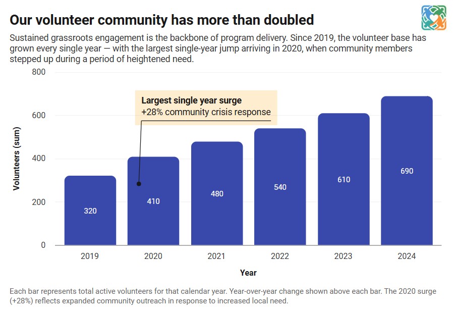
Turn Program Data Into Charts for Funders
Paste in your program data, donation totals, or beneficiary numbers and generate professional charts in minutes. Make your annual report and grant applications stand out.
Communications
Use Charts Across All Your Communications
One tool, every format: Export as PNG, PDF, or embed as a live interactive chart.
Use your charts in:
- Annual reports
- Grant applications
- Donor newsletters
- Board presentations
- Website pages
- Social media
- Email campaigns
- PDF handouts
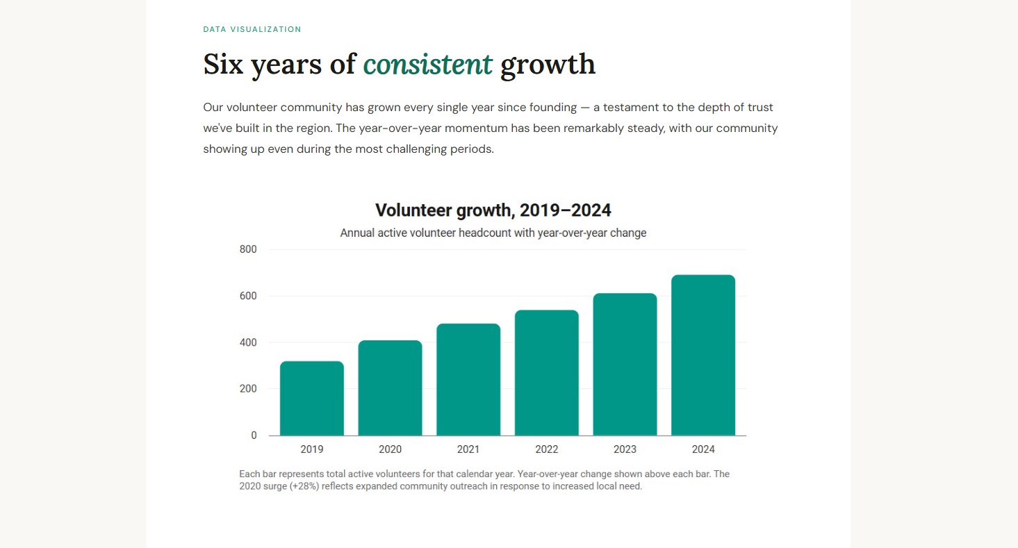
Chart types
Charts that fit nonprofit data
Show fundraising progress with a gauge chart that fills toward your goal, or a semi circle donut chart like the live example shown here, and show where donations go with a pie chart with percentages.
Fundraising Progress
A gauge or grouped gauge chart with a target line shows donors how close each campaign is to its goal.
Where Donations Go
Break down spending across programs, fundraising and administration with percentage labels.
Program Outcomes
Chart people served, meals delivered or hours volunteered over time with line and bar charts.
Grouped Gauge Goal Chart
LiveStorytelling
Charts that make your case to funders
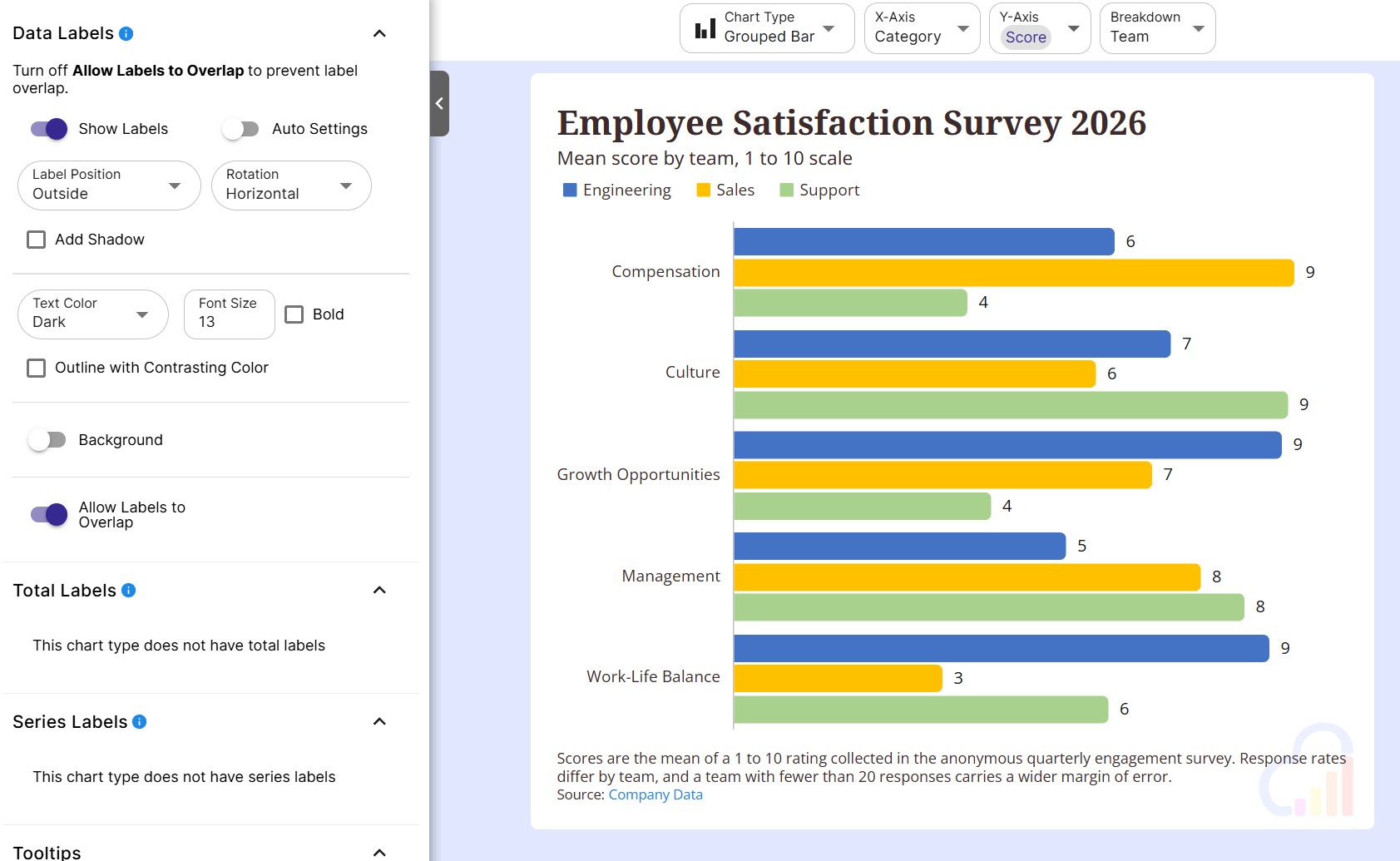
Lead donors and grantmakers to the takeaway with a clear headline, highlighted milestones and a cited source.
Auto Titles
InstaCharts writes a headline from the trends and percent changes in your data.
Annotations & Trend Lines
Highlight milestones with text annotations, and show growth with a trend line.
Caption & Source
Add a caption, source text and a source link so funders see where the numbers come from.
Features
Built for Mission-Driven Organizations
Free to Start
Create, export and embed charts on the free plan with up to 500 rows of data per sheet and 5 AI credits a month.
Accessible to Your Whole Team
No technical skills required. Program managers and communications staff can create charts without involving IT or designers.
Professional-Looking Results
Customize colors, fonts, and labels to match your brand. Deliver polished visuals that reflect the credibility of your organization.
Survey & Feedback Charts
Chart multiple choice answers and Likert scale questions from participant surveys, beneficiary feedback and event forms.
Every Export Format
Export PDF and SVG for print, PowerPoint for board meetings, and PNG, JPG or WebP for social media and emails.
See Who Views Your Impact
Share analytics counts the views of your shared and embedded charts, and lists the pages that load them.
Dashboards
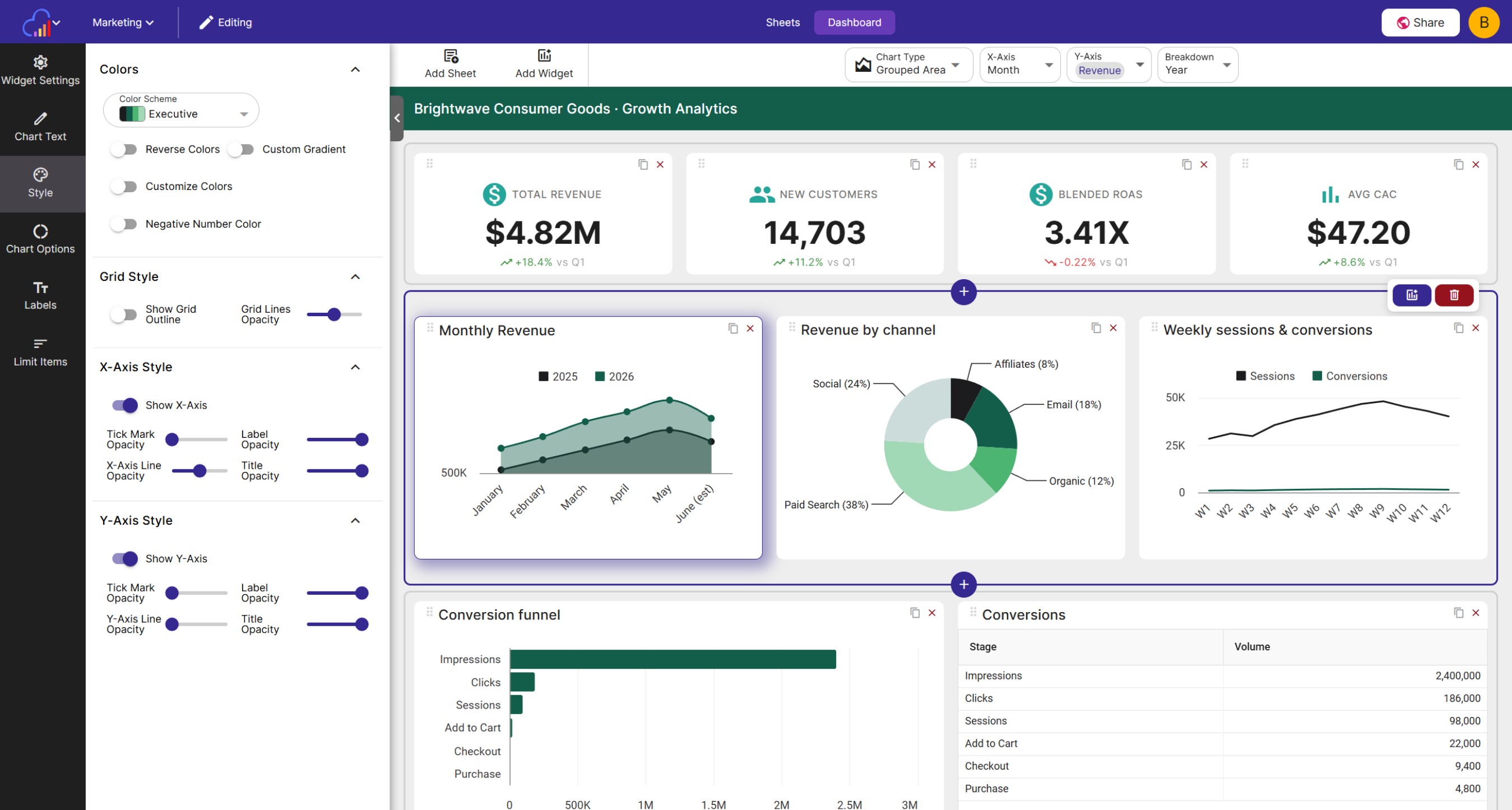
An impact dashboard for your board
Bring funds raised, program results and volunteer activity together on one live dashboard.
KPI Widgets
Call out funds raised, people served or volunteer hours in large numbers with a trend.
A Page for Each Program
Give every program its own dashboard page, with slicers to filter by region or year.
Share Publicly
Paid plans can share a dashboard with a public link so donors and partners can follow your results.
Live data
Keep campaign charts current
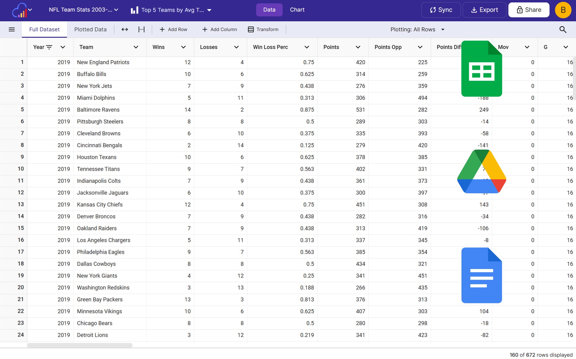
Connect the spreadsheets and forms your team already uses, and your charts update as the numbers change.
Google Sheets & Drive
Chart the donation logs and volunteer hour sheets you already keep, and sync them on a schedule.
Forms & Surveys
Add new Google Forms or Typeform responses to your charts through the Zapier "Add Data Row" action.
Online Donations
Send each new Stripe payment into a sheet with Zapier, and watch your campaign charts grow.
Team & website
Share your impact with everyone who supports you
Give your board read-only access, and show live results to visitors on your own website.
Free Viewer Seats
Paid workspaces include up to 5 free viewers for board members, advisors and partners.
Embed on Your Impact Page
Paste a chart embed code into WordPress, Squarespace or Wix to show live results to visitors.
Your Brand & Logo
Use your brand colors and fonts, and add your logo to charts and dashboard headers.

FAQs
Nonprofit Charts FAQs
Most annual reports show donations or revenue over time with a line or bar chart, how funds were spent across programs with a pie or donut chart, and program outcomes such as people served or meals delivered with a bar chart. A gauge chart works well for progress toward a fundraising goal, and a caption with a cited source tells readers where each number comes from.
Create a gauge chart from your donations column and set the Target to your fundraising goal, so donors see at a glance how close you are. To compare several campaigns, use a grouped gauge chart with one ring per campaign, or start from the Fundraising Campaign Goals template. Connect the chart to a Google Sheet to keep the total current during a campaign.
Use a pie or donut chart of spending by category, such as programs, fundraising and administration, and turn on data labels to show the percentage of each slice. A clear breakdown of spending helps donors and grantmakers see how much of each dollar reaches your programs.
Upload your program data and chart outcomes over time with a line or bar chart. Add a trend line to show growth, annotations to highlight milestones, and a caption with your data source. Export the chart as a PDF, PNG or SVG file to place it in your application.
Upload your survey export and InstaCharts detects multiple choice answers and charts each choice. Use a Likert scale chart for agreement questions such as satisfaction ratings. Connect Google Forms or Typeform through Zapier to add new responses to your charts as they arrive.
Yes. Connect the Google Sheet your team already uses and InstaCharts charts it. Paid plans can sync on a schedule or whenever the sheet changes, and free accounts can run 5 manual syncs a day, so your charts stay current as volunteers log hours or donations come in.
Yes. Use the InstaCharts "Add Data Row" action in Zapier to send each new Stripe payment, or a new row from another app, into an InstaCharts sheet. Every chart and dashboard built on that sheet updates as donations arrive.
Yes. Combine charts, data tables, KPI widgets and text widgets into one dashboard. Show funds raised, people served or volunteer hours in KPI widgets, give each program its own page, and add slicers so board members can filter by program, region or year.
Yes. Paid plans can share a dashboard publicly with a link, so donors, partners and community members can see your results in a live view. You can also share dashboards with your whole workspace or with specific people.
Yes. Copy a chart's embed code into your website builder, such as WordPress, Squarespace or Wix, to show an interactive chart on your impact or donate page. The free plan includes up to 200 embed views a month, and paid plans raise the limit.
Yes. Paid workspaces include up to 5 free viewers with read-only access to your charts and sheets. Anyone can also open a chart shared with a public link, and staff who build charts join the workspace as Editors.
Yes. Pick your brand colors and Google Fonts, and add your logo to any chart with an image annotation. Paid plans can save brand colors to the workspace, upload a shared logo for the whole team and add a logo to the dashboard header.
Use PDF or SVG for printed annual reports, PowerPoint for board presentations, and PNG, JPG or WebP for social media, donor emails and newsletters. Every chart can be exported in all six formats, and the data behind a chart exports as CSV or Excel.
Yes. Turn on Auto Titles and InstaCharts writes a headline from the trends and percent changes in your data. Generate AI charts to get 3 chart suggestions with titles and captions, plus a summary that calls out outliers. The free plan includes 5 AI credits a month.
Update the sheet behind your charts with next year's data. Overwrite the data, append new rows or add new columns from a newer file, and every chart keeps its colors, titles and annotations. Copy a dashboard to start next year's version with the same layout and theme.
Yes. The free plan lets you create and export charts with up to 500 rows of data per sheet, share and embed charts with up to 200 views a month, and use 5 AI credits a month. Charts on the free plan include a small watermark. Paid plans starting at $10 per user per month remove the watermark and add more rows, more views, scheduled syncing and dashboard sharing.
Start Showing Your Impact Today
InstaCharts makes data visualization easy, so you can build clear reports without design experience.