When to use a bar chart
Bar charts are the most flexible chart type you'll ever use. Here's exactly when they work and when to reach for something else.

The bar chart has been around since 1786, when William Playfair invented it to compare Scotland’s trade balances. Two hundred and forty years later, it’s still the most-used chart type in the world and for good reason. No other chart packs as much clarity into such a simple shape.
But “use a bar chart” isn’t always the right answer. There are four situations where bar charts genuinely shine, a couple of variants that most people overlook, and a handful of cases where you should use something else entirely. This guide covers all of it.
What is a bar chart?
A bar chart represents data as rectangular bars. The length of each bar is proportional to the value it represents. That’s it. The genius is in the simplicity: our eyes are exceptionally good at judging the relative length of lines, which means bar charts are almost always easier to read than pie charts, tables, or most other formats.
There are two orientations:
- Vertical bars (sometimes called a column chart) run bottom-to-top
- Horizontal bars run left-to-right
Both are bar charts. Which one to use is covered below.
The four situations where bar charts belong
1. Comparing values across categories
This is the classic use case. You have a set of distinct categories (ex: products, countries, departments, candidates, anything) and you want to show how a single number differs between them.
Example: You’re presenting Q3 sales by region. You have five regions: North, South, East, West, and Central. A bar chart lets your audience immediately see which region performed best and roughly how far ahead it was; all without anyone doing mental arithmetic.
 A vertical bar chart makes regional comparisons instant to read
A table of the same five numbers would require readers to compare each figure in their head. A bar chart does that work for them.
Rule of thumb: If someone could ask “which one is biggest?” about your data, a bar chart will answer that question faster than anything else.
2. Ranking data
Bar charts are the best chart type for ranked data. When the order matters (ex: top 10 movies by box office gross, most-used programming languages, countries by GDP) a horizontal bar chart sorted from highest to lowest is almost always the right choice.
 Sorted horizontal bars make rankings effortless to read
Why horizontal for rankings? Two reasons. First, category labels (movie titles, country names) tend to be long, and they fit cleanly on a horizontal axis without getting rotated or truncated. Second, ranked lists feel natural reading top-to-bottom, which horizontal bars support.
Example: A “Top Streaming Shows by Hours Watched” chart. Sort bars from most to least watched. Your reader’s eye moves straight down the list; no scanning back and forth across a table required.
3. Showing changes over time when you have few time points
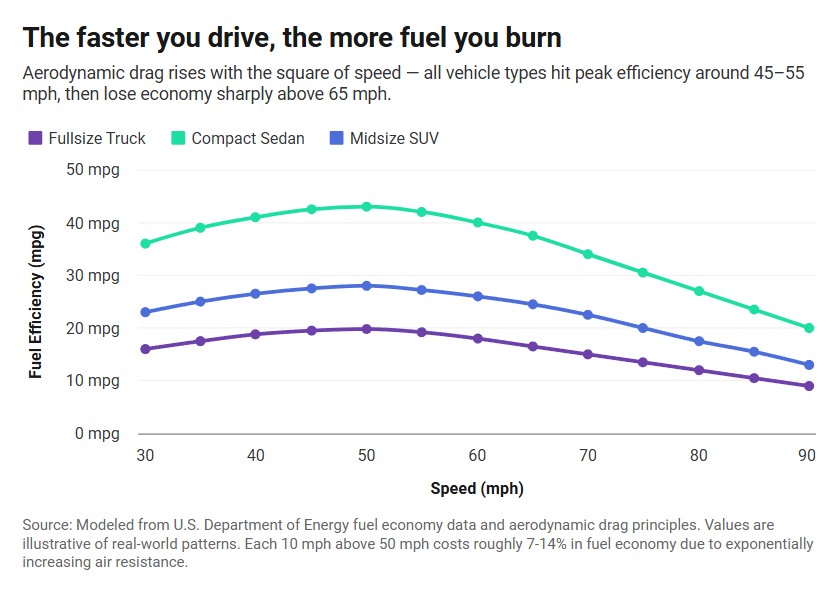
Bar charts can show change over time, but only when you have a small number of time points and the gaps between them are equal and meaningful on their own.
Good fit: Monthly revenue for a single year (12 bars). Annual headcount for five years (5 bars). Quarterly customer count (4 bars).
Bad fit: Daily stock prices for a year (365 bars: use a line chart). Weekly website traffic over two years (use a line chart).
The dividing line is roughly 12–15 data points. Beyond that, bars become hard to read individually and a line chart handles the trend story better.
 Monthly bars work well when each period stands on its own
4. Showing frequency distributions
A frequency distribution answers the question: “How often does each value occur?” Bar charts handle this beautifully.
Example: You survey 200 customers and ask them to rate their satisfaction from 1 to 5. A bar chart showing how many people chose each rating immediately shows whether responses cluster at the extremes, pile up in the middle, or split evenly. A table of the same five numbers tells you almost nothing at a glance.
This is also how histograms work; they’re technically a specific type of bar chart used for continuous data, with no gaps between bars.
Vertical vs. horizontal: a quick decision guide
Most people default to vertical bars without thinking about it. Here’s when to flip to horizontal:
| Use vertical bars when… | Use horizontal bars when… |
|---|---|
| The time axis goes left to right | Category labels are long (more than ~10 characters) |
| You have 8 or fewer categories | You have more than 8 categories |
| Categories have short names | You’re showing a ranked list |
| The chart will be tall and narrow | The chart will be wide |
When in doubt and your labels are short, go vertical. When labels are long or you’re ranking, go horizontal.
Stacked and grouped bar charts
Once you need to show two variables at once (not just one number per category) you need either a stacked or grouped bar chart.
Grouped bar charts
A grouped bar chart places bars for different sub-categories side by side within each main category. Use this when you want readers to compare both within a category and across categories.
Example: Monthly sales for three product lines. Each month gets three bars, one per product, sitting next to each other. A reader can compare January’s three products, and also see how Product A performed across all 12 months.
 Grouped bars show within group comparisons and across group trends
The catch: Grouped bars get crowded fast. More than 3-4 sub-categories makes them hard to read. If you have more than that, consider splitting into separate charts.
Stacked bar charts
A stacked bar chart places sub-categories on top of each other to build a single bar. Use this when the total across sub-categories matters as much as the breakdown.
Example: Movie production budget broken down by rating: G, PG, PG-13, R, etc. Each month’s bar shows an average production budget, and the segments show how the mix shifted over time.
 Stacked bars show both total size and how components contribute to it
The catch: Stacked bars make the bottom segment easy to compare (it has a consistent baseline), but the middle and top segments are hard to compare because their baselines shift. If comparing individual segments across categories is the main point, use a grouped bar chart instead.
Mistakes that make bar charts harder to read
Even a straightforward chart can mislead or confuse if these details are off.
Truncated y-axis. Starting your value axis at anything other than zero exaggerates differences. A bar that’s 10% taller than another looks enormous if the axis starts at 90. Always start at zero for bar charts. Unlike line charts, the length of the bar is the data.
Too many categories. More than about 12 bars in a single chart usually means the chart is carrying too much. Either filter to the most important categories, split into multiple charts, or reconsider whether a table might serve the reader better.
Random ordering. If your data isn’t time-based, sort the bars. Unsorted bars force the reader to search for the highest and lowest values. Sorted bars hand them that answer immediately.
Inconsistent colors. Using different colors to represent the same category across two charts, or using too many colors in a single chart, adds visual noise without adding information. Pick one color for single-variable bar charts, and use color only when it encodes a second variable.
3D bars. Three-dimensional bar charts look impressive in a PowerPoint but make it genuinely harder to judge bar lengths accurately. Flat is better.
When to use a different chart type
Bar charts aren’t always the answer. Here’s a quick guide to alternatives:
Line chart: You have more than ~12 time points and the trend between points matters. Stock prices, daily temperatures, monthly user growth over several years: these all tell a story through the continuous line, not through individual bar heights.
Pie or donut chart: You have 2–5 categories that add up to a meaningful whole (like market share), and you want to show proportions rather than raw values. Even then, a horizontal bar chart is usually more precise; pie slices are hard to compare accurately.
Scatter plot: You want to show the relationship between two numerical variables. “Does ad spend correlate with sales?” is a scatter plot question, not a bar chart question.
Table: The exact numbers matter more than the visual pattern. If someone will read the chart and immediately need to know the precise value (for a financial report, for instance) a table may serve better than a chart.
Heatmap: You have many categories on two dimensions and want to show intensity rather than exact values. A bar chart with 50 categories across 12 months is a mess; a heatmap handles it cleanly.
 Picking the right chart type makes your data easier to understand at a glance
Five practical tips for better bar charts
1. Label directly when you can. Putting the value at the end of each bar (or directly on it) removes the need for the reader to track across to the axis. This is especially useful in horizontal bar charts.
2. Put your most important category first or last. Readers notice the first and last items in a list. If you have a category you want to highlight, sort so it anchors the chart.
3. Keep the title specific. “Sales by Region” is fine. “West Region Led Q3 with 34% Revenue Growth” is better. A descriptive title does half the interpretive work before the reader looks at a single bar.
4. Give your axis a unit. ”$” or ”%” or “thousands” in the axis label prevents misreading. Don’t make people guess whether those bars represent dollars or units.
5. Less color, not more. A single color with one contrasting highlight (for the bar you want to call out) is almost always cleaner and more effective than a rainbow of colors.
Create a bar chart with InstaCharts
InstaCharts is a free bar chart maker. Paste in your data or upload a CSV, pick bar chart, and you’ll have a clean, embeddable chart in under a minute. No design experience needed, no developer required; the charts work in WordPress, Ghost, Substack, or anywhere else you publish.
Try the demo or create a free account to get started.