When to use a line chart
The line chart is the go-to chart for showing how something changes over time. Here's exactly when it works, when it doesn't, and the mistakes that make them hard to read.

If you’ve ever looked at a stock chart, a weather forecast, or a fitness app’s progress graph, you’ve already read a line chart. It’s one of the oldest chart types in data visualization (William Playfair invented it in 1786 in the same publication where he invented the bar chart!) and it remains one of the most useful. But “just use a line chart” is advice that gets misapplied constantly.
Line charts are built for one thing: showing how a value changes continuously. When that’s what your data is doing, a line chart is almost always the right choice. When it isn’t, a line chart will actively mislead your audience. This guide covers how to tell the difference.
What is a line chart?
A line chart plots individual data points and connects them with a line. The horizontal axis (x-axis) almost always represents time or some other continuous sequence. The vertical axis (y-axis) represents the value being measured.
The line itself is the message. It says: these points are connected, and the path between them tells a story. That’s also the source of the chart’s one firm rule: you should only connect points with a line when movement between them is meaningful. More on that in a moment.
The three situations where line charts belong
1. Showing how something changes over time
This is the primary use case, and it’s where line charts are unbeatable. If your x-axis is a time dimension (ex: hours, days, months, years) and the values between your data points represent a continuous real-world process, use a line chart.
 A line chart makes showing changes over time instant to read
Examples:
- Monthly website traffic over the past two years
- Daily temperature readings throughout a week
- Annual revenue from 2018 to 2025
- A patient’s heart rate during a 30-minute stress test
- Weekly active users since a product launched
The line chart works here because the space between data points is real. If your traffic was 12,000 sessions in January and 18,000 in February, something must have happened in between: a campaign went live, a post went viral, or SEO rankings shifted. The line’s slope signals that change without showing every individual day’s data.
Rule of thumb: If someone could ask “what’s the trend (over time)?” about your data, a line chart will answer that faster than anything else.
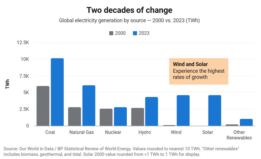
2. Comparing multiple trends over time
A multi-line chart, where each line represents a different series, is one of the most powerful charts you can build. It lets your audience compare rates of change at a glance, not just absolute values.
 A multi-line chart uses color to separate trends, making comparisons immediate
Examples:
- Revenue by product line across 12 months: you can immediately see which product is accelerating and which is flattening out
- New user sign-ups across three marketing channels over a quarter: which channel responded to the mid-month push?
- Average temperatures in four cities across a full year: do they converge in summer or stay spread apart?
- Portfolio performance vs. a benchmark index over five years
The key insight multi-line charts offer is relative rate of change. Two products might both be growing, but the one with a steeper slope is growing faster; a line chart makes that visible in a single glance. A table of the same numbers requires real mental effort to see the same thing.
Practical limit: Three to five lines is about the maximum before the chart becomes hard to follow. Beyond that, consider splitting into small multiples (separate charts per series) or highlighting only the lines you want your audience to focus on.
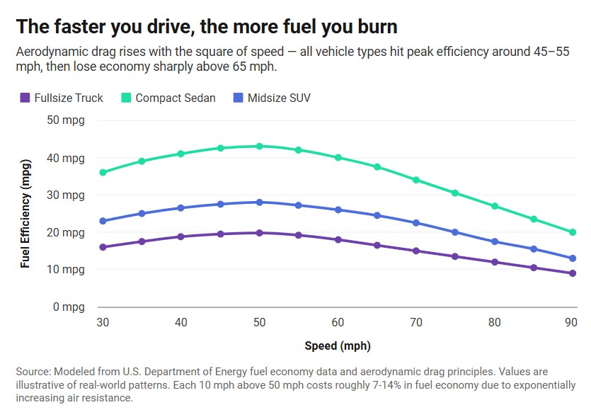
3. Showing a relationship between two continuous variables
Less common but equally valid: a line chart can show how one continuous variable responds to another. Here the x-axis isn’t time; it’s another measured quantity.
 A multi-line chart measuring speed vs fuel efficiency
Examples:
- How crop yield changes as rainfall increases from 0 to 80 inches per year
- How a car’s fuel efficiency changes as speed increases from 30 to 90 mph
- How drug effectiveness changes with dosage
This use case is close to a scatter plot, and the choice between them matters. Use a line chart when the x-axis values are ordered and the relationship is expected to be smooth and continuous. Use a scatter plot when you have many individual observations and want to show the distribution of the data, not just the overall pattern.
When to use a different chart type
The most common line chart mistake isn’t a formatting issue, it’s using a line chart when the data doesn’t support one.
| Your data looks like this… | Use this instead |
|---|---|
| Comparing values across a few distinct categories (not time) | Bar chart |
| Tracking a single time series with fewer than ~6 data points | Bar chart |
| Showing what percentage each category contributes to a whole | Pie or donut chart |
| Showing the relationship between two variables with many points | Scatter plot |
| Showing how a value is distributed across a range | Histogram |
| Showing change over time across many categories simultaneously | Heatmap |
The most important row is the first one. Never use a line chart to connect categorical data. If your x-axis is something like “New York, London, Tokyo, Sydney” (i.e. categories with no inherent order or continuity between them) drawing a line between those points implies a relationship that doesn’t exist. A bar chart is the correct tool for categorical comparisons.
This mistake appears surprisingly often in business reports: someone has quarterly data for five different regions and connects each region’s bars with a line. The line implies that there’s a meaningful path from New York to London to Tokyo, which there isn’t. Use grouped bars instead.
Mistakes that make line charts harder to read
Even when a line chart is the right choice, these errors undermine it.
Connecting points that shouldn’t be connected. If your data has gaps (such as months with no readings, categories that were discontinued, etc.) a continuous line through the gap fabricates data that doesn’t exist. Break the line at gaps, or use dotted segments to signal that the connecting path is an estimate.
Too many lines. Six or more lines in the same chart usually produces a tangle of color that nobody can parse. The temptation is to show everything; the right move is to pick the lines that tell your story and either remove or gray out the rest. Color is attention; use it for what matters.
A y-axis that doesn’t start at zero (when it misleads). Unlike bar charts, line charts don’t always need to start at zero. A stock price chart that zooms in to show daily movement is completely legitimate. But if you’re comparing two trends and one of them barely moves while the other swings wildly, a truncated axis can make a flat line look volatile. Ask yourself whether a reader would be surprised to learn your axis doesn’t start at zero.
Dual y-axes. Putting two different value scales on the same chart (one on the left, one on the right) is sometimes a bad idea. The visual correlation it implies depends entirely on how you scale the two axes, and it’s easy to make any two trends appear correlated or uncorrelated by adjusting the scales. If the two series have meaningfully different units, consider two separate charts.
Plotting too many data points without smoothing. Daily data over five years is 1,825 points. That’s a valid dataset, but if every point is plotted as a dot on the line, the chart becomes visual noise. Either plot the line without dots, aggregate to weekly or monthly, or apply a moving average to show the signal beneath the noise.
Five tips for better line charts
1. Let the title state the finding, not just the topic. “Monthly Active Users” is a label. “Monthly Active Users Grew 40% After March Rebrand” is a headline. The second version does half the reader’s interpretive work before they look at the chart.
2. Label the lines directly when you can. A legend requires the reader to look back and forth between the legend and the lines. End-of-line labels eliminate that work entirely. If two lines finish close together, nudge one label up or down; it’s worth it.
3. Use the right time granularity. Hourly data makes sense for a 24-hour monitoring dashboard. It makes no sense for a five-year revenue report. Match your time intervals to the decisions your audience will make with the chart. Too granular and the noise overwhelms the signal; too coarse and you lose the detail that matters.
4. Highlight the important moment. If there’s a product launch, a policy change, or an event your audience should connect to a change in the line, annotate it. A vertical line at the date plus a one-line note turns a puzzling dip or spike into an explained finding.
5. Don’t force smoothing when the real data is the point. Moving averages are useful for noisy data, but if your audience needs to see specific data points (ex: a quarterly earnings call, weekly sprint velocity, individual race results) plot the actual values. Smoothing that serves clarity is good; smoothing that hides inconvenient volatility is not.
Create a line chart with InstaCharts
InstaCharts is a free line graph maker. Paste in your data or upload a CSV, pick line chart, and you’ll have a clean, embeddable chart in seconds. No design background needed; the charts work in WordPress, Ghost, Substack, or anywhere else you publish.
Try the demo or create a free account to get started.