When to use a pie chart
Pie charts have one job - showing how parts make up a whole. They do it well when used correctly, and badly when they're not. Here's exactly when to reach for one and when to use something else.

Pie charts might be the most argued-about chart type in data visualization. Designers love to criticize them. Business people love to use them. The truth is somewhere in between: a pie chart is a genuinely useful tool in a narrow set of situations, and a genuinely bad choice in most others.
The key is knowing which situation you’re in before you start building the chart.
What is a pie chart?
A pie chart is a circle divided into slices, where each slice represents a category’s share of a whole. The size of each slice is proportional to its percentage of the total. That’s the entire concept, and it’s also the source of both the chart’s strengths and its limits.
A donut chart is the same thing with a hole in the middle. The hollow center is sometimes used to display the total or a single key number, which can be useful. For the purposes of deciding when to use one, they’re interchangeable.
 The pie chart works best here because there are five or fewer categories, the differences between slices are large enough to be visually meaningful, and the part-to-whole relationship (each source’s share of total capacity) is the primary message.
When pie charts work
There is exactly one question a pie chart is designed to answer: what share of the total does each category represent? When that’s your question, a pie chart is a natural fit.
The parts add up to a meaningful whole
The most important condition for a pie chart is that your categories sum to something real and complete. Market share across all competitors, budget allocation across all departments, votes cast across all candidates: in each case, the total is 100% of something that exists in the real world.
If your categories don’t add up to a meaningful whole, you don’t have pie chart data. A survey where respondents could select multiple answers, for example, will produce percentages that sum to more than 100%. A bar chart is the right tool there.
You have few categories
Pie charts start breaking down fast as the number of slices grows. With two or three categories, a pie chart is clean and readable. With five or six, it still works if the slices are reasonably sized. Beyond six, the smaller slices become too thin to read accurately, and the chart requires a legend that forces the reader to look back and forth to match colors to labels.
The practical limit is five to six slices. If you have more, either group the smallest categories into an “Other” slice or switch to a horizontal bar chart.
The exact values matter less than the rough proportions
Pie charts are good at conveying a general sense of magnitude, such as “roughly a third,” “just over half,” “a small sliver.” They are poor at conveying precise values. If a reader needs to know that one category is 34% and another is 31%, a pie chart will not help them see that difference clearly. A bar chart will.
This means pie charts work best in editorial and presentation contexts (ex: a slide, a dashboard summary, an infographic) where you want to communicate a dominant share or a striking imbalance quickly, not where precision is the point.
Real examples where pie charts fit
Market share: Four major smartphone makers control the global market. A pie chart immediately shows that two of them account for most of it, with the others sharing the remainder.
Budget breakdown: A project budget divided across five cost categories. The pie shows at a glance that staffing dominates, with tools and travel as minor slices.
Election results: A three-candidate race where one candidate won decisively. The winning slice takes up more than half the circle; the story is obvious without reading the percentages.
Traffic sources: Website traffic split between organic search, direct, social, and referral. Four categories, they sum to 100%, and you want to see which channel dominates.
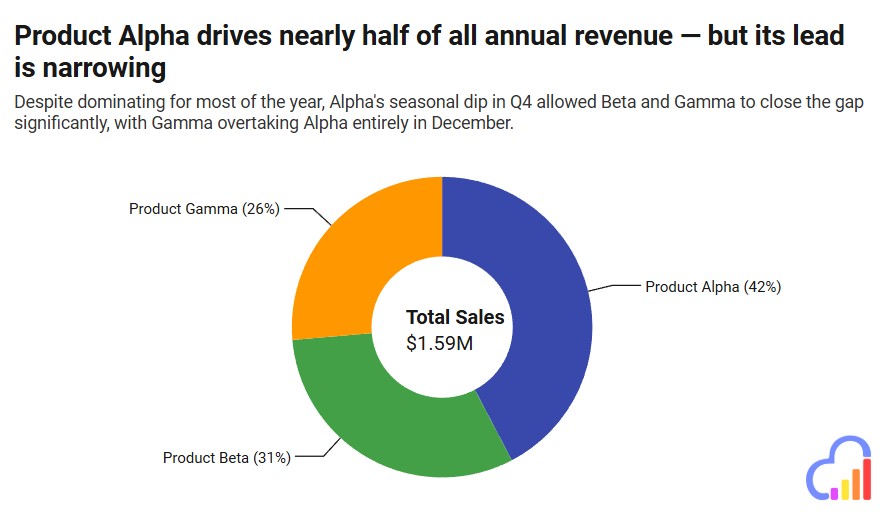
 Use a pie chart to make the dominant category immediately clear
When to use a different chart type
Most misused pie charts fall into one of these categories. If your data fits any of these descriptions, a pie chart will work against you.
| Your situation | Use this instead |
|---|---|
| More than 6 categories | Horizontal bar chart |
| You need readers to compare two close values precisely | Bar chart |
| Categories don’t sum to a meaningful 100% | Bar chart |
| Showing how a proportion has changed over time | Line chart or stacked bars |
| Showing values that aren’t percentages or shares | Bar chart |
| Survey with multi-select answers (totals exceed 100%) | Bar chart |
The most common misuse is trying to compare similar-sized slices. Human eyes are surprisingly bad at judging angles and arc lengths. Two slices of 28% and 32% will look nearly identical in a pie chart; your reader cannot reliably tell which is larger without reading the labels. Side-by-side bars make that difference instantly visible.
Mistakes that undermine pie charts
Too many slices. A pie chart with ten categories doesn’t give the reader ten pieces of information, it gives them visual chaos. Thin slivers at 2% and 3% are almost impossible to distinguish, and labeling them requires either a crowded legend or overlapping callouts. Group anything below about 5% into “Other” and reserve a footnote for the full breakdown.
Starting comparisons across two separate pie charts. Comparing two pie charts side by side is one of the hardest comparisons to make visually. “Has the share of mobile traffic grown since last year?” is a question that two pie charts answer badly and a grouped bar chart or a simple line chart answers cleanly.
3D pie charts. Three-dimensional pie charts distort slice sizes because the slices at the front of the “tilt” appear larger than those at the back. This is not a subtle effect; it actively misleads. Flat is always better.
Exploded slices for emphasis. Pulling a single slice out from the pie to highlight it changes the apparent size of that slice relative to the rest. If you want to call attention to a specific slice, label it clearly or use a contrasting color instead.
Inconsistent color use. Using the same color for two different categories across charts, or choosing colors that are difficult to distinguish for readers with color blindness, creates confusion. If you have more than four or five slices, test that the colors are distinguishable in grayscale; some charts end up in black-and-white print or on screens with poor contrast.
Five tips for better pie charts
 Use a donut chart to add inportant information to the middle of the chart, such as an overall total
1. Sort slices from largest to smallest, starting at 12 o’clock. Readers naturally start reading a circle from the top. Beginning with the largest slice there and moving clockwise makes the ranking immediately clear without requiring the reader to scan the whole chart.
2. Label slices directly with percentages. If the slice is large enough to hold a label, put the percentage directly on it. This removes the need for a legend entirely on simple charts. Thin slices that can’t hold a label can use callout lines, but keep them clean: only use them for slices worth highlighting.
3. Limit your color palette. Each slice gets its own color, which means pie charts already push toward visual complexity. Use a restrained palette with good contrast between adjacent slices. If you want to highlight one category, use your accent color for that slice and a neutral gray for everything else.
4. State what the whole represents in the title or subtitle. “Q3 Revenue by Channel” is fine, but “Q3 Revenue by Channel - $2.4M Total” is better. Knowing the absolute size of the whole makes the proportions meaningful. A 40% slice means something very different depending on whether the total is $10,000 or $10 million.
5. Consider a donut chart when you have a key number to feature. The hole in the center of a donut chart is valuable real estate. Displaying the total, the dominant category’s name, or a key derived metric there adds information without adding visual clutter.
Create a pie chart with InstaCharts
InstaCharts is a free pie chart maker. Paste in your data or upload a CSV, pick pie or donut chart, and you’ll have a clean, embeddable chart in seconds. No design background needed; the charts work in WordPress, Ghost, Substack, or anywhere else you publish.
Try the demo or create a free account to get started.