When to use a scatter plot chart
Scatter plots answer the question no other chart can - is there a relationship between these two things? Here's when to use one, what the patterns actually mean, and the mistakes that make them misleading.

Most chart types answer one of two questions: how much? or how has this changed? Bar charts, line charts, pie charts: they’re all built around those two ideas. The scatter plot is different. It answers a third question that the others can’t touch: is there a relationship between these two things?
That single purpose makes scatter plots one of the most useful analytical tools in data visualization, and also one of the most misread. This guide covers when to reach for one, how to read what you see, and what to watch out for.
What is a scatter plot?
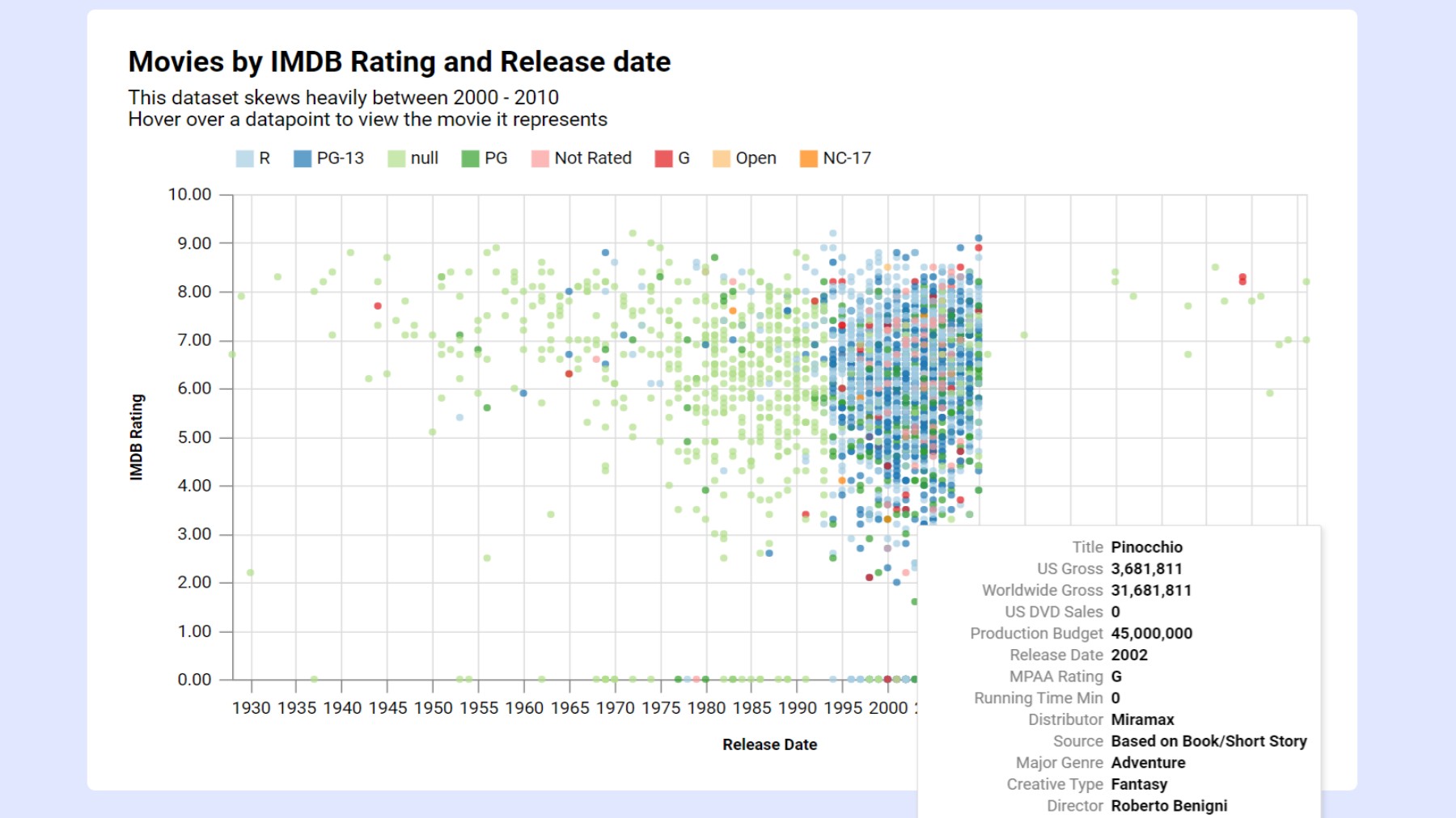
A scatter plot places individual data points on a two-axis grid. Each point represents one observation, and its position encodes two values at once: the x-axis value and the y-axis value for that observation. With enough points, a pattern (or the absence of one) becomes visible across the whole dataset.
That’s what makes scatter plots unique. Every other chart type summarizes data (totals, averages, counts). A scatter plot shows the raw data itself, which means it reveals things that summaries hide: outliers, clusters, non-linear relationships, gaps in the data.
When scatter plots belong
1. Looking for a relationship between two variables
This is the core use case. If you have two numeric measurements for each item in your dataset and you want to know whether they move together, a scatter plot is the right tool.
Examples:
- Does advertising spend correlate with sales revenue? Plot each month as a dot: ad spend on the x-axis, revenue on the y-axis. If the dots trend upward left to right, there’s a positive relationship.
- Do houses with more square footage sell for more? Each house is a dot. Square footage on x, sale price on y.
- Does a student’s attendance rate predict their final grade? Each student is a dot.
- Is there a relationship between a country’s average income and its average life expectancy?
 Each dot is a country’s average income plotted against its average life expectancy
The relationship you find will be one of four types:
- Positive correlation: dots trend upward left to right. As one variable increases, the other tends to increase too.
- Negative correlation: dots trend downward left to right. As one increases, the other tends to decrease.
- No correlation: dots scattered with no pattern. The two variables move independently.
- Non-linear relationship: dots follow a curve rather than a straight line; a relationship exists, but it isn’t proportional.
A trend line (also called a regression line) drawn through the points makes the direction and strength of the relationship easier to see. Most charting tools can add one automatically.
2. Spotting outliers
Scatter plots are one of the best tools for finding data points that don’t fit the pattern. When most of your data clusters in one area and a handful of points sit far from the group, those outliers jump out visually in a way that’s nearly impossible to see in a table or a bar chart.
Examples:
- A sales scatter plot where most reps cluster in a similar revenue range, but one sits far ahead of the others, and one sits far behind. Both deserve investigation.
- A product performance chart where most items land near the origin (low cost, low revenue), but two are in completely different quadrants.
Outliers in a scatter plot aren’t necessarily errors; they’re signals. They’re either the most interesting data points in your set or the ones most worth checking for mistakes.
3. Comparing groups within the same dataset
Color is a powerful tool in scatter plots. When you have two or more groups in your data, you can assign each group a different color and plot them all on the same chart. Instead of asking “does X relate to Y?”, you’re now asking “does X relate to Y differently for each group?”
 Color separates groups, making it easy to see whether the relationship differs between them
Examples:
- Sales performance by region: each rep is a dot, colored by region. You can see whether the correlation between calls made and deals closed holds up in every region or just some.
- Biology data where male and female subjects are plotted separately. Do the two groups overlap completely, or does one cluster show a distinct pattern?
This use of scatter plots is common in scientific research, but it’s just as useful in business analysis. Segmenting by color can reveal that what looks like a single weak trend is actually two strong but opposite trends that cancel each other out in aggregate.
When to use a different chart type
| Your goal | Use this instead |
|---|---|
| Showing how a single variable changes over time | Line chart |
| Comparing values across categories | Bar chart |
| Showing the distribution of a single variable | Histogram |
| One of your variables is categorical, not numeric | Bar chart |
| You have very few data points (fewer than ~10) | Bar chart with labels |
| Showing three variables at once (adding a size dimension) | Bubble chart |
The most important row is the fourth one. Scatter plots only make sense when both axes are numeric and continuous. If your x-axis is a set of categories (product names, months as labels, job titles), you don’t have two numeric variables; you have a bar chart waiting to be built.
What scatter plots can’t tell you
Correlation is not causation. This is the most important limitation to understand. A scatter plot can show that two variables move together. It cannot tell you why. Ice cream sales and drowning incidents are positively correlated, both rise in summer, but one doesn’t cause the other.
When you present a scatter plot, you’re showing a pattern. Explaining what drives that pattern requires additional context, domain knowledge, and often a more rigorous analysis. Be careful about the claims you make from a scatter plot alone, and be skeptical when others make strong causal claims from one.
Sample size matters. A scatter plot with 12 data points that appears to show a strong correlation may simply be noise. The same trend across 1,200 points is much more credible. The visual appearance of correlation can be convincing even when the underlying relationship is weak. When in doubt, show the trend line’s confidence interval, or report the correlation coefficient (r-value) alongside the chart.
Mistakes that undermine scatter plots
Overplotting. When you have thousands of data points, dots stack on top of each other and the chart becomes a solid smear. The fix is to reduce the dot size, add transparency to the dots so overlapping areas appear darker, or use a density plot if the dataset is very large.
Connecting the dots. Adding lines between scatter plot points implies a sequence or time-order between observations. Unless your data actually has a meaningful order, don’t connect the dots: you’ll imply a relationship that doesn’t exist. A line chart is the right tool when order matters.
Ignoring axis scale. Compressing or expanding an axis can make a weak correlation look strong or a strong one look weak. Both axes should be scaled to cover the actual range of the data without excessive padding, and neither should be manipulated to push dots into a more convincing pattern.
Forcing a linear trend line onto non-linear data. If your dots clearly follow a curve, a straight trend line will misrepresent the relationship. A trend line that cuts through the middle of a U-shaped cloud of points suggests no correlation when there clearly is one, it’s just not linear.
Five tips for better scatter plots
1. Put the variable you’re trying to explain on the y-axis. Convention and intuition both say the y-axis holds the outcome (what you’re trying to predict or explain) and the x-axis holds the input (what you think drives the outcome). Sales revenue on y, ad spend on x. Test scores on y, study hours on x. This makes the chart read naturally.
2. Add a trend line but don’t hide behind it. A trend line summarizes the relationship across the whole dataset. It’s useful. But always show the underlying dots too; the scatter around the line tells you how strong (or weak) the relationship actually is. A tight cluster around the line is a strong signal. A loose cloud with a mild slope is a weak one, even if the line looks convincing.
3. Label your outliers. An unlabeled outlier is a mystery. A labeled one is a story. If a specific data point sits far from the pack, name it: the team, the product, the country. The outlier is often the most interesting thing in the chart.
4. Keep the dot size consistent unless size encodes a third variable. Variable dot sizes imply a bubble chart, where size represents a third numeric dimension. If you’re only plotting two variables, keep all dots the same size. Inconsistent sizing introduces a phantom variable that confuses readers.
5. Use color purposefully. In a single-group scatter plot, one color is enough. Add color only when it encodes something real, like a second categorical variable, a threshold, or a specific group you’re highlighting. Random or decorative color in a scatter plot adds noise without adding information.
Create a scatter plot with InstaCharts
InstaCharts is a free scatter plot maker. Paste in your data or upload a CSV, pick scatter plot, and you’ll have a clean, embeddable chart in seconds. No design background is needed; the charts work in WordPress, Ghost, Substack, or anywhere else you publish.
Try the demo or create a free account to get started.