When to use an area chart
An area chart is a line chart with the space below filled in. That one difference changes everything about when it works and when it doesn't. Here's the full breakdown.

An area chart looks like a line chart where someone filled in the space between the line and the x-axis. That seems like a small cosmetic change, but it fundamentally shifts what the chart communicates and it’s the reason area charts work well in some situations and actively mislead in others.
The fill adds a sense of volume. Where a line chart says “here’s the trend,” an area chart says “here’s how much accumulated over time.” Understanding that distinction is the whole key to using area charts correctly.
What is an area chart?
An area chart plots data points connected by a line, with the region between the line and the baseline filled in with a solid or semi-transparent color. The x-axis almost always represents time. The y-axis represents the value being measured.
There are two main variants:
- Standard area chart: Each series has its own baseline at zero. Series can overlap, which requires transparency to stay readable.
- Stacked area chart: Series are layered on top of each other so they don’t overlap. The top of the stack represents the combined total. Each band’s thickness shows its individual contribution.
These two variants are used for completely different purposes, which is covered below.
When area charts work
1. Showing volume or magnitude over time, not just the trend
This is the area chart’s primary advantage over a plain line chart. The filled region creates a visual sense of accumulated quantity. The chart doesn’t just show where the line is; it shows how much space it occupies.
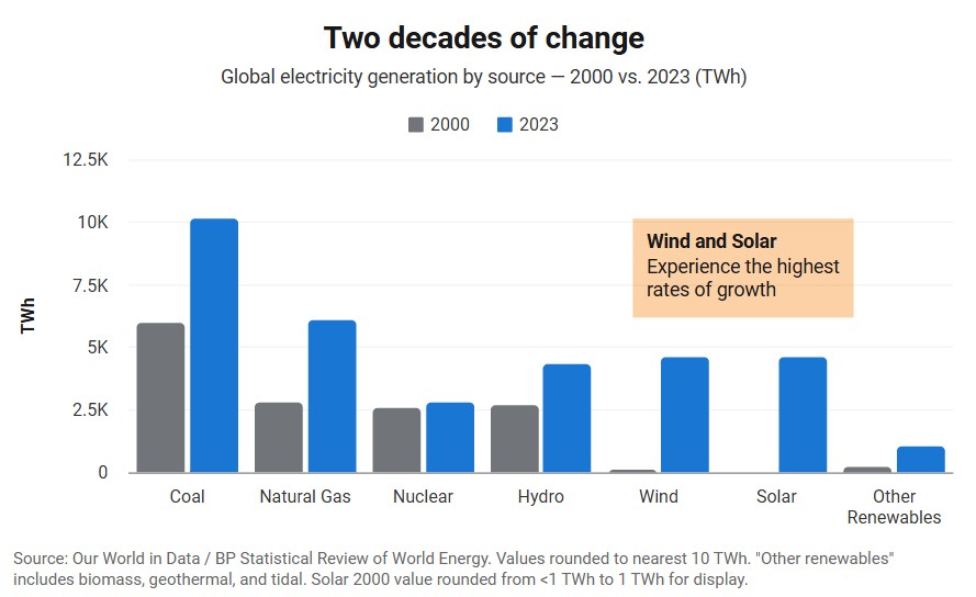
 An area chart shows how global electricity generation grows over the past few decades
This matters when the size of a value is as important as its direction. Monthly revenue is a good example. A line chart shows whether revenue went up or down. An area chart shows whether revenue was large or small: the shaded region feels heavy when the number is big, thin when it’s small.
Examples:
- Total energy consumption over a year: the filled area represents the volume of energy used, not just the rate
- Monthly downloads of an app since launch: the growing shaded area communicates the accumulation of users over time
- Daily active users on a platform: the area chart conveys scale in a way a line doesn’t
If the trend is all that matters, use a line chart. If the magnitude matters too, an area chart earns its fill.
2. A single series where the baseline of zero is meaningful
Area charts work best with a single data series when the distance from zero has real meaning. Revenue, headcount, storage used, page views - in each case, the gap between the line and zero represents a real quantity. Filling that gap makes visual sense.
If your baseline isn’t zero (ex: a temperature chart that starts at 40°F because nothing interesting happens below that) the fill is deceptive. It implies that the shaded area represents the full quantity, when it actually represents only the portion above an arbitrary cutoff.
Rule of thumb: If you wouldn’t feel comfortable starting your y-axis at zero, don’t use an area chart.
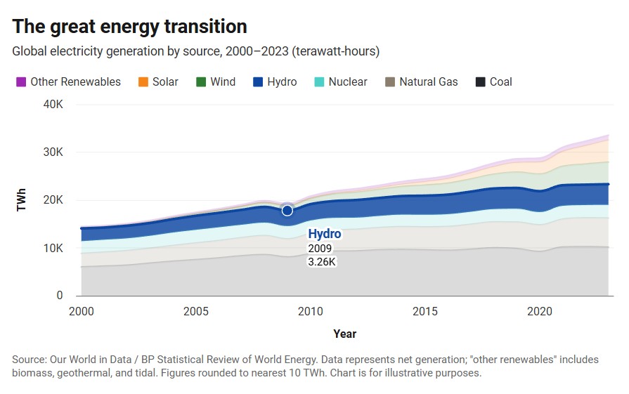
3. Stacked area charts for part-to-whole over time
The stacked area chart is a distinct use case. It’s the right tool when you want to show how several categories contribute to a total, and how that composition changes over time.
 A stacked area chart shows how each category contributes to the total and how the mix shifts over time
Examples:
- Revenue by product line over three years: the total height of the stack at any point is total revenue, and each band’s thickness shows a product’s share
- Website traffic by channel (organic, paid, social, direct) month by month: you can see both total traffic growth and whether the channel mix is shifting
- Energy production from different sources (solar, wind, gas, coal) over time: the stack shows total output and the transition between sources
The stacked area chart answers a question that’s genuinely hard to answer with any other chart type: how is the composition changing while the total is also changing?
The major limitation is that only the bottom band has a consistent baseline (zero), so it’s easy to compare across time. Middle and upper bands float on shifting baselines, which makes their absolute values harder to read. If comparing individual bands precisely matters more than the whole-vs-part story, a grouped bar chart or separate line charts will serve better.
When to use a different chart type
| Your situation | Use this instead |
|---|---|
| Trend matters but not magnitude - the y-axis doesn’t start at zero | Line chart |
| Comparing two or more overlapping series of similar size | Line chart |
| Comparing individual category values across time periods | Grouped bar chart |
| Showing composition at a single point in time | Pie or donut chart |
| More than 4–5 series in a stacked chart | Line chart or small multiples |
| Exact values matter more than the visual shape | Bar chart or table |
The most common misuse is the overlapping multi-series area chart. When two area series cover similar value ranges, they sit on top of each other. With transparency you can see both, but the visual overlap makes comparison difficult and the chart can look muddy. Line charts handle multiple series far more cleanly: the lines stay distinct without obscuring each other.
Mistakes that undermine area charts
Truncating the y-axis. Because the filled area is the visual message, starting the y-axis above zero distorts the chart severely. The filled region implies “this is the full quantity” - if the axis starts at 500 and the value is 520, the shaded area looks enormous relative to the true magnitude. Area charts must start at zero.
Too many series in a stacked chart. Stacked area charts become very hard to read past four or five bands. The upper bands have no consistent baseline, thin bands are nearly invisible, and the legend becomes the main event. If you have eight categories, group the smallest into “Other” or find a different chart type.
Using area charts for non-zero-based data. Showing temperature change, stock price movement, or any data where zero isn’t a meaningful reference point is a poor fit for an area chart. The visual weight of the fill implies the values represent totals, not changes. Use a line chart for data that oscillates around a non-zero baseline.
Overlapping opaque series. If you have two standard (non-stacked) area series and they share the same range of values, one will cover the other entirely. Always use transparency (around 50–70% opacity) when overlapping series are needed, and reconsider whether a line chart would be clearer.
Implying continuity where there are gaps. Like line charts, area charts imply that the data is continuous between plotted points. If there are gaps in your data (ex: missing months, a period where measurement stopped, etc.) filling those gaps with a solid area fabricates data that doesn’t exist. Break the area at gaps or switch to a bar chart where gaps are naturally visible.
Five tips for better area charts
 A normalized area chart shows how each category grows or shinks over time
1. Sort stacked bands with the most stable series at the bottom. In a stacked area chart, readers can only reliably track the bottom band (it has a flat baseline) and the total height. Put the category that changes least at the bottom; it will be the easiest to read across the chart. Put the most volatile category at the top where its variation is visible against the rest of the stack.
2. Use a normalized (or 100% stacked) area chart when the total doesn’t matter. If you only care about composition (ex:how the share of each category shifts over time) use a normalized area chart. Every time period reaches the same height (100%), so the bands show proportion rather than absolute values. This removes the distraction of a growing or shrinking total.
3. Limit to three or four series for standard overlapping charts. With transparency, two or three overlapping area series can be readable. Four is pushing it. Beyond that, the chart becomes a muddy tangle of semi-transparent color. Cut to the series that matter, or switch to a line chart.
4. Label the areas directly where possible. End-of-chart labels placed at the right edge of each band are easier to read than a legend that requires back-and-forth scanning. In a stacked chart, the label can sit inside the band if the band is wide enough to hold it.
5. Don’t add point markers unless a specific data point matters. A line chart sometimes benefits from dots at each data point, but on an area chart, dots add clutter without adding much. The shape of the filled region is already doing the visual work. Add a specific callout annotation if one data point deserves attention; don’t mark all of them.
Create an area chart with InstaCharts
InstaCharts is a free area chart maker. Paste in your data or upload a CSV, pick area chart, and you’ll have a clean, embeddable chart in seconds. No design background needed; the charts work in WordPress, Ghost, Substack, or anywhere else you publish.
Try the demo or create a free account to get started.