Quick Start
InstaCharts is an online chart maker that creates interactive charts from spreadsheet data. Upload a CSV or Excel file, pick a chart type, and get a publication-ready chart in seconds - no formulas or coding required.
Charts can be exported as image files or shared online as interactive, embeddable charts.
Here’s an example of an embedded interactive chart:
Sign up for an account
Create a free InstaCharts account to save your data and share charts publicly. Sign up here.
Not ready to sign up? Try the demo with no account needed.
Import Spreadsheet Data
InstaCharts supports three ways to import data: upload a spreadsheet file from your computer, sync a Google Sheet, or paste data directly into a text box.
This guide covers file upload, the fastest way to create a chart from your data.
For the best results, structure your spreadsheet first: see Formatting Data for Import for how to lay out rows, columns, header names, and data types.
Upload a Spreadsheet File
From your workspace, click New -> New Sheet and select a spreadsheet from your device. InstaCharts processes the file and generates a chart automatically - no manual configuration needed.
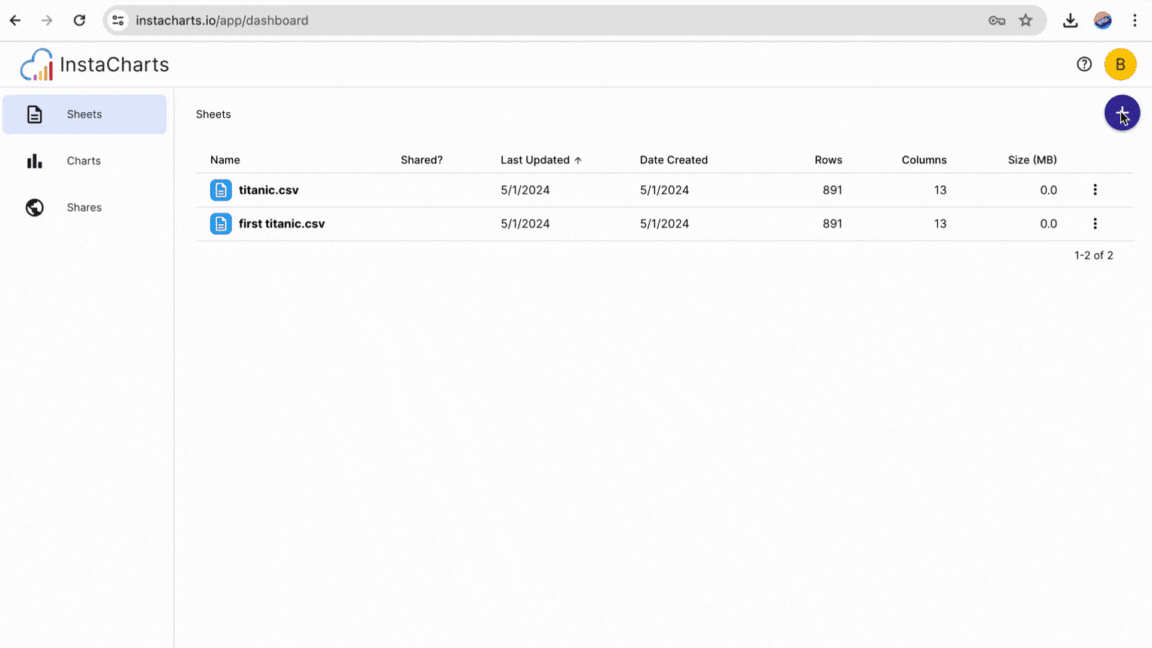
Supported file formats: CSV, Excel (.xlsx/.xls), TSV, PSV, OpenDocument, JSON, and log files.
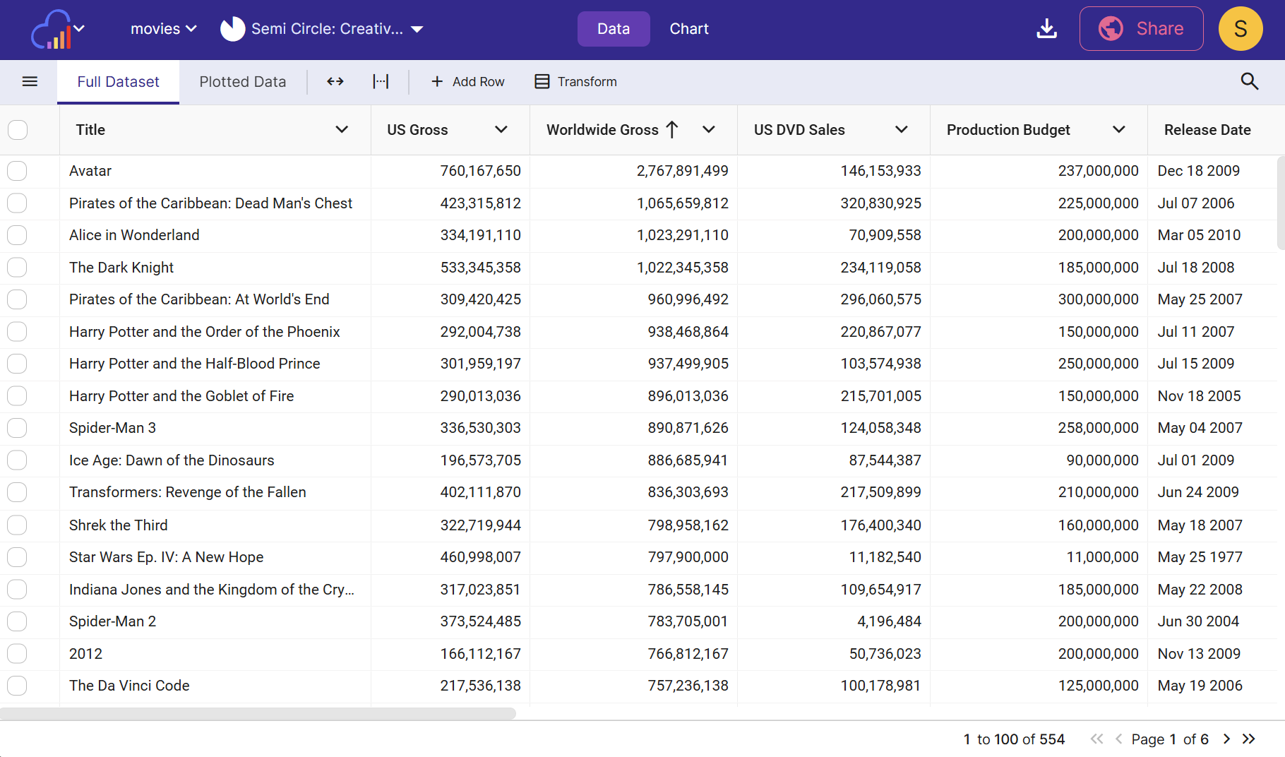
Check Your Data
After uploading, click the Data tab and open Full Dataset to see how InstaCharts read your spreadsheet. Column types (dates, numbers, categories) are detected automatically, which affects chart type recommendations and axis options.
Create and Edit Your Chart
Click the Chart tab to view the generated chart.
InstaCharts picks a chart type and axes automatically, but you can change both to get the visualization you need.
Choose a Chart Type
Use the chart type dropdown to switch between all supported chart types: Line, Grouped Line, Bar, Stacked Bar, Grouped Bar, Scatterplot, Grouped Scatterplot, Area, Grouped Area, Pie, Radar, Heatmap and Mekko.
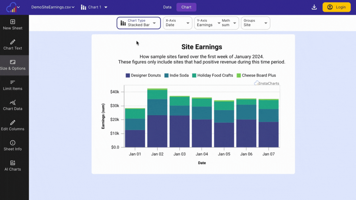
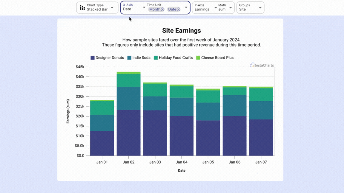
Choose Your Axes
After selecting a chart type, assign your spreadsheet columns to each axis. This controls what data appears in the chart.
-
X-Axis: typically a date, time period, or category column. This is the horizontal axis of your chart.
-
Y-Axis / Series: typically a numeric column, plotted on the vertical axis. You can add multiple series if your data supports it.
-
Aggregation: when multiple spreadsheet rows share the same X value, an aggregation function like sum, count, or average is applied to combine them into a single chart value.
-
Breakdown: available on grouped chart types with a single series. Splits a numeric column into groups using a categorical column like region, product, or status.
Further Chart Customization
The left sidebar has options for title and axis labels, colors and chart size, and limiting which items appear.
To filter the data included in the chart, use column filters on the Data tab.
Multiple Charts from One Dataset
Need several charts from the same spreadsheet? Click the spreadsheet name in the main toolbar, then Add Chart. Each chart has its own axis settings and filters, so they can show completely different views of the same data.
Next Steps
- Export chart images
- Export spreadsheet data
- Share an interactive chart
- Combine charts, tables and KPIs into a dashboard