Chart Options
The Chart Options panel contains settings to change the chart’s axis sorting, axis minimums & maximums and other chart specific settings.
Options for Specific Chart Types
This section allows you to set options that only apply to one or more chart types.
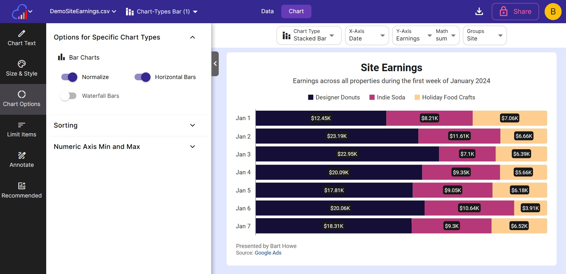
- Normalize
Normalize will change the scale of the y-axis to a percentage of 100. It will look as though the plotted bars stretch to the top of the chart.
Bar Charts
-
Horizontal Bars Enable this toggle to show the bars of a Bar chart horizontally instead of vertically. This is useful when there is categorical info plotted on the x-axis that have long names. The long names are more easily read horizontally rather than vertically.
-
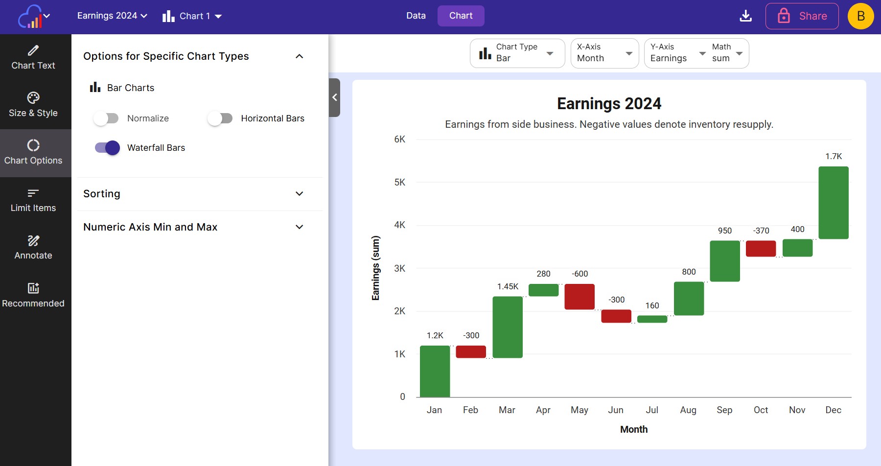
Waterfall Bars Applies to bar charts only. Enable this toggle to make bars appear as a cumulative value, appearing like a waterfall. Use the Colors panel on the Size & Style value to set the colors for regular bars and negative value bars.
- Bar Border Radius Round the corners of each bar.
- Custom Bar Width Toggle on to set an exact bar width instead of letting bars size automatically.
Line Charts
- Show Markers Toggle on to show a dot at each data point along the line.
- Smooth Lines Toggle on to curve the line between points instead of drawing straight segments.
- Line Width Set the thickness of the line.
Area Charts
- Stack / Normalize / No Stack Choose whether area series stack on top of each other, stack and normalize to a percentage of 100, or don’t stack at all.
- Show Markers, Smooth Lines, Fill Opacity, and Line Width work the same as on Line charts, with Fill Opacity controlling how see-through the filled area is.
Pie Charts
-
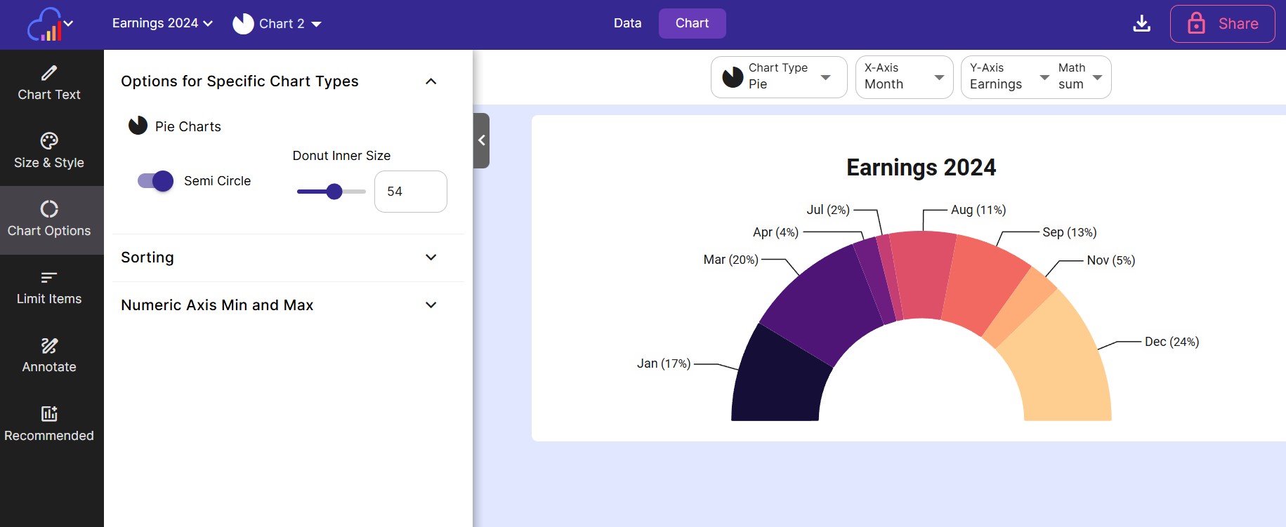
Semi Circle Toggle this setting on to only show the chart as a half circle instead of a full circle pie chart.
-
Donut Inner Size Set the percentage of the inner cut out size of the pie chart - resembles a donut.
-
Border Radius Round the corners of each pie slice.
Radar Charts
- Show Markers and Line Width work the same as on Line charts.
Heatmap
-
Fill in missing values Normally empty or 0 values will be shown as an empty void in the chart. Enable this setting to fill in blank values with a colored box.
-
Border Radius Round the corners of each cell.
Gauge Charts
These settings apply to Gauge and Grouped Gauge charts.
- Min The lowest value on the gauge. Leave it blank to start at 0, or lower when the value is negative.
- Max The highest value on the gauge. Leave it blank to round up past the value and the target.
- Target Draws a target line across the gauge at this value. Leave it blank for no target.
- Default target color The target line uses the text color. Turn this off to choose a color for the target line.
Gauge charts only:
- Needle Dial Draws a speedometer dial with a needle instead of a filled arc.
- Degrees How much of a circle the gauge covers. 180 is a half circle and 360 is a full circle.
- Band Thickness How thick the colored band is, as a percent of the gauge’s radius. On the Needle Dial, a thicker band moves the tick marks inward and makes the needle shorter.
Grouped Gauge charts only:
- Ring Width How wide each ring is, as a percent of the gauge’s radius. With many rings, they get thinner than this so they all fit.
- Max and Target for each ring When a grouped gauge plots more than one series, each series gets its own ring, and each ring gets its own Max and Target fields.
Sorting
Auto Sort is enabled by default to automatically sort the items in the chart.
Turn off auto sort to manually control how the chart is sorted.
-
Sort X-Axis Which axis to sort the X-Axis by. Options include: Auto, X-Axis and Y-Axis/Series
-
Sort Direction The direction to sort the X-Axis in. 0 for auto, 1 for Ascending and 2 for Descending
-
Sort Legend Which axis to sort the legend by. Options include: Auto, X-Axis and Y-Axis/Series
-
Legend Sort Direction The direction to sort the legend in. 0 for auto, 1 for Ascending and 2 for Descending
Numeric Axis Min and Max
Use these settings to control the min and max values plotted on each axis. Toggle off Use Default Values first to enter your own numbers.
-
X-Axis Min & Max Set these 2 values to control the smallest and largest value plotted on the X-Axis. This option will be disabled if the chosen X-Axis column is not numeric.
-
Y-Axis Min & Max Set these 2 values to control the smallest and largest value plotted on the Y-Axis. This option will be disabled if the chosen chart type is a Heatmap.
-
Breakdown Min & Max Set these 2 values to control the smallest and largest value plotted on the Breakdown Axis (if there is a Breakdown set).
Related
- Size and Style - colors, sizing, grid and axis styling
- Labels - axis, series, data and total labels
- Chart Text - titles, legend and locale
- Chart Types - which options apply to each chart