Gauge Chart
A gauge chart, also called a dial chart or speedometer chart, shows a single number on a curved scale. The colored arc fills from the low end of the scale up to the value, so readers can see at a glance how close a number is to its maximum or to a goal. In InstaCharts, a gauge chart adds up or averages the Y-Axis column and draws that one value on the dial.
Gauge charts are a good fit for KPIs that have a natural scale or a goal (ex: sales against a quota, an average rating out of 5, percent of a budget spent).
Creating a Gauge Chart
Choose Gauge from the chart type menu, then pick the column to measure.
- Y-Axis Numerical values. The Y-Axis column is aggregated into one number (ex: sum of revenue, average rating)
- X-Axis Not used. The X-Axis dropdown is hidden for gauge charts because every row goes into the same total
- Breakdown Axis Not used. To split the value by a category, use a Grouped Gauge chart
Pick the aggregation that makes the number meaningful. Use sum for amounts and quantities, average for ratings, scores and percents, and count or distinct to show how many rows or unique values there are.
Gauge Settings
Gauge settings are in the Chart Options panel under Options for Specific Chart Types. See Chart Options for the full list.
- Min The lowest value on the gauge. Leave it blank to start at 0, or lower when the value is negative
- Max The highest value on the gauge. Leave it blank to round up past the value and the target
- Target Draws a target line across the gauge at this value. Leave it blank for no target
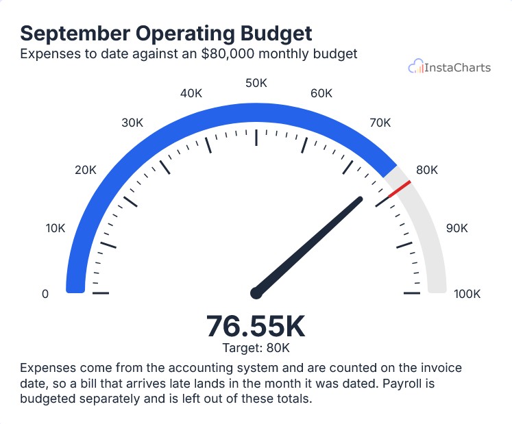
- Needle Dial Draws a speedometer dial with a needle and tick marks instead of a filled arc
- Degrees How much of a circle the gauge covers. 180 is a half circle and 360 is a full circle
- Band Thickness How thick the colored band is, as a percent of the gauge’s radius
- Default target color The target line uses the text color. Turn this off to choose your own target line color
Description
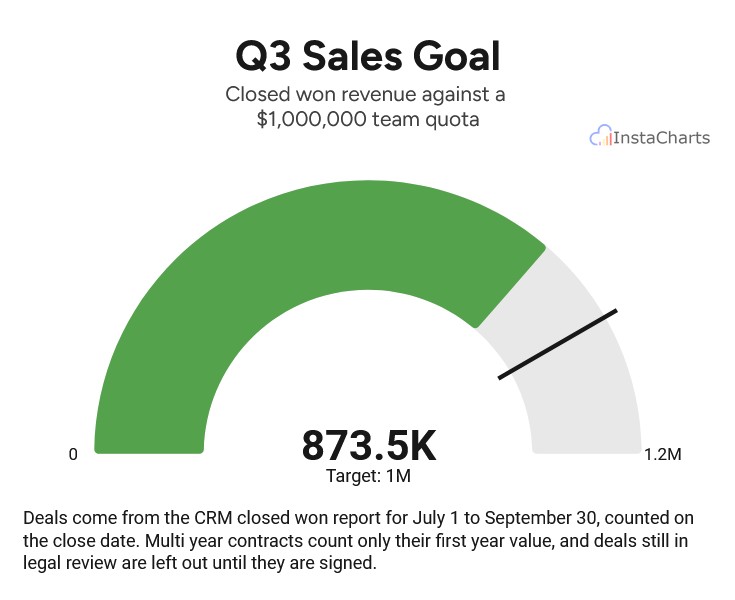
- Arc the colored band fills from the Min up to the value. The rest of the band is a lighter track that runs to the Max
- Needle with Needle Dial turned on, a needle points to the value and tick marks run along the inside of the band
- Value label the value sits in the center of the gauge, with the target written underneath when one is set
- Scale labels the filled arc shows the Min and Max at each end, and the Needle Dial labels its tick marks along the scale
- Tooltip hover over the arc to see the value, the percent of the Max it has reached, and the target
When to Use a Gauge Chart
- Progress toward a goal - sales against a quota, donations against a fundraising goal, or tasks completed out of the total
- Tracking progress on a task or project - show percent complete on a dial that fills toward 100
- Scores and ratings - an average customer satisfaction rating on a 1 to 5 scale
- Budgets and limits - how much of a budget or capacity has been used
- Dashboard KPIs - a gauge adds context to a headline number on a dashboard
When to Avoid a Gauge Chart
- Trends over time - a gauge shows one number, so use a line chart to show change over time
- Comparing many categories - use a bar chart, or a grouped gauge for a few categories
- Numbers with no scale or goal - a plain total reads better as a KPI widget on a dashboard
Templates and AI
When you add a new sheet, the Choose a template gallery includes gauge templates with sample data, such as Quarterly Sales Goal and Monthly Operating Budget Spent.
AI Chart Recommendations and the dashboard AI prompt bar can also suggest gauge charts. The AI picks a gauge when one total or average is the main story, and when you ask it to track progress on a task or goal. It also fills in the Min, Max, and Target when your data or your request makes them clear.
Related
- Grouped Gauge Chart - one ring per category or series
- Chart Options - every gauge setting
- Dashboard Widgets - add a gauge chart to a dashboard