Size and Style
The Size & Style panel contains options to change the chart’s colors, size, grid and axis styles.
Color Scheme
Use this dropdown to select a color scheme for the chart. Most color schemes contain 10 colors.
For charts that contain a single color (Ex: line chart), it’s possible to select an individual color. Next to the color scheme dropdown, a single color selector will appear. Click it to launch a color picker dialog.
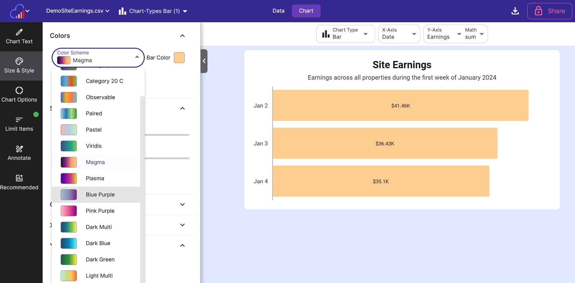
Available Color Schemes
| Color Scheme | Type | Best for | |
|---|---|---|---|
| Tableau | Categorical | Showing different groups or categories of data | |
| Tableau 20 | Categorical | Showing different groups or categories of data | |
| Category 20 B | Categorical | Showing different groups or categories of data | |
| Category 20 C | Categorical | Showing different groups or categories of data | |
| Observable | Categorical | Showing different groups or categories of data | |
| Paired | Categorical | Showing different groups or categories of data | |
| Pastel | Categorical | Showing different groups or categories of data | |
| Viridis | Sequential Multi-Hue | Displaying numeric values getting larger or smaller | |
| Magma | Sequential Multi-Hue | Displaying numeric values getting larger or smaller | |
| Plasma | Sequential Multi-Hue | Displaying numeric values getting larger or smaller | |
| Blue Purple | Sequential Multi-Hue | Displaying numeric values getting larger or smaller | |
| Pink Purple | Sequential Multi-Hue | Displaying numeric values getting larger or smaller | |
| Dark Multi | Sequential Multi-Hue | Displaying numeric values getting larger or smaller | |
| Dark Blue | Sequential Multi-Hue | Displaying numeric values getting larger or smaller | |
| Dark Green | Sequential Multi-Hue | Displaying numeric values getting larger or smaller | |
| Light Multi | Sequential Multi-Hue | Displaying numeric values getting larger or smaller | |
| Green Blue | Sequential Multi-Hue | Displaying numeric values getting larger or smaller | |
| Gold Red | Sequential Multi-Hue | Displaying numeric values getting larger or smaller | |
| Red Yellow Green | Diverging | Highlights numeric values with a meaningful midpoint | |
| Spectral | Diverging | Highlights numeric values with a meaningful midpoint | |
| Rainbow | Cyclical | Highlight repeating cycles within data | |
| Blues | Sequential Single-Hue | Displaying numeric values getting larger or smaller | |
| Reds | Sequential Single-Hue | Displaying numeric values getting larger or smaller | |
| Teals | Sequential Single-Hue | Displaying numeric values getting larger or smaller | |
| Purples | Sequential Single-Hue | Displaying numeric values getting larger or smaller | |
| Greens | Sequential Single-Hue | Displaying numeric values getting larger or smaller | |
| Warm Grays | Sequential Single-Hue | Displaying numeric values getting larger or smaller |
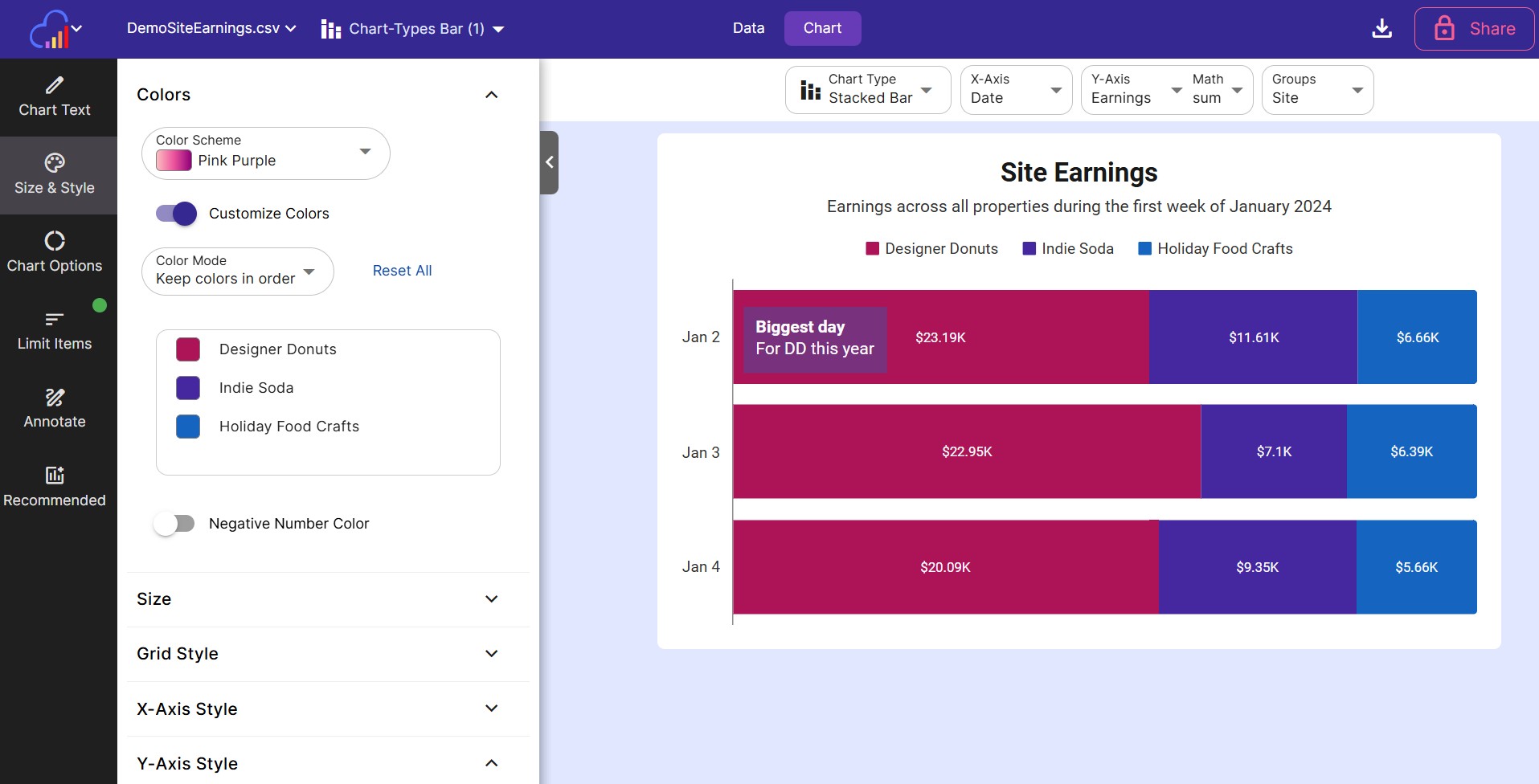
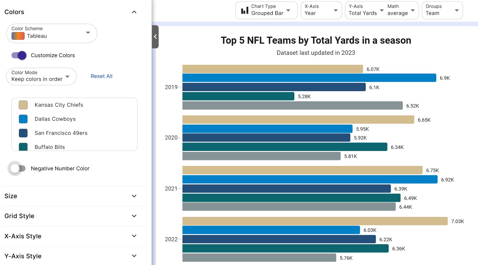
Customize Colors
For charts that have multiple colors (multi line chart, pie chart, etc), use this section to customize which colors are assigned to different legend items.
-
Customize Colors Turn this toggle on to customize the colors shown in the chart. The colors will be prefilled with the chosen color scheme.
-
Color Mode Set to either save the colors in order, or assign a specific color to a specific label. This comes in handy when changing the columns plotted in the breakdown axis without losing your color selections.
-
Reset All Press the reset all button to revert back to the original color scheme.
-
Color Scroll Box All legend items will appear in this scroll box along with the color assigned to that item. To change an item’s color, click on it’s color square.
Negative Number Color
You can choose to show negative values in your chart in a different color. To show negative values in a different color, enable the Negative Number Color toggle, then select a color from the color box.
The default color for negative numbers is a shade of red.
Chart Width and Height
-
X-Axis Width A slider that sets the width of the x-axis. The value scale is in pixels, and the width can be set in 25 px increments.
-
Y-Axis Height A slider that sets the height of the y-axis. The value scale is in pixels, and the height can be set in 25 px increments.
-
Auto Size Large # Items When a dataset has a large number of items to plot (more than 20 items) in the X-Axis, this allows the X-Axis to stretch as long as it needs to in order to plot every item.
This setting is enabled by default.
Grid Style
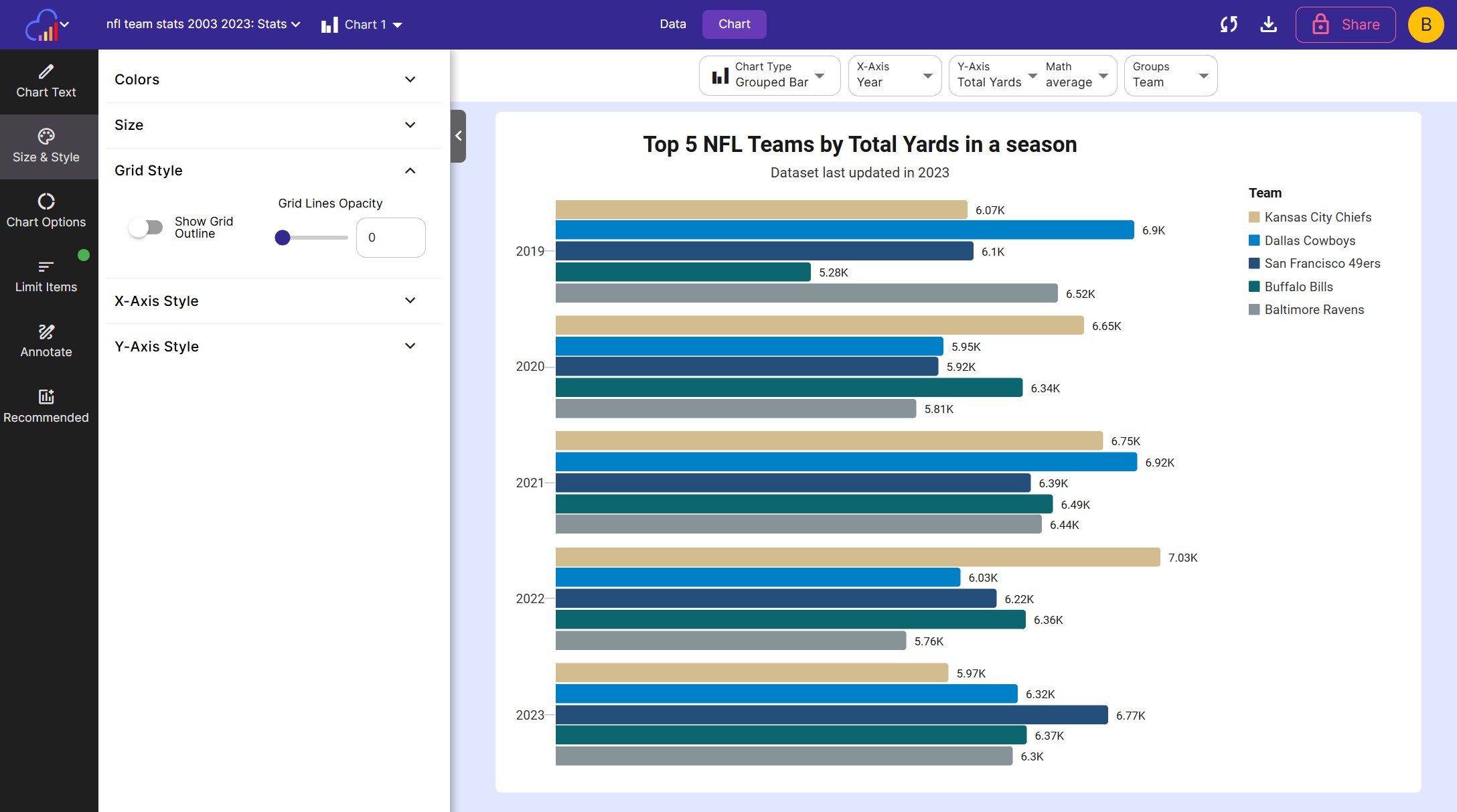
This card controls the styling of the chart’s grid. These options don’t apply to pie charts.
- Show Grid Outline Use this toggle to turn on or off the outline around the chart
- Grid Lines Opacity Choose between a number from 0-100 to use as the opacity of the grid lines that connect to the Y-Axis. Set to 0 to turn off these lines.
X and Y-Axis Style
These 2 cards control the styling of the X and Y-Axis. These options don’t apply to pie charts.
Each card contains the following options:
- Show Axis Use this toggle to turn on or off the entire axis
- Tick Mark Opacity Choose between a number from 0-100 to use as the opacity of the tick marks on this axis. Set to 0 to turn off the tick marks.
- Label Opacity Choose between a number from 0-100 to use as the opacity of the labels on this axis. Set to 0 to turn off the labels.
- Axis Line Opacity Choose between a number from 0-100 to use as the opacity of the axis line. Set to 0 to turn off the axis line.
- Title Opacity Choose between a number from 0-100 to use as the opacity of the axis title. Set to 0 to turn off the title.
Related
- Chart Options - sorting, axis min/max and chart-specific settings
- Labels - axis, series and data labels
- Chart Text - titles, legend and locale
- Workspace Chart Defaults - set default colors and fonts for new charts
- Chart Types - browse all available charts