Dashboard Widgets
Widgets are the building blocks of a dashboard. There are four widget types, and you can mix and match as many as you need.
| Widget | What it shows |
|---|---|
| Chart | A chart built from one of your sheets (ex: bar, line, pie) |
| Data Table | Sheet data in a sortable table, with your choice of columns |
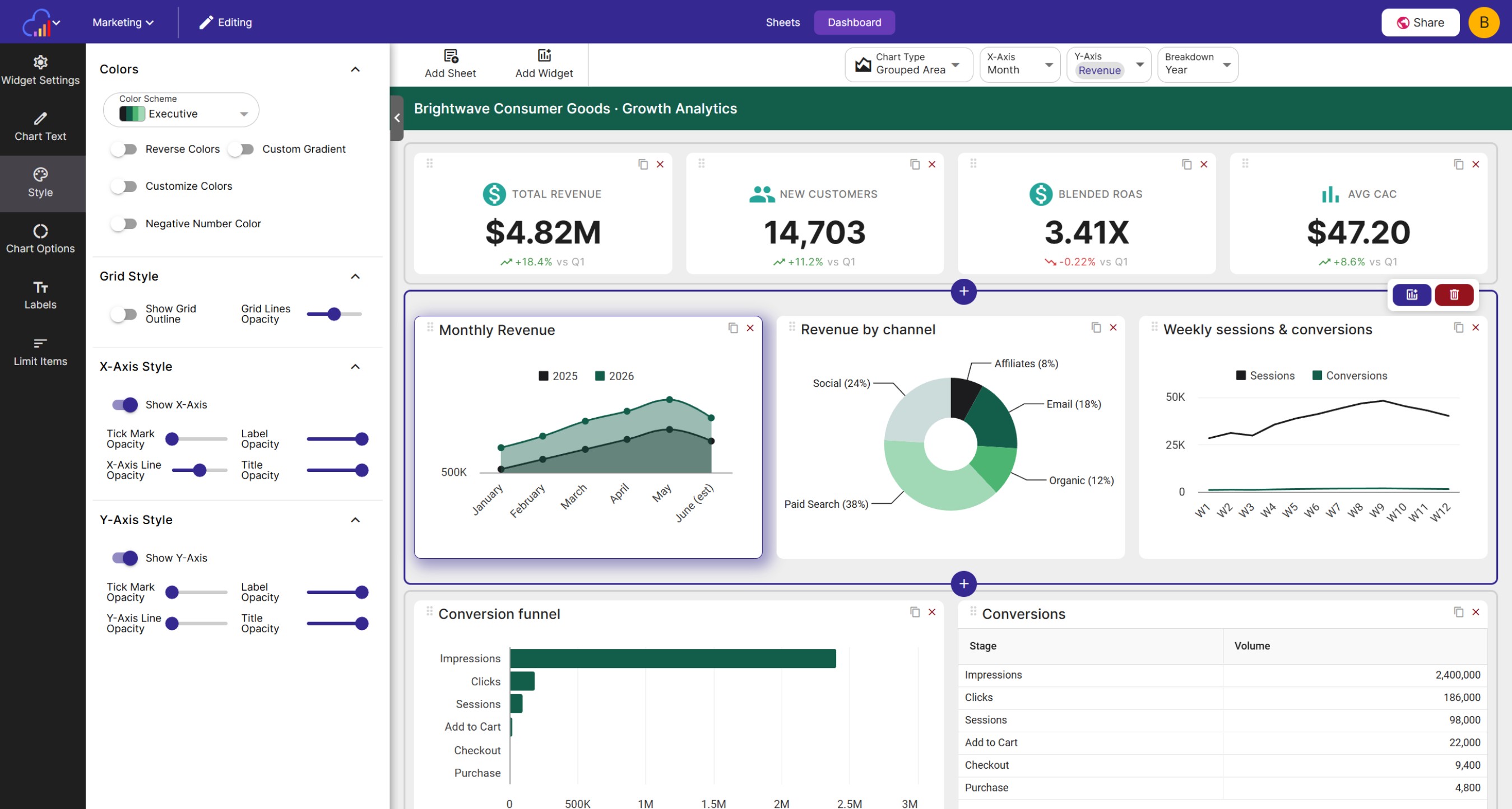
| KPI Metric | A key performance indicator with an optional trend |
| Text | Formatted text for explanations, notes, and context |
Adding a Widget
Click Add Widget (or Add your first widget on an empty dashboard) to open the Add Widget dialog, then select a widget type.
Chart and Data Table widgets read from a sheet, so the dialog will next ask you to choose the sheet to use for the widget. If the sheet you want isn’t on the dashboard yet, click Add Sheet to add a new or existing sheet without leaving the dialog.
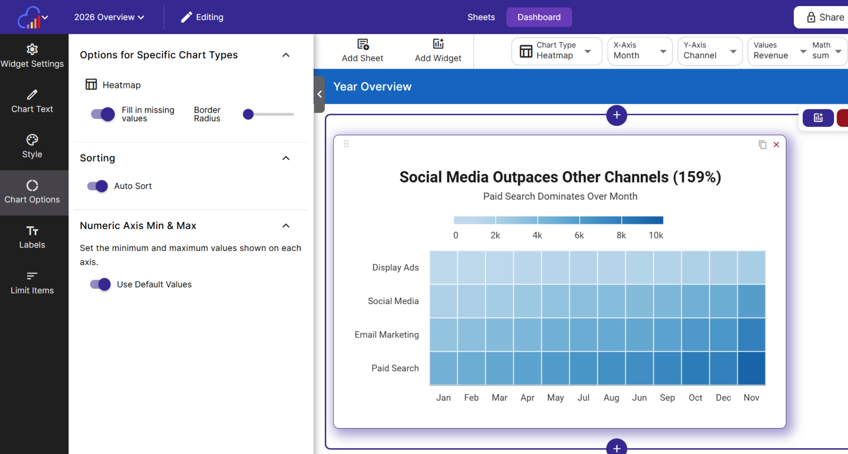
Chart widgets
After choosing a sheet, pick a base chart for the widget. InstaCharts analyzes the sheet and presents recommended charts, each showing the chart type and which columns are plotted on each axis.
Once added, a chart widget is fully customizable, just like a regular InstaCharts chart; change the chart type, axes, colors, and labels to get exactly the view you want.
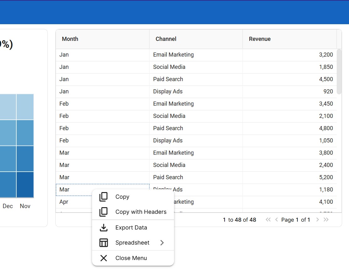
Data Table widgets
After choosing a sheet, select which columns to show in the data table. Use Select All or Remove All to toggle the whole list quickly. The table shows only the columns you pick, so viewers see the data that matters without the clutter of the full spreadsheet.
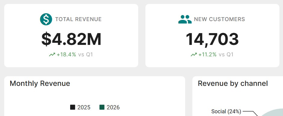
KPI Metric widgets
KPI widgets display a headline number with a label (ex: Total Revenue). After adding one, use the edit panel to set:
- Value - the number to display (ex: 1,234)
- Label - a description of the value
- Trend - optionally show a trend percentage (ex: 5.2 or -2.1) with a trend period
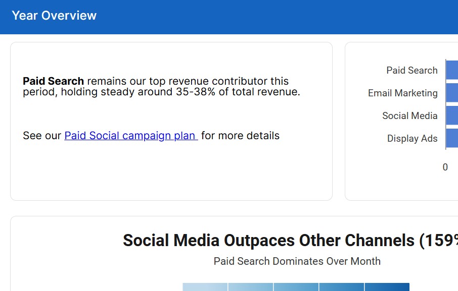
Text widgets
Text widgets hold formatted text; use them for titles, explanations, takeaways, or any context your audience needs. The built-in editor supports rich formatting (ex: bold, italics, lists).
Rows and Layout
Widgets are organized into rows. Hover over a row in edit mode to reveal the row controls:
- Add row above / Add row below - insert a new empty row
- Add widget to row - add a widget directly into that row
- Delete row - remove the row
You can also drag and drop widgets to move them between rows. Each widget’s size and title can be adjusted from its edit panel.
Editing and Removing Widgets
Select a widget to open its edit panel, where you can change the widget’s title, size, and type-specific settings. To remove a widget, use the widget menu and confirm the removal; the underlying sheet and its charts are not affected.