Zapier Integration
InstaCharts’ Zapier integration allows you to automatically generate chart images whenever a trigger event occurs.
This automation can save time and ensure consistent chart generation across your workflows.
The Zapier integration is based around chart templates.
Prerequisites
- An active InstaCharts account
- A Zapier account
Setup a Generate Chart Image action with Zapier
These steps allow you to generate a chart image using Zapier. At the end, you will receive an image url to use in another step of your zap. You can email the image url, embed it in another app, download to a Google Drive folder or whatever your workflow needs!
Images are securely stored by Zapier for a week.
Create a New Zap
- Log into your Zapier account
- Click “Create Zap”
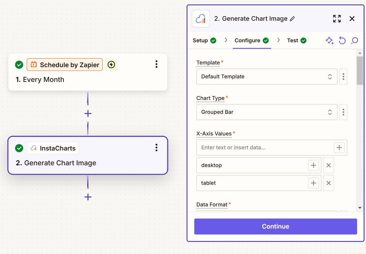
- Choose your desired trigger app and event. In our example above, we’ve chosen Schedule By Zapier, so we can produce a chart once a month.
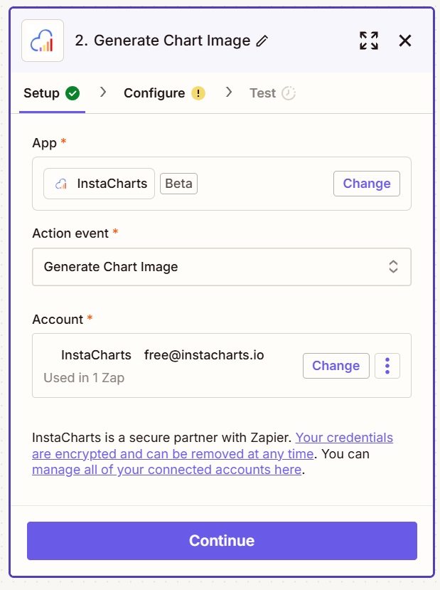
Configure InstaCharts Action - Setup
- Select “InstaCharts” as your action app
- On the Setup Tab, Choose “Generate Chart Image” as the action event
- Connect your InstaCharts account if you haven’t already
Configure Chart Settings
On the next screen, Configure, you will choose all of your chart options to send to InstaCharts.
Pick a template
The first dropdown allows you to pick a template from your InstaCharts account. Since InstaCharts allows over 100 options to be specified per chart, it can be a real timesaver to set up a chart template using the UI instead of manually entering chart options.
Read this guide to learn more about how to Setup a template
If you have not yet created a template, no worries - choose the Default Template.
Enter in data
There are two main ways to send data to InstaCharts.
Basic Input (Unaggregated)
Below is a screenshot of Basic input.
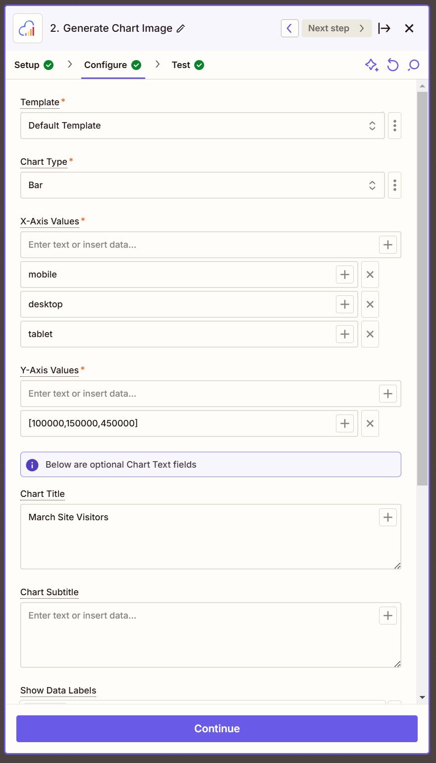
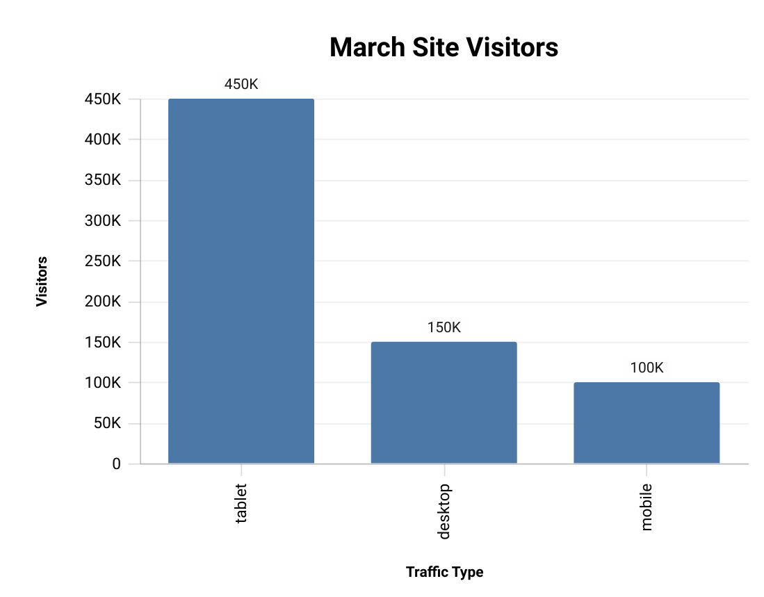
For our Bar chart, we’ve chosen 3 values for the X-Axis, mobile, desktop and tablet - each entered separately on a different line.
The Y-Axis values are in an array [100000,150000,450000], but you can also set them separately like the X-Axis values.
Make sure the X-Axis and the Y-Axis have the same number of values.
Series Input (Separate Series)
When using grouped charts (charts that allow multiple series to be graphed), like a stacked bar chart or grouped line chart, you have a choice of how you’d like to input your data.
Most people will want to choose a Data Format of Separate Series. Choose Un-aggregated if you are entering in raw unaggregated data from a file source.
A screenshot of using separate series is below.
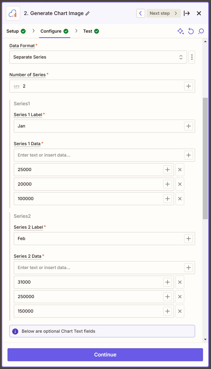
An extra option will pop up, allowing you to select the number of series.
- Number of Series Choose how many series you’d like to add. In our example, we’ve chosen 2 series.
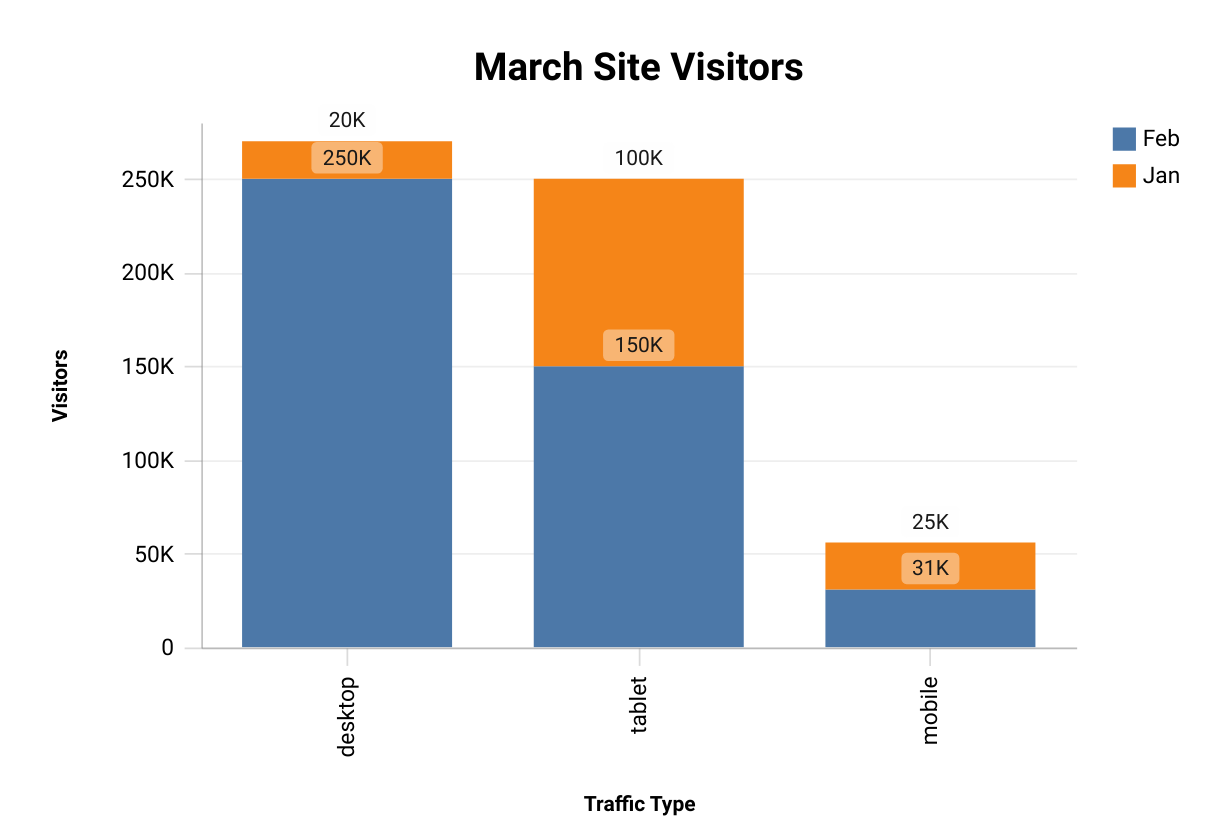
For our Stacked Bar Chart, we’d like to compare Site Traffic by month, so we’ll add series data that reflects device traffic by month.
As before, we’ve chosen 3 values for the X-Axis, mobile, desktop and tablet - each entered separately on a different line.
The Series 1 values are Jan for our series label (this will show in the legend) and 25000 20000 and 100000 as our values.
The Series 2 values are Feb for our series label and 31000 250000 and 150000 as our values.
Choose Text Options
A variety of text options are available, all are optional.
- Chart title Enter a title for your chart
- Chart Subtitle Enter a subtitle to be shown under the title
- Show Data Labels Defaults to true. Bar charts and pie charts will have labeled pieces
- X-Axis Title Enter an axis title for the X-Axis
- Y-Axis Title Enter an axis title for the Y-Axis
- Legend Title Enter a title for the legend
Other Overrides
InstaCharts has many more customization options that don’t fit within the Zapier UI. Use the Chart Overrides text box to enter them in.
A list of available parameters can be found here.
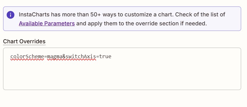
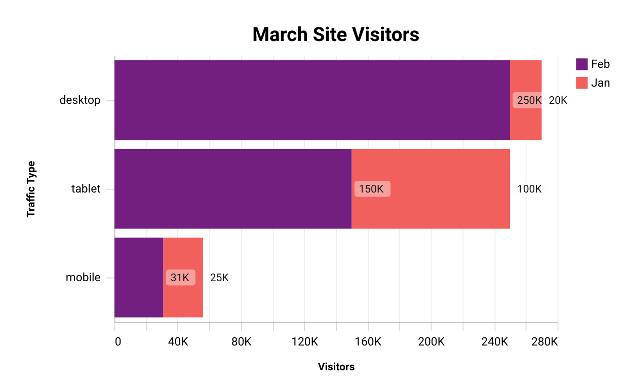
To set the bar chart horizontal and change the color scheme of the chart, you would enter this in the Chart Overrides text box:
colorScheme=magma&switchAxis=true
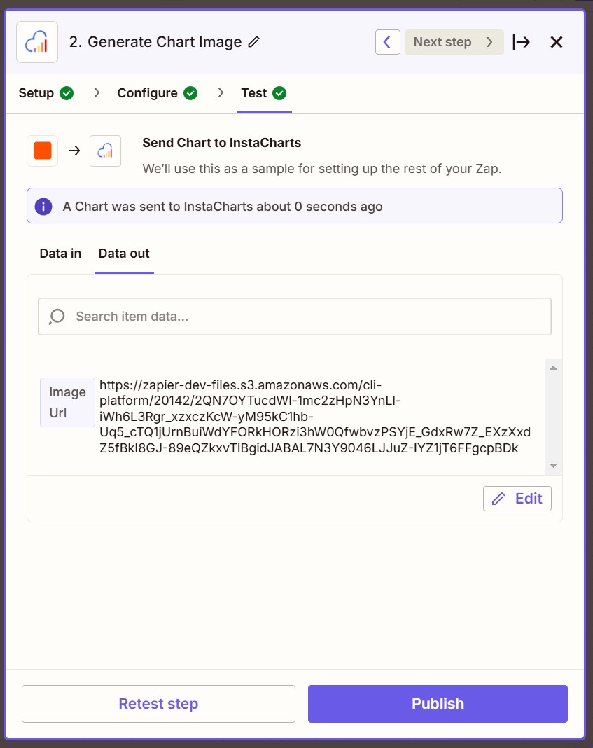
Testing
Once all required params are entered on the Configure screen, press Continue to go to the Test screen.
Test the integration by pressing the Test button. If its successful, you should be sent an Image Url.
Next Steps
Add another step in Zapier to do something with your image.
You could save it to a folder in Google Drive, embed it in an email, or integrate it with your other workflows.
Read More
Read more about using Zapier: Zaps Quick Start Guide
Read the Full Template Docs
Read how to Generate Charts using Templates