Labels
Use the Labels panel to edit a chart’s labels including: axis labels, series labels, data labels, total labels and tooltips. This panel contains many options to change the labels within the chart.
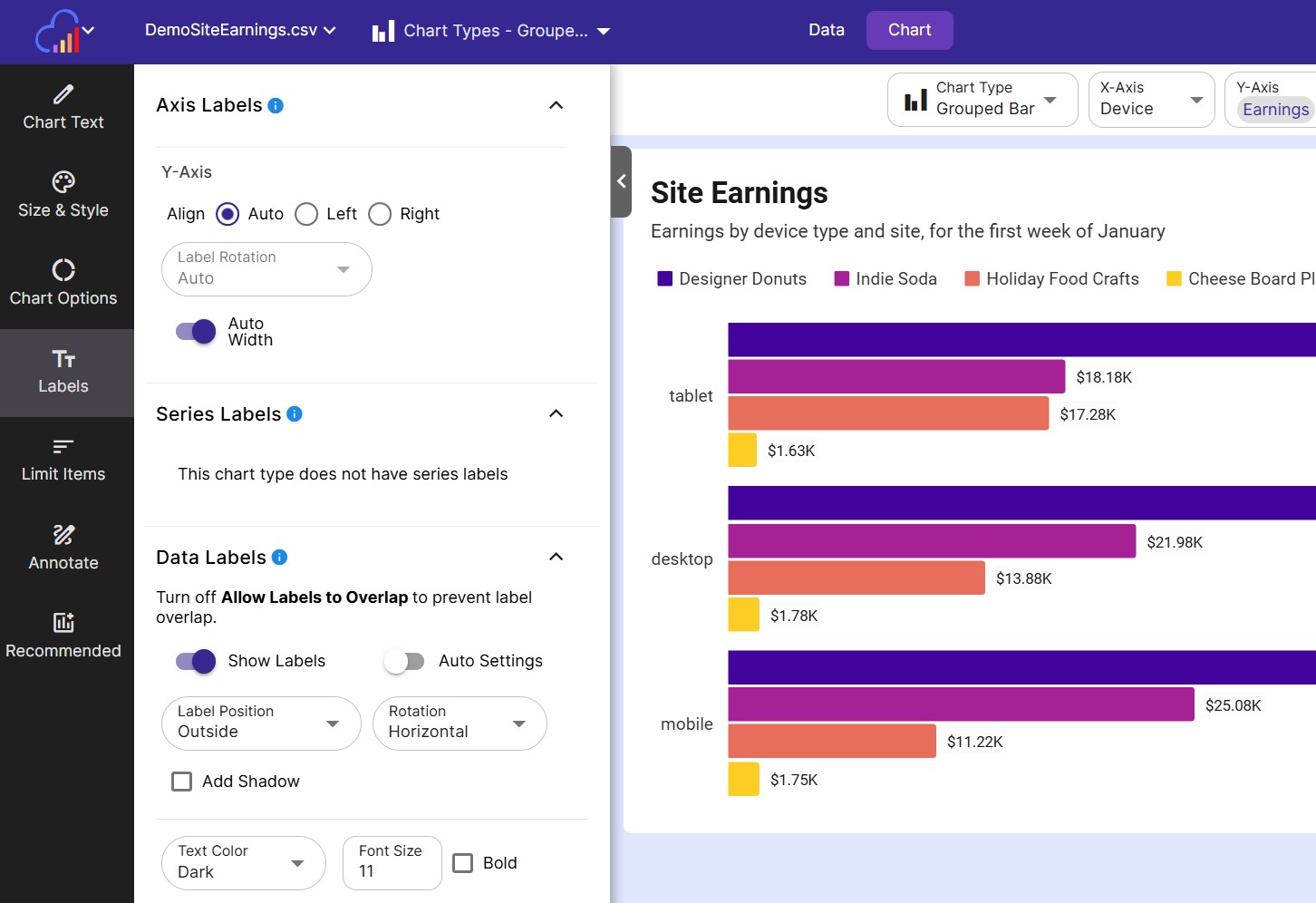
Axis Labels
- X-Axis Label Rotation Rotate the X-Axis labels in the direction specified. The possible values are listed below:
| Label Rotation Direction | Description |
|---|---|
| Auto | Based on the chart type, and the available space for chart labels, the software will pick a direction. |
| Horizontal | The label text will be written horizontally. Best used for labels with a short length. |
| Vertical | The label text will be written vertically. |
| 45 degree angle | The label text will be written at a 45 degree angle. Useful for very long labels. |
- X-Axis Auto Width Toggle this off to customize the label width on the X-Axis
- X-Axis Label Width The maximum width labels on the X-Axis can be
- X-Axis Max Lines The maximum number of lines a long label can wrap
Horizontal Bar Charts
Since the chart’s main text will most likely be along the Y-Axis, horizontal Bar charts have an extra set of options to align these labels
- Y-Axis Align Align your labels to either the left or right.
- Y-Axis Auto Width Toggle this off to customize the label width on the X-Axis
- Y-Axis Label Width The maximum width labels on the X-Axis can be
- Y-Axis Max Lines The maximum number of lines a long label can wrap
Series Labels
Grouped area charts and grouped line charts can have their series labeled right on the chart. Use these options to customize the look of series labels.
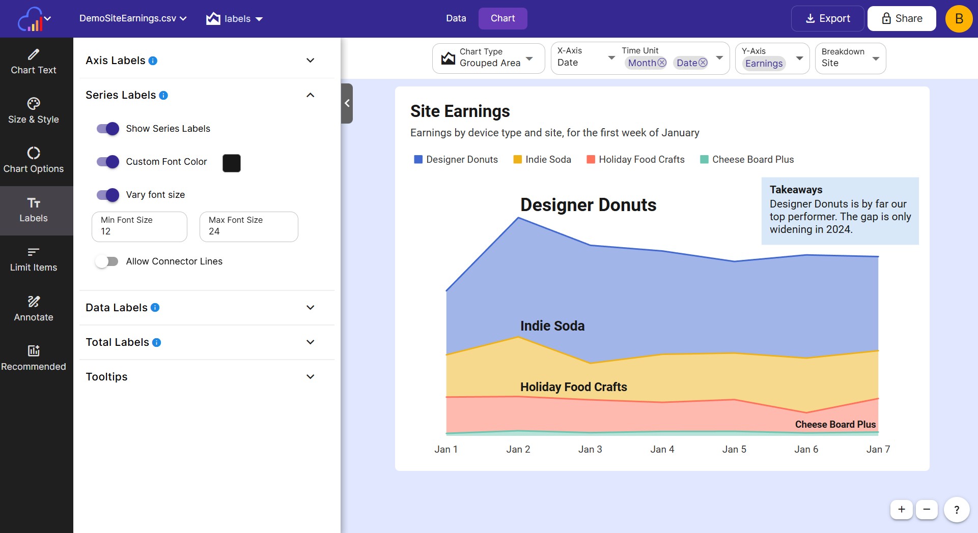
Below are the options to customize a chart’s series labels:
- Show Series Labels Toggle this on to display series labels.
- Custom Font Color Toggle this on to choose a custom font color for all series labels. Otherwise the series color will be used.
- Vary Font Size Toggle this on to show larger series in a larger font size and vice versa. You can control the min and max font sizes through text inputs.
- Allow Connector Lines Toggle this on for congested charts. Allows a line to be drawn from the series name to the series.
Data Labels
Charts can have their individual data pieces/plotted points labeled. These are called data labels.
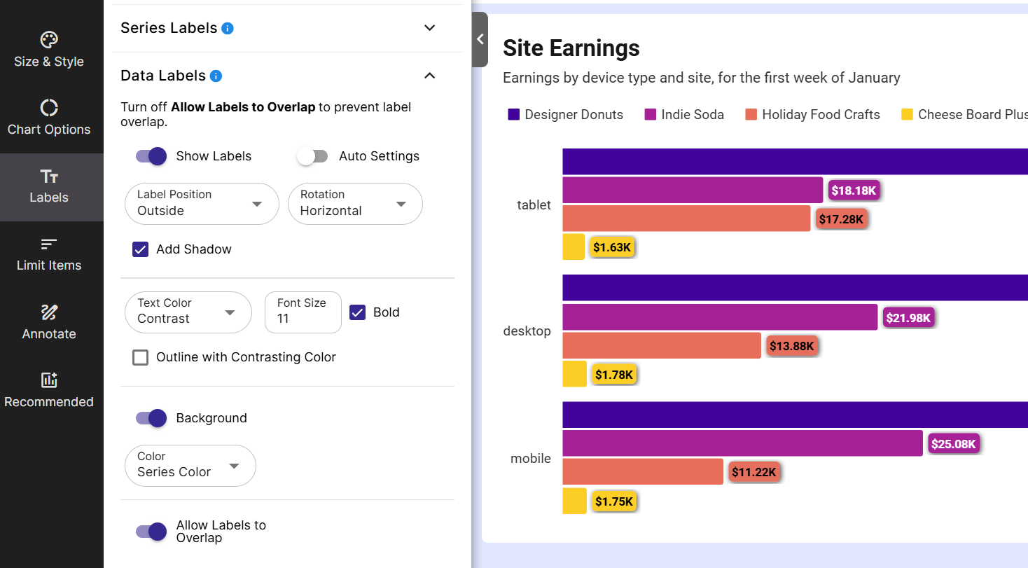
Below are the options to customize a chart’s data labels, divided into sections.
Main Options
- Show Labels Change this setting to show or hide the chart’s data labels
- Auto Settings Toggle this off to further customize the data labels.
- Label Position For Bar charts only. Choose where the labels should be shown (outside the bar, inside top, inside center, inside bottom)
- Rotation Rotate each data label (horizontal, vertical, 45 degree angle)
- Add Shadow Enable this to add a shadow behind each data label
Text Options
- Text Color Sets the text color of the labels. Choose between several present colors including: light, dark, contrast (will be either light or dark to contrast with the series color), & custom (choose your own color)
- Font Size Font size of the data labels
- Bold Enable this for bold text
- Outline with contrasting color Enable this to outline the text with either a light or dark color
Background Options
- Background Show or hide a contrasting background on the data label. Helps data labels be visible on a wide variety of colored bars.
- Color Choose the color of the background (Light, dark, series color, & custom)
- Background opacity Set towards 0 to make the background more transparent and towards 100 to be more opaque. (Not available with Series color)
Other Options
-
Label Removal % Available on stacked bar charts and pie charts. Allows you to remove labels from small pieces under this percentage. Helpful when there are lots of small pieces with overlapping labels.
-
Allow Labels to Overlap Turn off this toggle to prevent labels from overlapping each other.
Total Labels
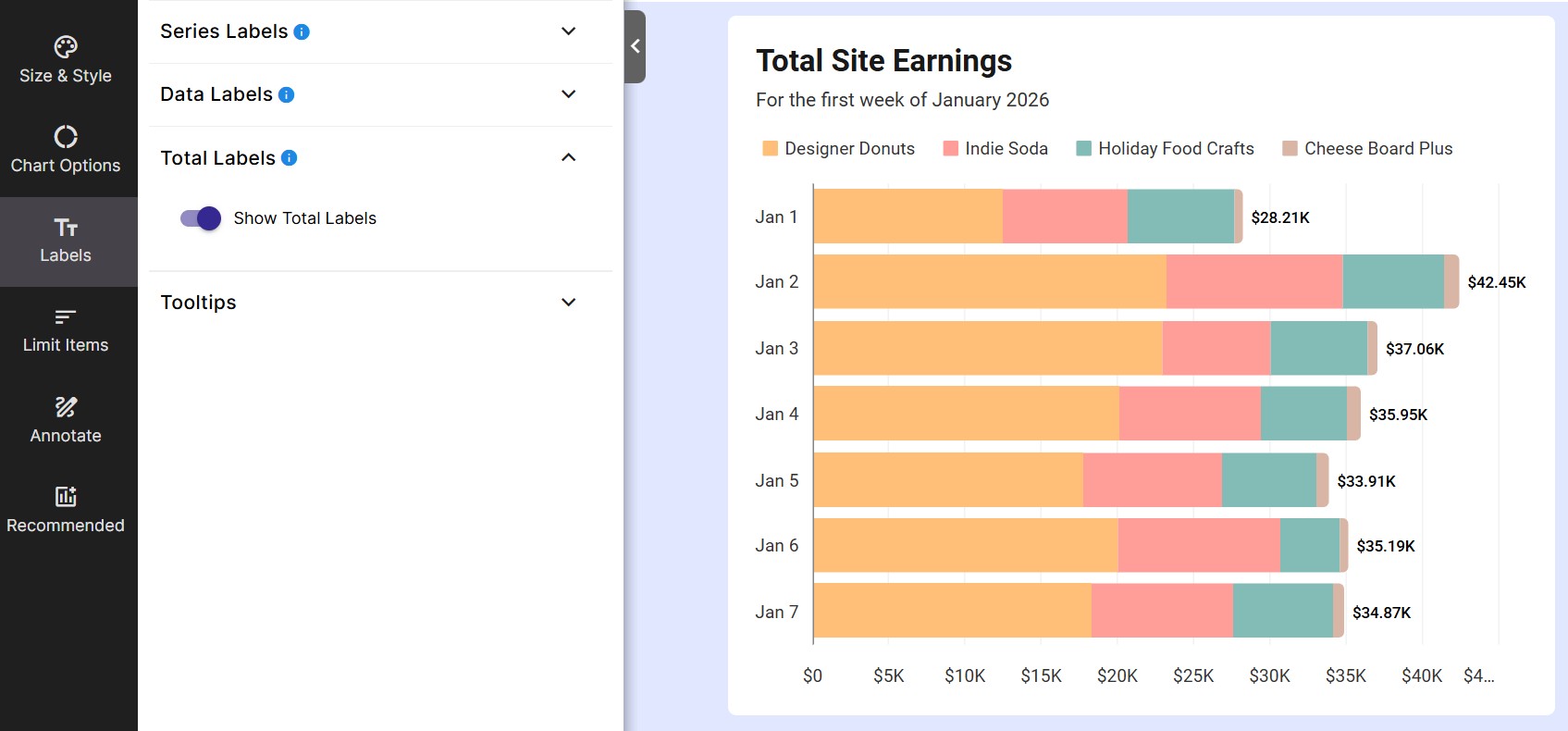
Total labels are for stacked bar charts only. Total labels will show the total value for the entire column, as opposed to data labels, which show a value for a piece of the column.
- Show Total Labels Enable this setting to display total labels.
Tooltips
When you hover over a datapoint in your chart, a tooltip can be displayed. Use the following options to customize them. Tooltip options can be found under the Tooltips section of the Labels tab in the left sidebar.
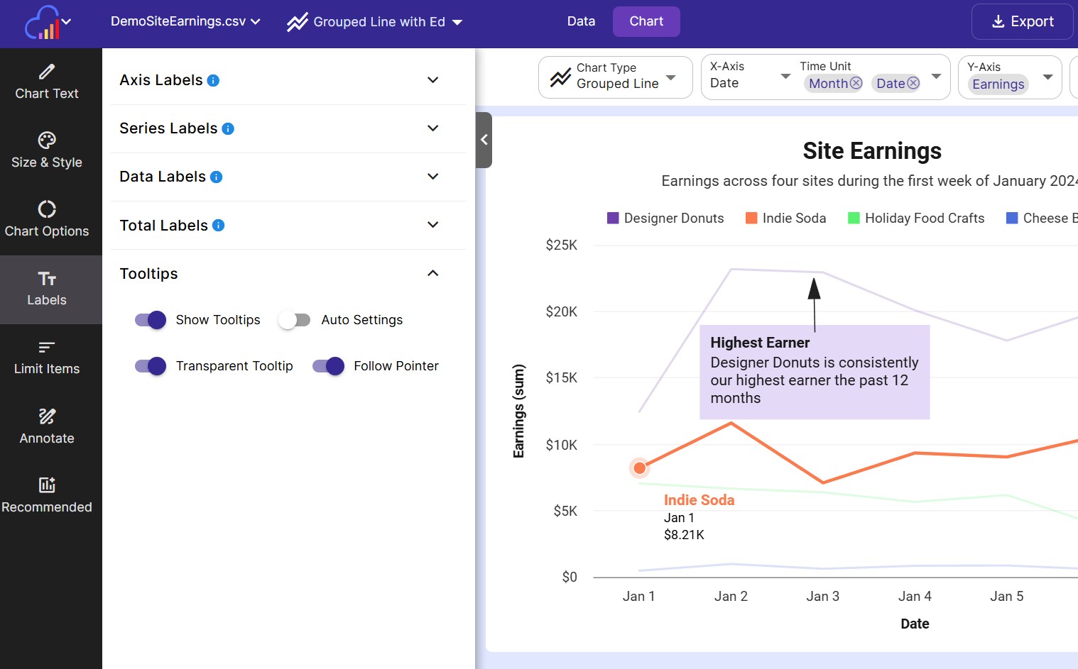
- Show Tooltips Toggle this on to show tooltips.
- Auto Settings Toggle this off to further customize the appearance of tooltips.
- Transparent Tooltip Enable this option for transparent tooltips.
- Follow Pointer Enable this option to have the tooltip follow the cursor as you mouse over the data point.