Quick Start
InstaCharts is an online chart maker that creates charts from spreadsheet files.
Charts can be saved as image files or shared online as interactive charts. Data from the spreadsheet can be shared as an interactive data table.
Below is an example of an embedded interactive chart.
Sign up for an account
To share a chart or save your data in the cloud, sign up for an account.
To try InstaCharts without signing up, use the demo.
Import Data
There are 3 ways to import data into InstaCharts: A file upload, synced through a google sheet, or copy and pasted into a textbox. This quick start guide will go over how to import data using a file upload.
Upload File
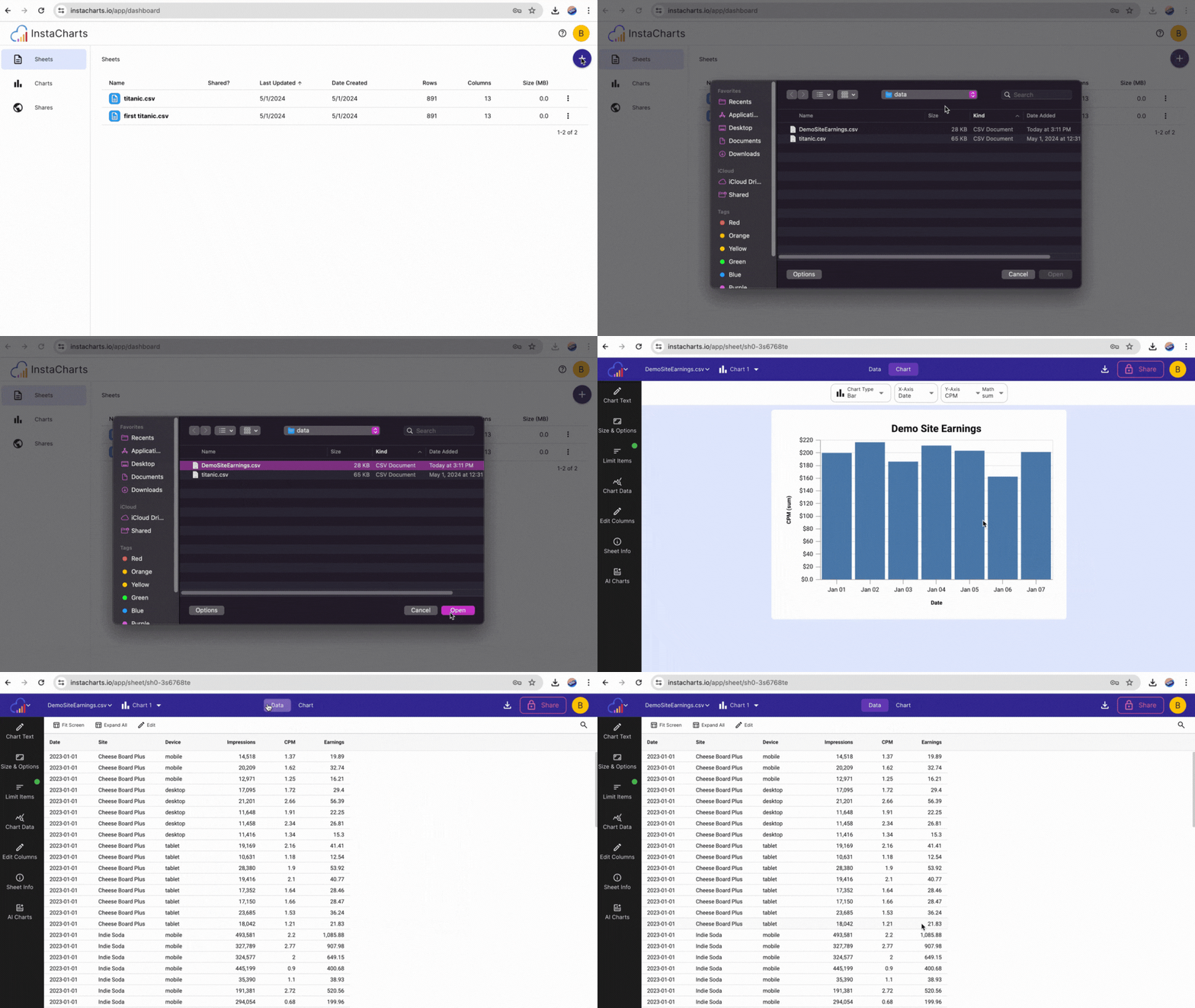
To import data into InstaCharts, upload a spreadsheet file from your computer. From the dashboard, click Add Sheet and select a spreadsheet from your device.

Many file types are supported including csv, excel, tsv, psv, open office, json and log files.
Check Data
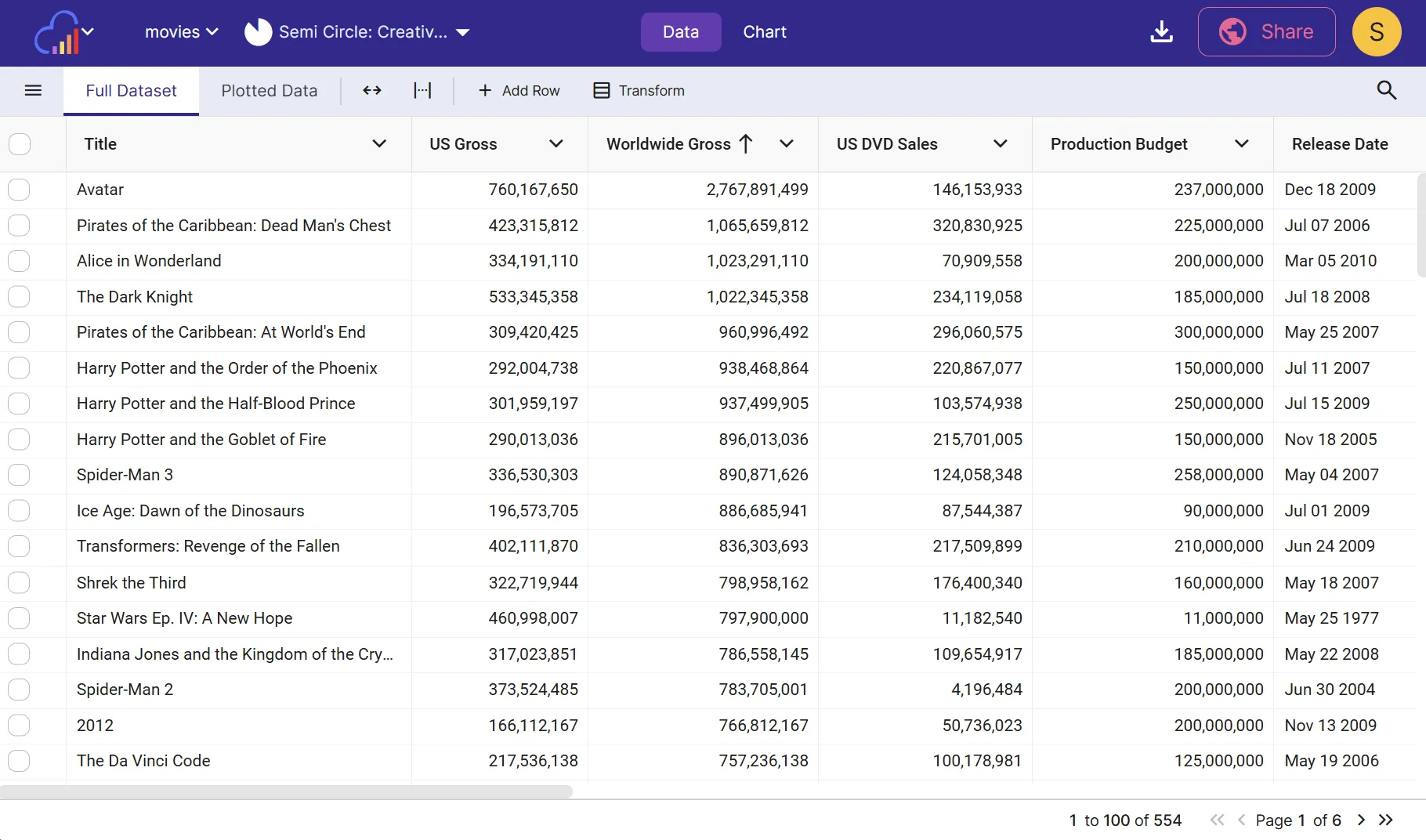
Once the spreadsheet is uploaded, a new Sheet will be created from its processed data. Click the Data tab, then Full Dataset to view it. Column types and formatting are autodetected based on the data each column contains.
 View your spreadsheet data on the Full Dataset view on the Data Tab
Edit Chart
Click the Chart tab to switch back to the chart view. A chart was instantly made based on your spreadsheet data!
Does it show anything meaningful? Maybe not. Let’s change it.
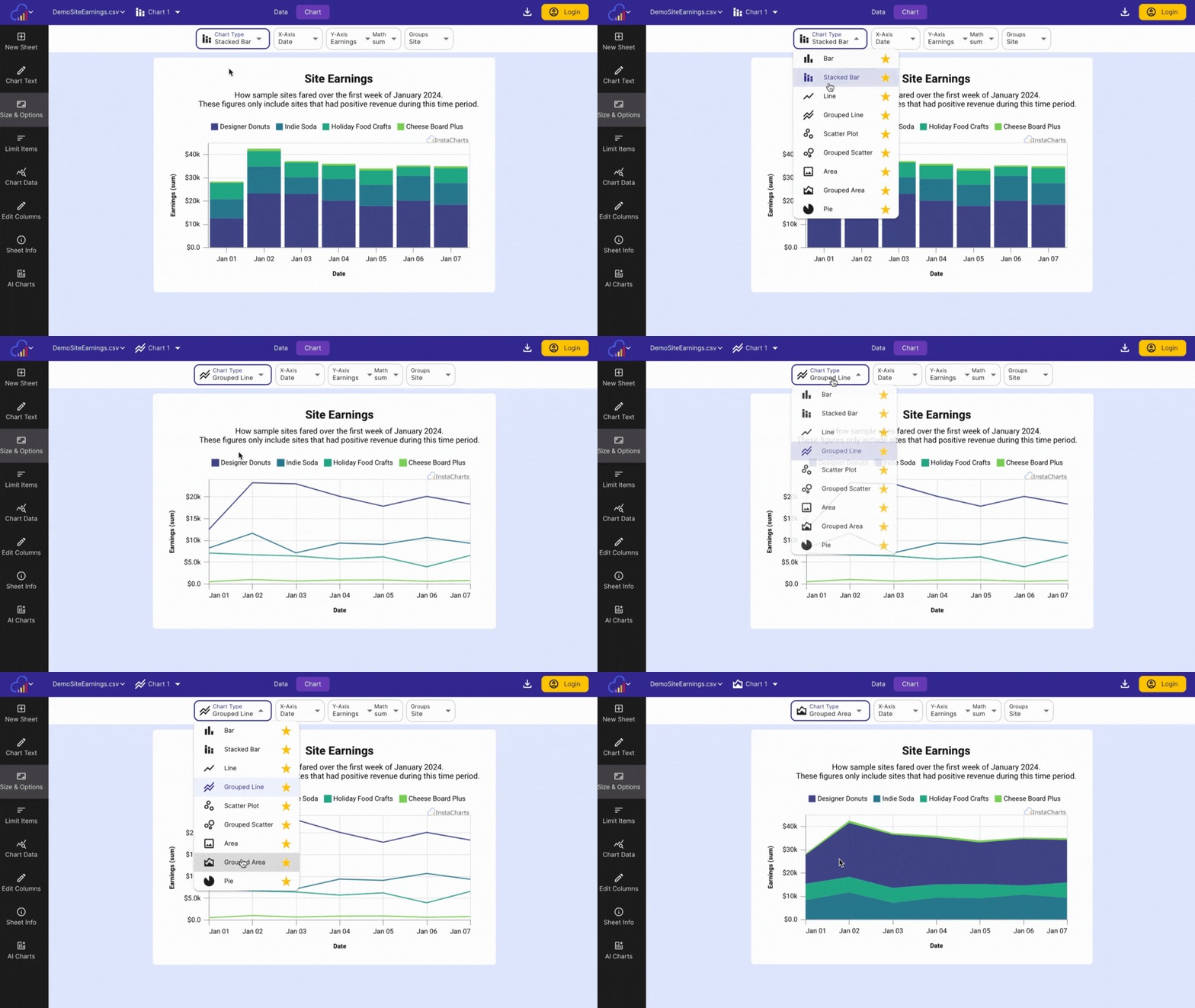
Choose Chart Type
Use this dropdown to switch between the main chart types: Line, Grouped Line, Bar, Stacked Bar, Grouped Bar, Scatterplot, Grouped Scatterplot, Area, Grouped Area, Pie, Radar, Heatmap & Mekko,

Choose Axis
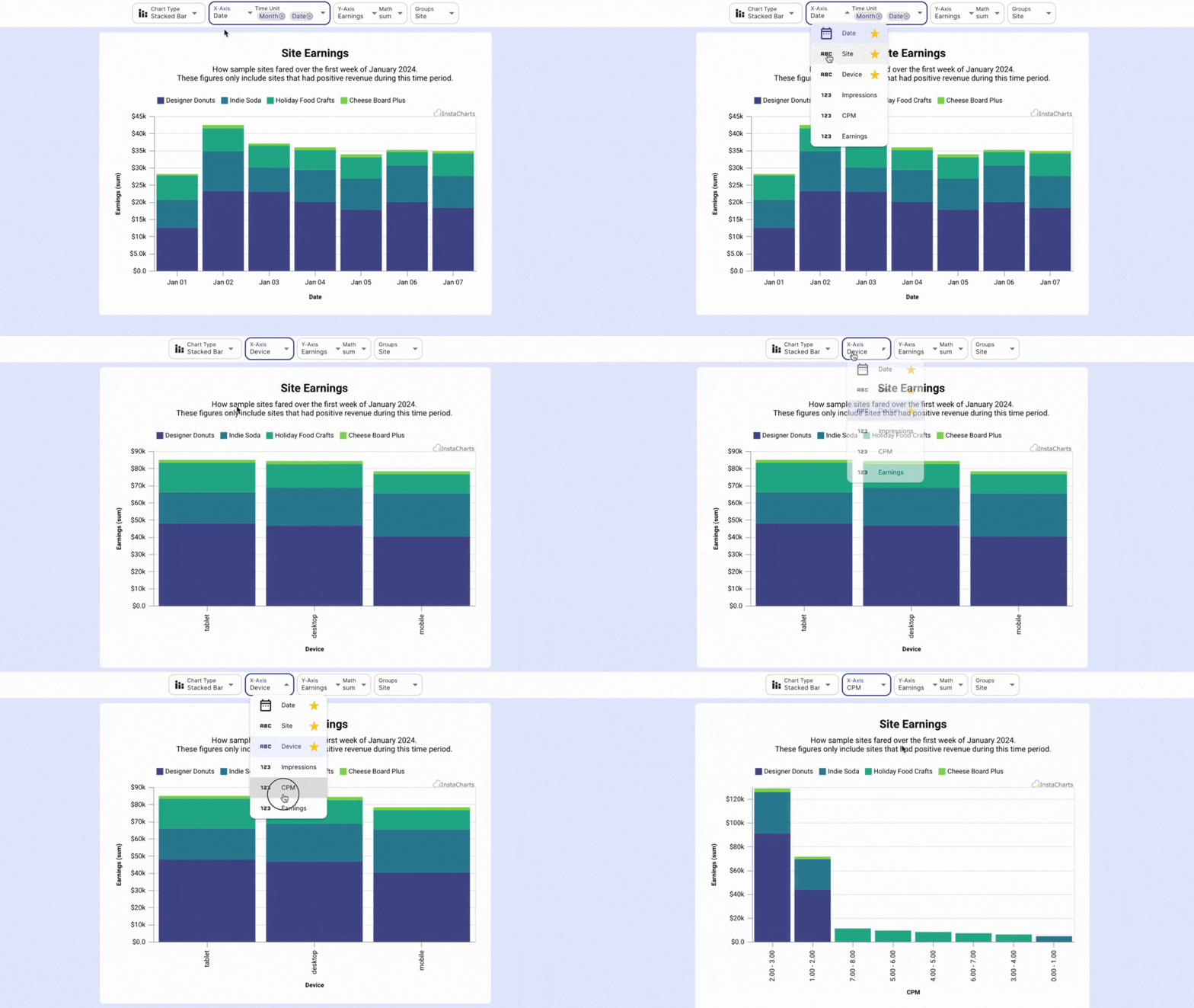
After selecting a chart type, switch the data plotted in the chart by changing which columns are plotted on each axis.

-
X-Axis Choose the spreadsheet column that should appear on the X (horizontal) axis. Time based columns or categorical data is typically recommended here.
-
Y-Axis or Series Choose the column that should appear on the Y (vertical) axis. Numerical data is typically recommended here. If the selected column supports multiple series, you will be able to add more series (columns) to the y-axis of your chart.
-
Aggregation Based on the axis selections, an additional Math dropdown may be added to the Y-Axis/Series. Select an aggregation function to be applied to Y axis (ex: sum, count, average, etc)
-
Breakdown If a grouped chart type is selected and only one series has been added, an additional dropdown will appear under Series called Breakdown. Categorical data (names, categories, etc.) is recommended.
Further Chart Customization
The left sidebar contains more options to further customize your chart. Edit the chart’s title and axis headings, the chart’s colors & size and limit items through the left sidebar.
The chart data can be filtered by setting column filters on the Data tab.
Multiple Charts
Need to make several charts from the same set of data? Click the Sheet menu (Spreadsheet file name) in the main toolbar, then Add Chart.
Each chart has its own set of filters applied to the data, so changing the active chart will change the filters (if any).
Next Steps
- Export chart images
- Export spreadsheet data
- Share an interactive chart