Annotations
Use the Annotate left side panel to add text and trend lines to your chart.
Annotations can help you highlight trends and patterns in your data visualizations.
Text Annotations
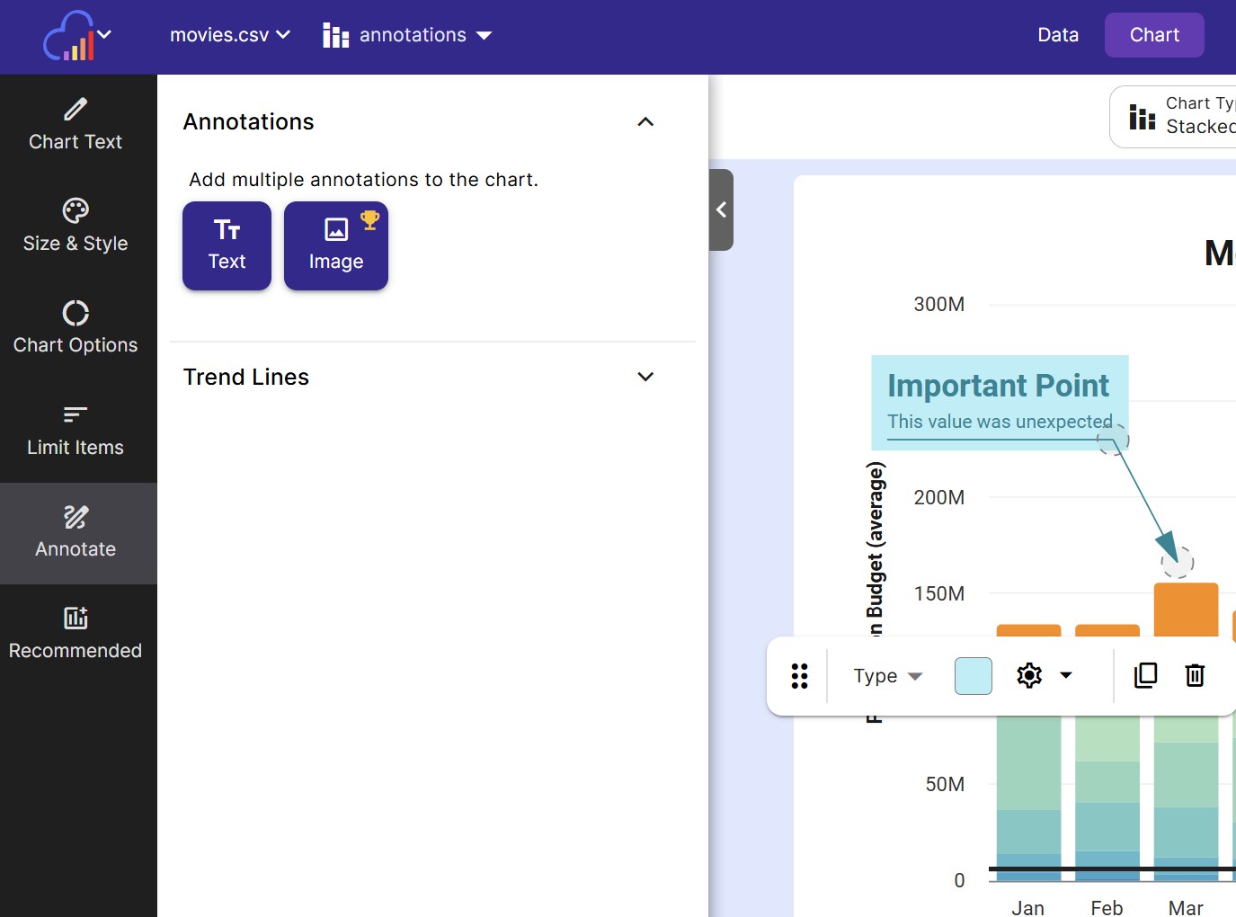
To add text, notes or a callout to your chart, click the Text button under Annotations.
To edit the settings of the text annotation, click on it from the chart. A popup bar will appear that allows you to change the text annotation’s appearance.
A text annotation can be customized in the following ways:
Text
- Title Enter a title for your text annotation. The title will be displayed in bold. Customize the title’s font size using its font size text box.
- Label Add a longer label or description for the annotation. Customize the label’s font size using its font size text box.
- Max Width The max width of the annotation label. Increase this value to have a wider annotation.
- Text Color Choose a text color for both the title and the label.
Line
- Type Choose the type of connector line. The default value is “Label Only” which does not have a connector line. Additional types are listed below.
- Line Color Choose a color for the connector line (if any)
- Connector End Choose what to display at the end of the connector line. The default value is “None”. You can choose “arrow” or “circle”
- Connector End Color Choose the color for the connector end (if any)
Background
- Show Background Toggle this on to show a background color behind the annotation.
- Background Color Choose a color for the background
- Background Opacity Choose the opacity (ability to see through) for the background. The default is set to 50%
Position
The positioning of the various text annotation elements can be tricky to set. Click on an annotation to drag around its anchor points.
Use the positioning values below if you have trouble selecting the annotation anchors. Not all anchor values are represented below; the callout rectangle has additional anchors that can only be set through clicking and dragging.
- X X position of the point anchor
- Y Y position of the point anchor
- DX X position of the label offset anchor. This value is offset from the X position of the point anchor.
- DXY Y position of the label offset anchor. This value is offset from the Y position of the point anchor.
Image Annotations
To add images, watermarks or logos to your chart, click the Image button under Annotations.
Uploading Images
Once you click the Image button under annotations, a screen will prompt you to upload an image from your device (or choose an image you have already uploaded in this sheet).
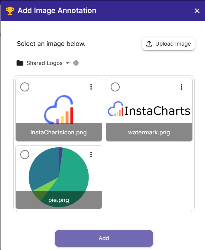
Once you have selected an image, click Add to add it to your chart.
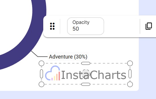
Editing Image Annotations
To edit the image annotation, click on it from the chart. You can drag the image around and resize it right from within the chart.
A popup bar will appear that allows you to change the image’s opacity, duplicate it or delete it.
Trend Lines
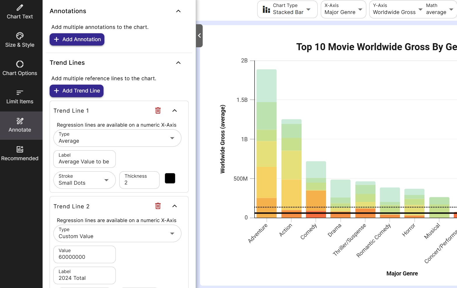
To add a trend line to your chart, open the Annotate left side panel, then click Add line under Trend Lines.
A trend line can be customized in the following ways:
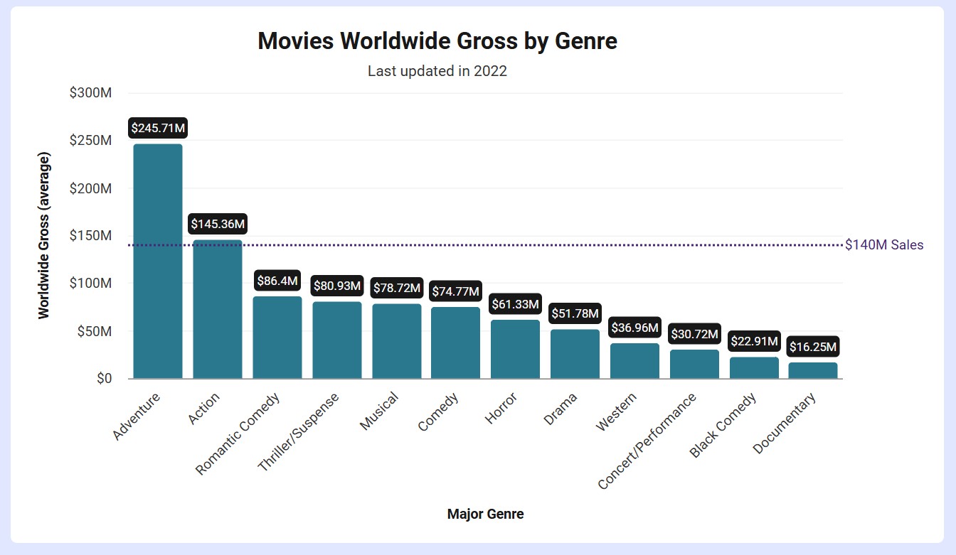
- Type Choose the type of line to draw on top of your chart. Choices include Average, Custom Value and Linear Regression among others.
- Value For the custom value trend line. Enter in a value to highlight on the Y-Axis
- Label The text to label a line with (not available on all line types)
- Stroke Choose the line stroke. Options include solid, small and large dotted
- Thickness Choose the line thickness
- Color Choose the color of the trend line and its label (if it has one)
The different trend line types are described below.
Custom Value
Use a custom value trend line to showcase a constant value on the Y-Axis.
Use cases
- Highlight an important custom metric
Average
The average (mean) line shows the arithmetic mean of your data points, providing a quick visual reference for the central tendency of your dataset.
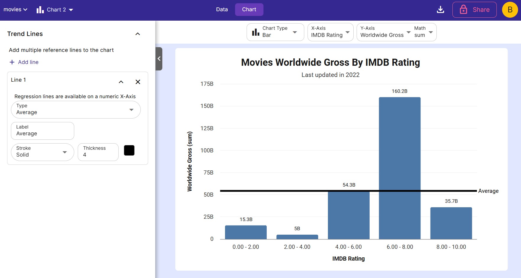
Use cases
- Identifying whether data points are above or below average
- Comparing different segments of data against the overall average
- Spotting outliers or unusual patterns
Median
The median line represents the middle value of your dataset when arranged in order, effectively dividing your data into two equal halves.
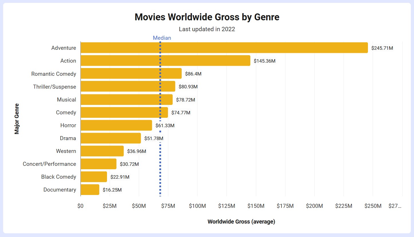
Use cases
- Visualizing the center of your data distribution
- Identifying skewness in your dataset
- Providing a robust measure of central tendency less affected by outliers
Linear Regression
A linear regression line shows the best straight-line fit through your data points, indicating overall linear trends.
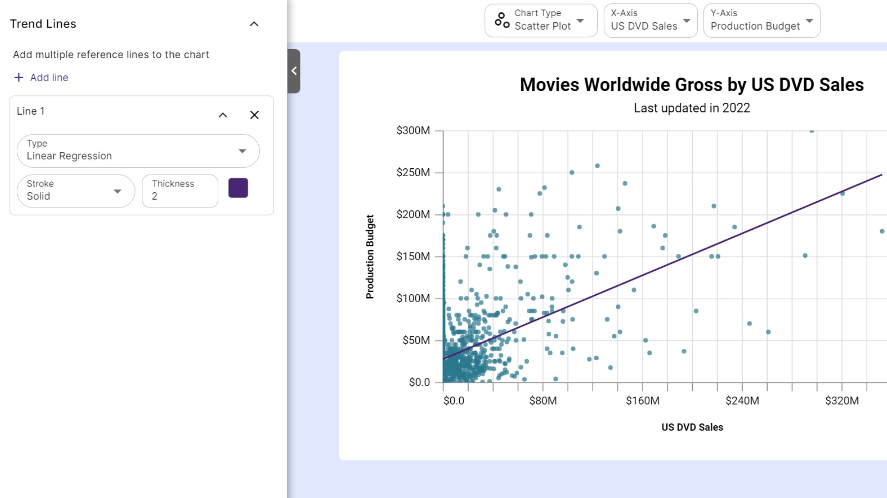
Use cases
- Identifying and visualizing linear relationships between variables
- Predicting values based on the linear trend
- Comparing actual values against the predicted linear relationship
Choosing the best trend line for your data
- Use average/median lines for reference points.
- Use linear regression for straight-line trends.